This document outlines our strategic approach for the visual identity of Cesareo Design.
You told us the studio’s signature isn’t a colour, a material or a style. It is a space that couldn’t belong to anyone else.
This document reads your answers closely, names the tensions an identity for Cesareo Design has to hold, and proposes three worlds the studio could live in, each shown at work using your own photographs.
- 01Overview
- 02Creative Strategy
- 03Visual Direction
- 04Next Steps
Brand Overview
01
“Rooms that couldn’t belong to anyone else.”
Cesareo Design is an art-driven California interior design studio creating highly personal, collected interiors through the interplay of contemporary design, historical reference, colour, materiality and custom craftsmanship.
We don’t believe the designer should be the protagonist. The client is. The studio’s eye edits, interprets and elevates each client’s story, and leaves rooms that keep evolving long after it has gone.
Art-driven interiors · San Francisco
Founder-led, studio-powered
From Leo Cesareo Design to Cesareo Design
What You Told Us
“We don’t believe the designer should be the protagonist. The client is.”
The brand steps back so houses and their people lead: photography first, the studio’s voice second.
“Our signature isn’t a particular color, material or style.”
The identity needs a fixed frame that stays recognisable while every project looks different.
“Cesareo can use restraint, but it shouldn’t use neutrality as personality.”
Colour and material are not only allowed, they are expected. Beige is not a strategy.
“We do not aspire to be everywhere. We aspire to be invited somewhere interesting.”
Selective rather than loud. The brand should read as an invitation, never an advertisement.
Two Names, One Point of View
The move from Leo Cesareo Design to Cesareo Design is more than a shorter name. Rather than replace one with the other, the identity keeps what the first built and makes room for what the second is becoming.
Central Insight
Cesareo Design makes rooms that couldn’t belong to anyone else.
The Art of Belonging runs in two directions: a home that belongs to its people, and people who belong around the studio, from clients who return to the artists and makers beside them. Not a tagline. A test for every decision.
Brand Foundations
Cesareo Design’s foundations define how the studio designs, collaborates and communicates. They guide every decision, from the first conversation to the last object placed in a room.
No two projects alike, because no two clients are alike. Their story leads.
Every object earns its place and carries memory, history or intention.
Open to the idea that isn’t the obvious one. Never predictable.
Custom work with artists and makers whose skill enriches the studio’s own.
Room for wit, colour, sensuality and things there simply for pleasure.
Architecture, art, furniture, material and light balanced as one picture.
Founder-led, studio-powered. A process built on dialogue and trust.
Interiors that grow richer through use, accumulation and time.
Brand Personality
and Voice
Cesareo Design should feel like an exceptionally interesting person you want to spend time with, not a luxury brand trying to impress you. Serious about the work, never too serious about itself.
Brand Personality
- Curious and cultured
- Confident, never self-important
- Warm, seductive and personal
- Unexpected, occasionally witty
Brand Voice
- Caption like a curator, write like a host
- Specific rather than superlative
- Short sentences, precise nouns
- Wit from observation, never puns
How Cesareo
Speaks
“Serious about the work, never too serious about ourselves.”
Specific names: the maker, the material, the room, the street.
Invitations, not calls to action. Come in. Write to us.
Luxury. Bespoke. Curated. Elevated. Timeless. These words announce status. Cesareo doesn’t need them.
Anything that makes the designer the protagonist. The client is.
The beige luxury formula, in words as much as in rooms.
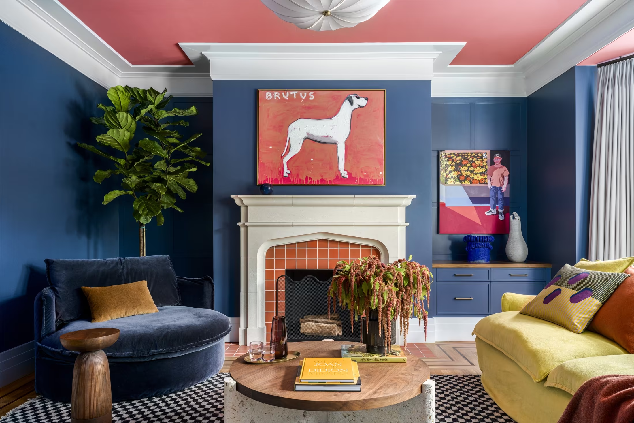
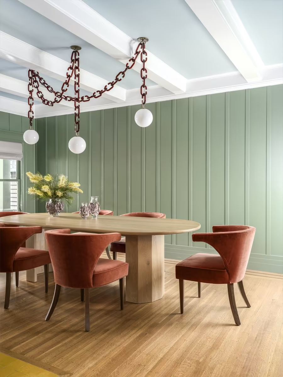
Glib wit. Humour comes from observation: a painted hound, a chain for a chandelier.
Community and
Positioning
Positioning
Where Bay Area peers are primarily curatorial, Cesareo Design is narrative. The work is not made to culminate in a perfect photograph. It is designed to keep evolving long after the studio leaves.
Who belongs here
- Curious, engaged clients who value perspective over prescription
- People who care about art, craft and history more than status
- The artists, makers and architects the studio wants beside it
Who should self-select out
- Anyone wanting a formula, or the beige luxury look
- A home as an expression of status
Creative Strategy
02
From Insights to Strategy
Five tensions to hold
- Restrained, not neutral
- Rigorous, not austere
- Sophisticated, not solemn
- Recognisable, not repetitive
- Founder-led, studio-powered
This creative strategy translates what you told us into a visual language that holds all five at once, so every design decision feels personal, collected and assured.
Design Goals
What we aim to express through design
ten seconds
One arresting image and very few words. Confidence shown, not claimed.
to see more
Houses told as stories, each opening onto the next.
hesitations
Show process, phases and makers plainly. It answers cost and control.
changing work
Recognisable without a house look. Structured, never restrictive.
Design Strategy
The strategy outlines the key visual pillars, defining the proposed aesthetic, colour approach, typography style and brand mood as a unified system.
Hold back on layout and type, never on colour and material. A composed editorial frame around colour-confident, witty rooms. One unexpected thing on every page.
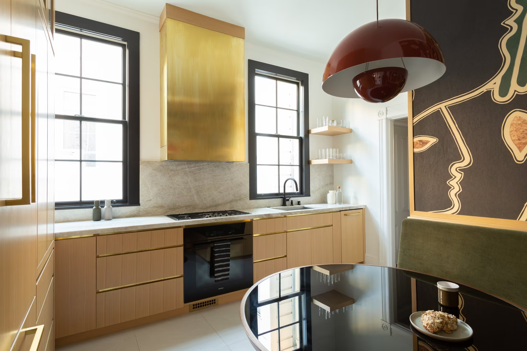
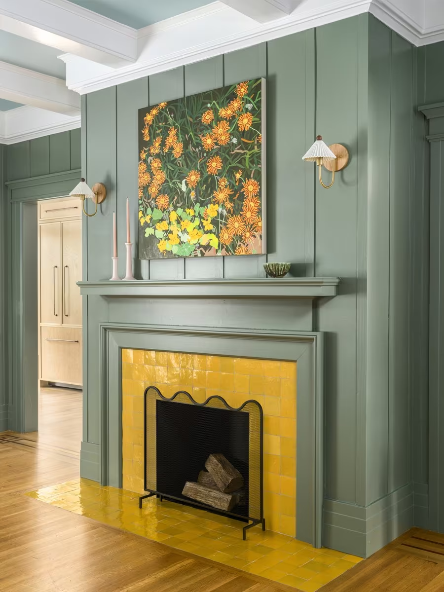
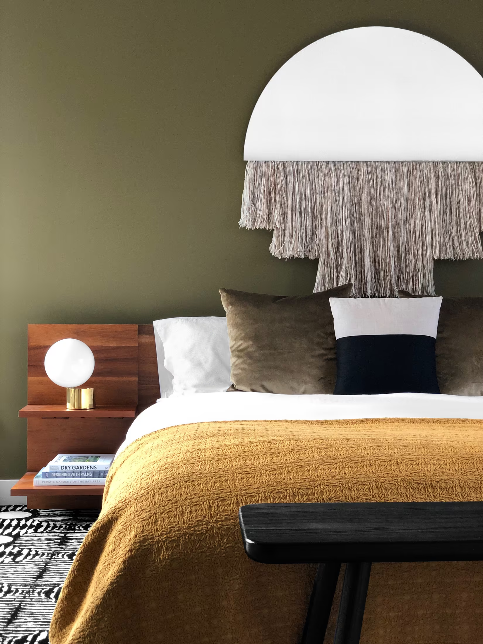
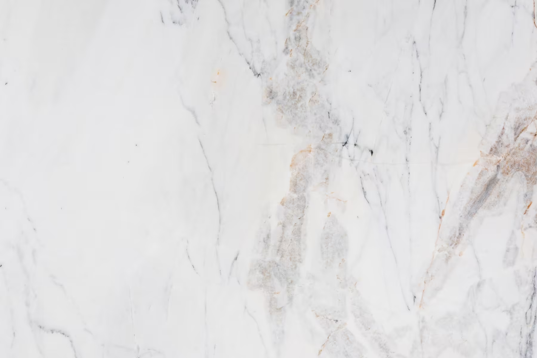
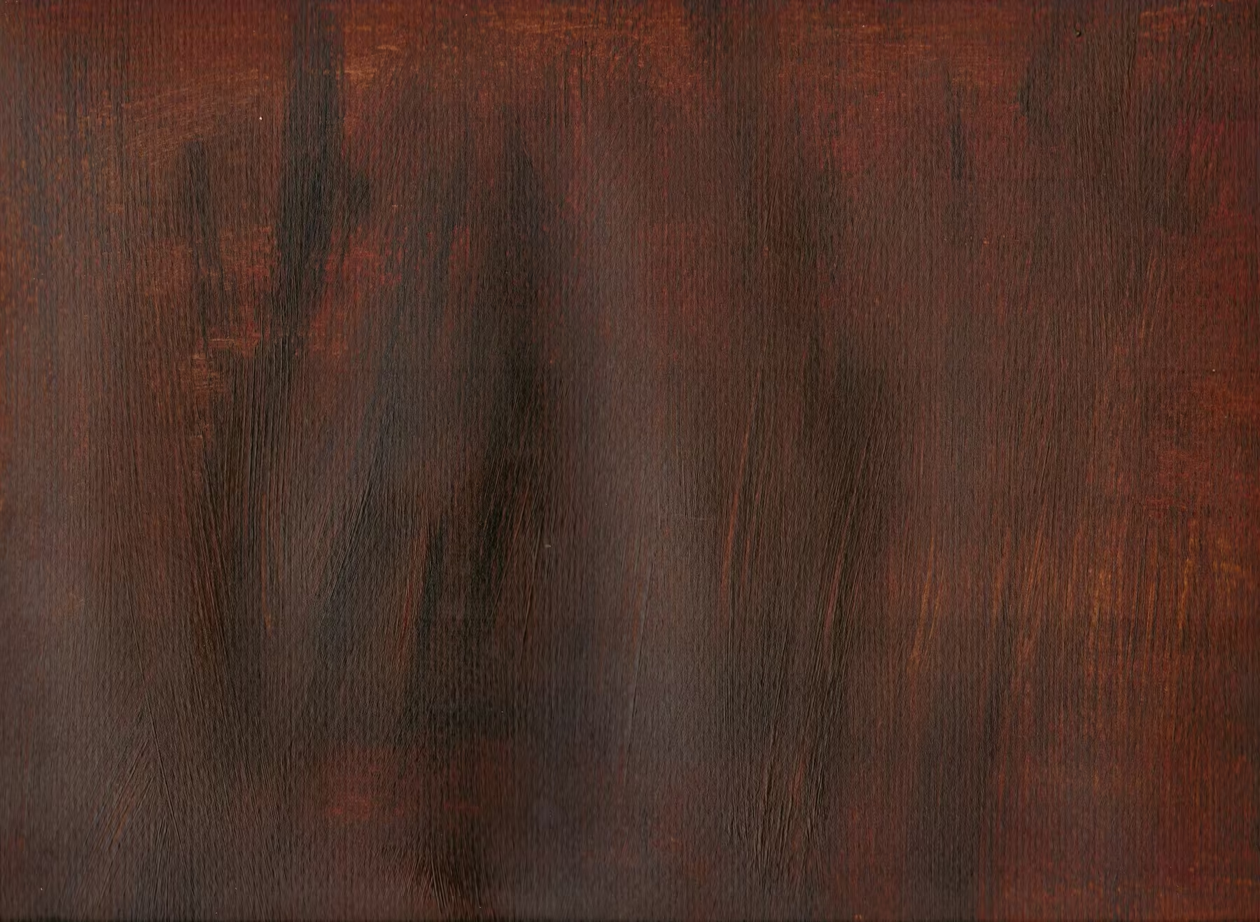
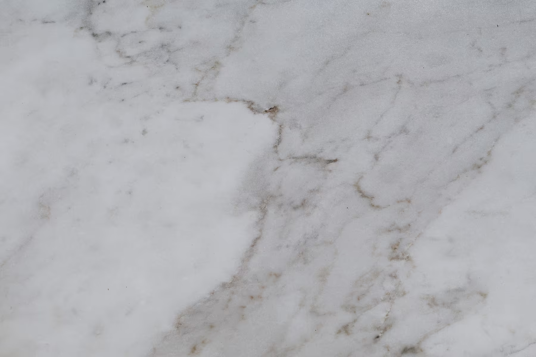
Oxblood, polished nickel, burnished brass, Calacatta Monet, smoked mirror, walnut and oak. The rooms bring navy, sage and saffron; the brand frames them.
A refined, high-contrast serif in the spirit of Heimat Didone for names and key moments, with a quiet sans for information.
In ten seconds, intrigue. In a minute, “I want to see more.” Long after: confident, worldly, capable.
Colours
The palette is drawn from the finishes you named: the depth of oxblood, the cool gleam of polished nickel, burnished brass, the veining of Calacatta Monet, smoked mirror, walnut and oak.
It is a palette that feels found rather than designed. Deep and light tones are held in balance, so the navy, sage and saffron already in the rooms always have somewhere to sit.


Typography
The typographic system is built on a refined Didone paired with a clean, neutral sans-serif.
- The Didone is used for names, headlines and key moments. Heimat Didone is the reference: high contrast, with hairlines sturdy enough to stay elegant at small sizes. It is a commercial typeface; Bodoni Moda stands in here.
- The sans-serif is used for captions, specifications and functional content, quiet and precise.
- Supporting elements such as labels and navigation use spaced capitals, adding structure without noise.
The system stays restrained, with room for personality through italics, catalogue numbers and the occasional witty caption.
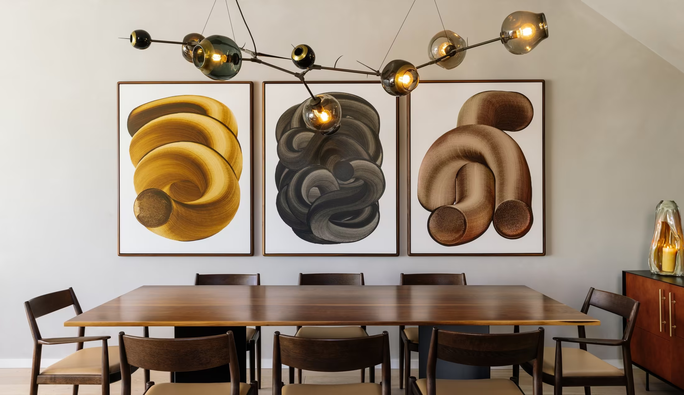
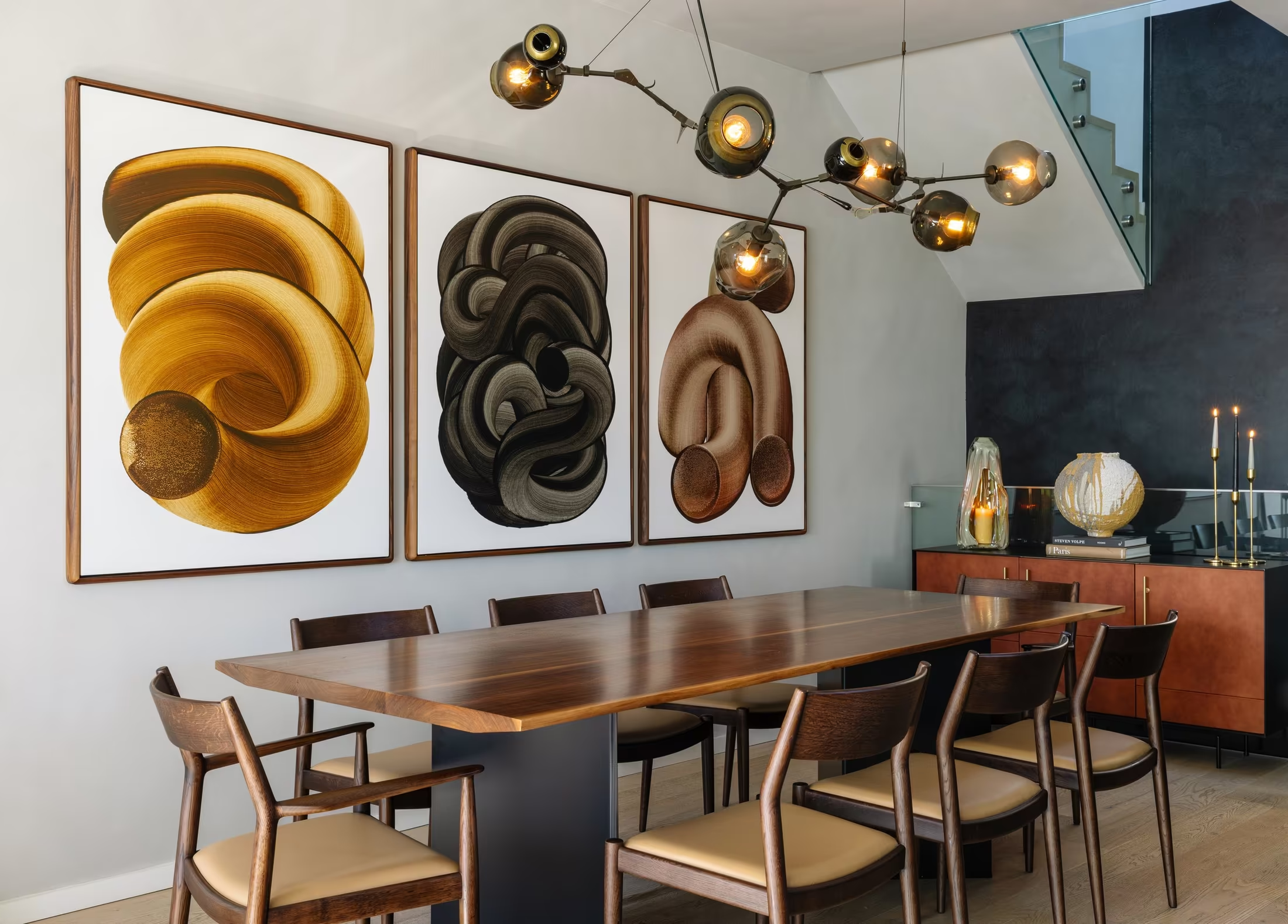
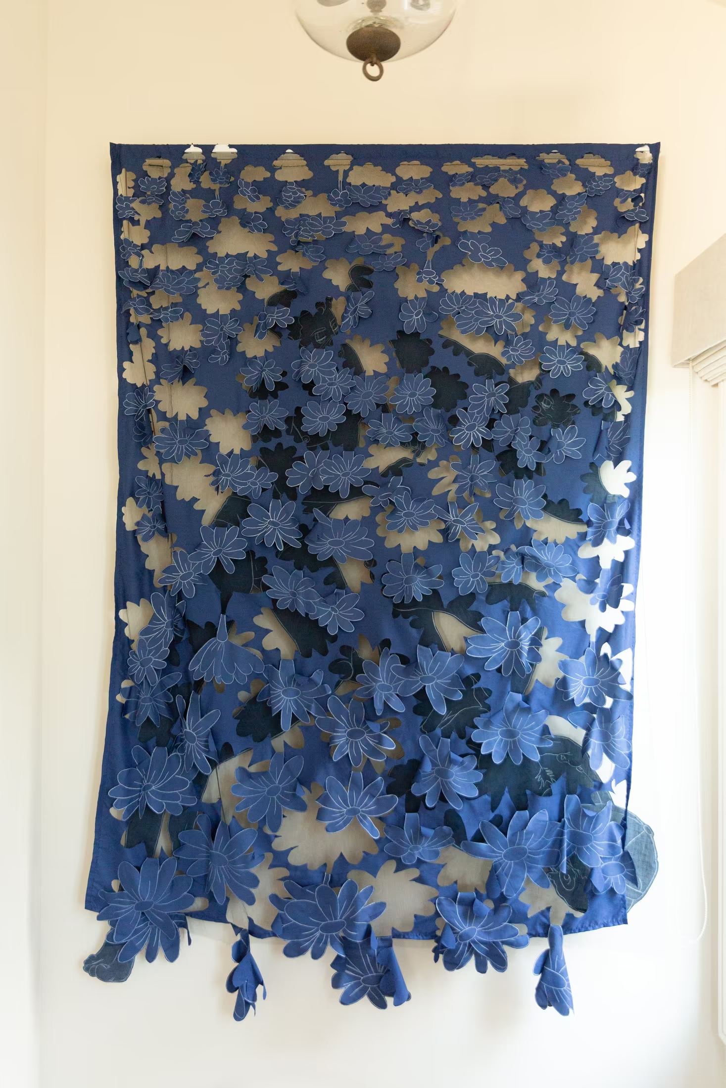
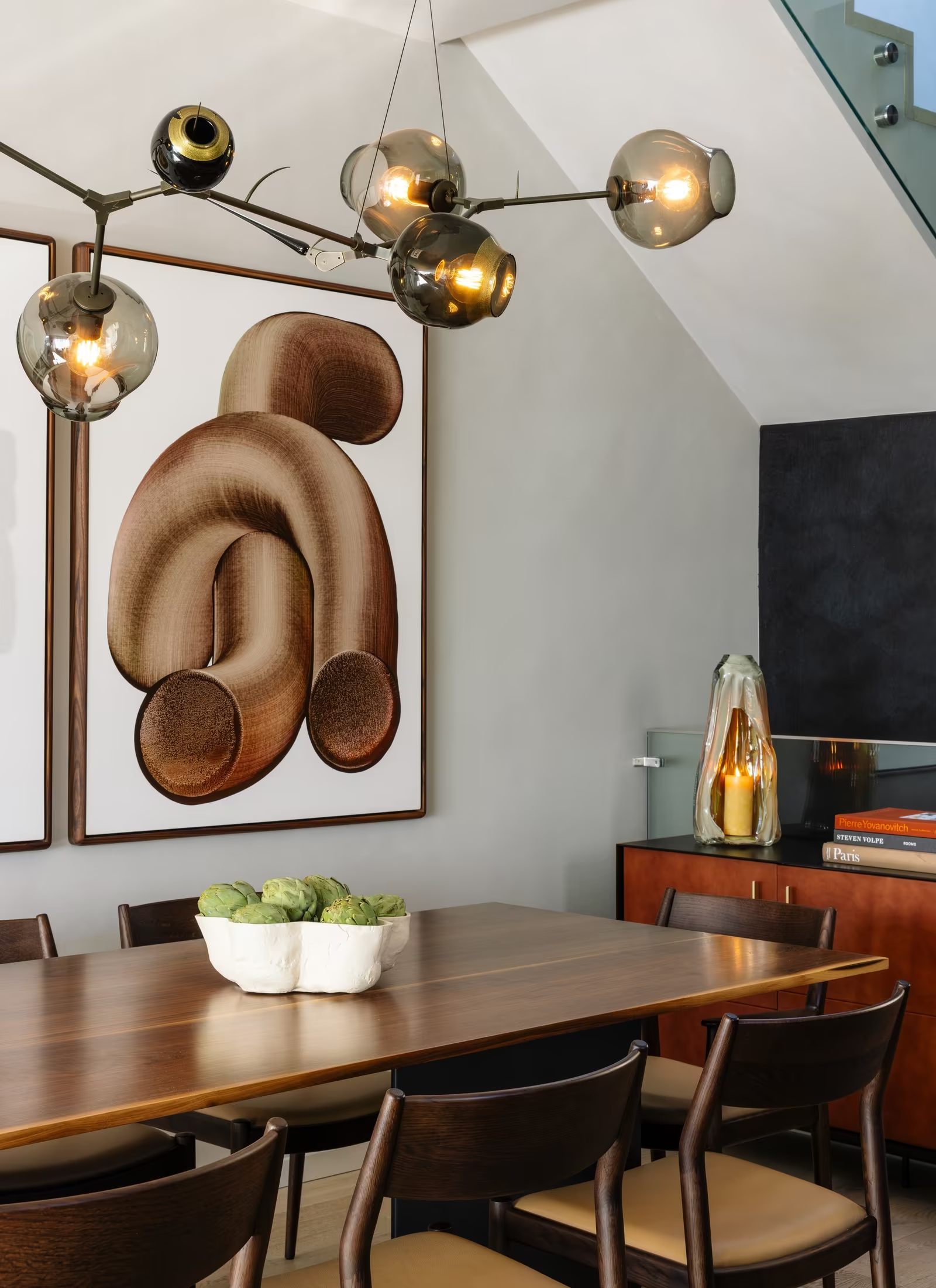
Coiled triptych
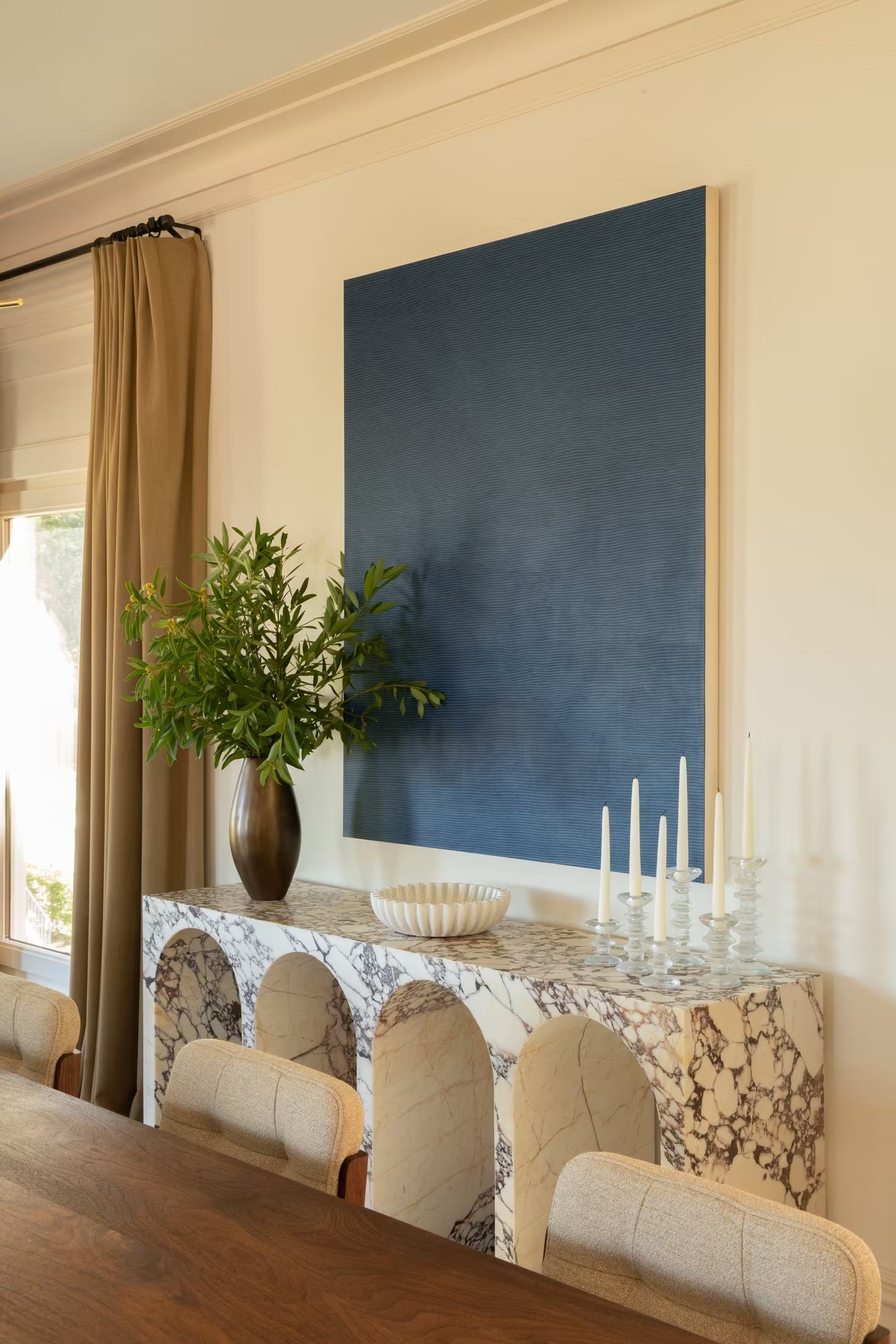
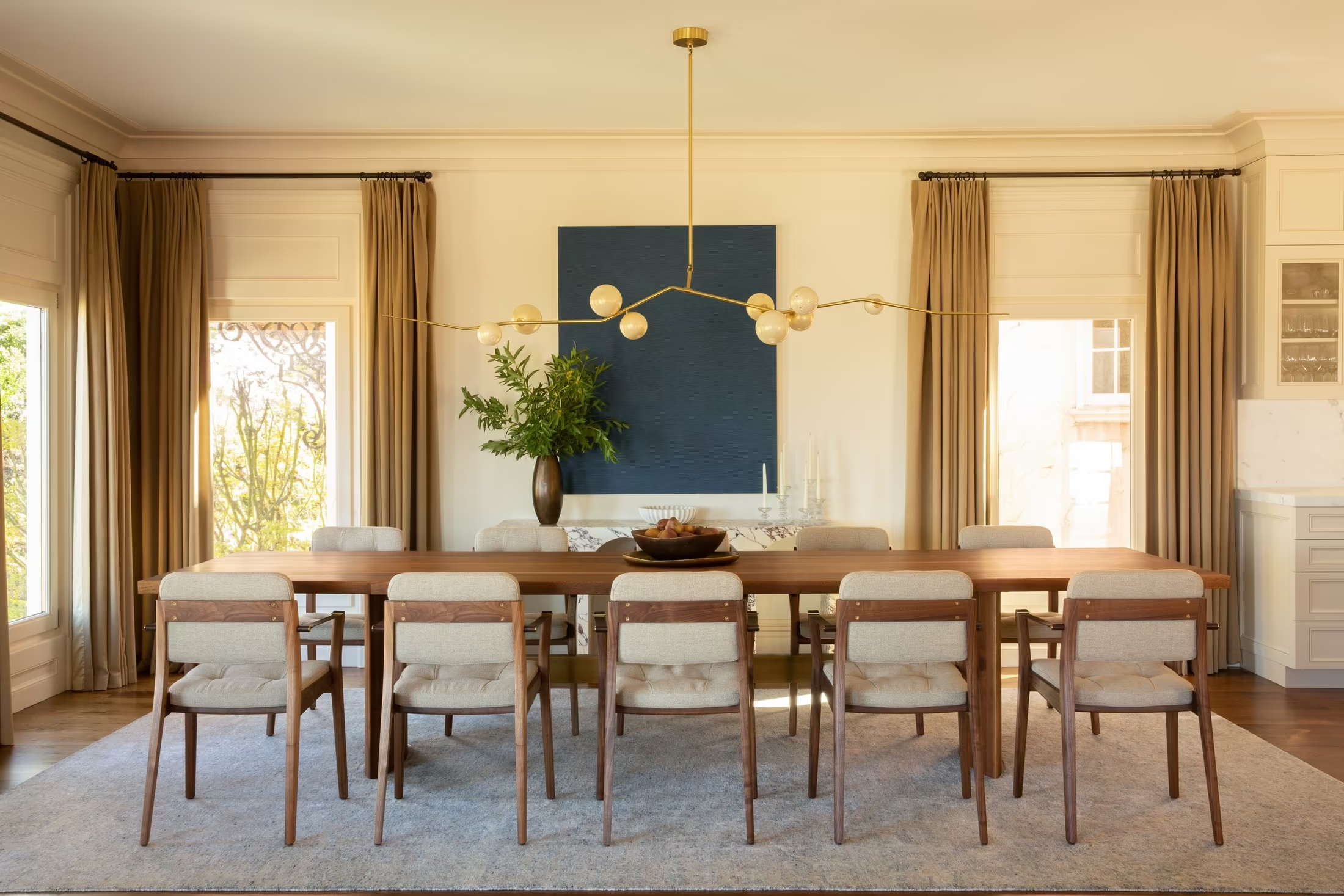
Valley Street, dining room
CESAREOValley StreetPrincipal
Rooms that couldn’t belong to anyone else.Mood &
Atmosphere
Photography
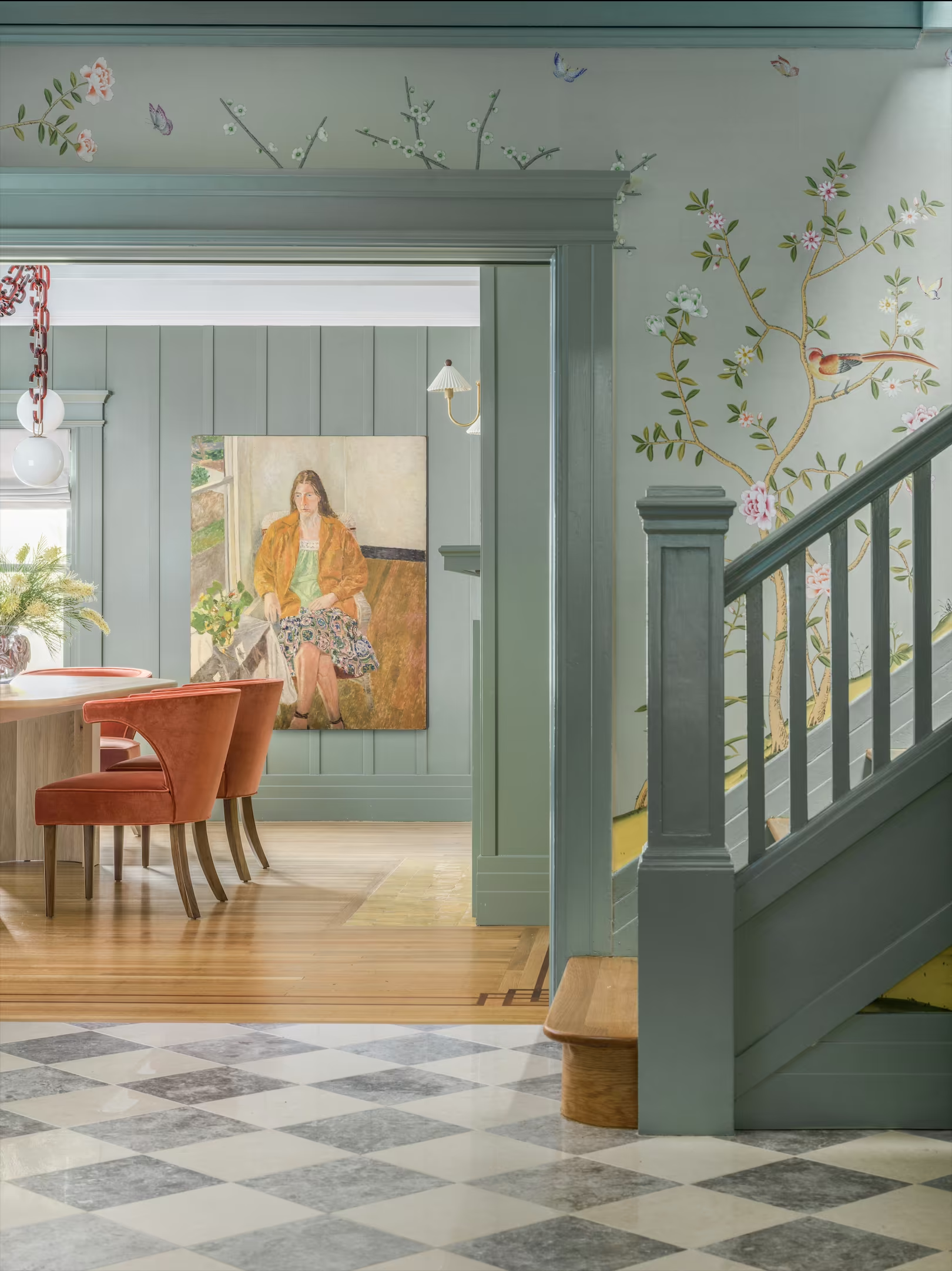
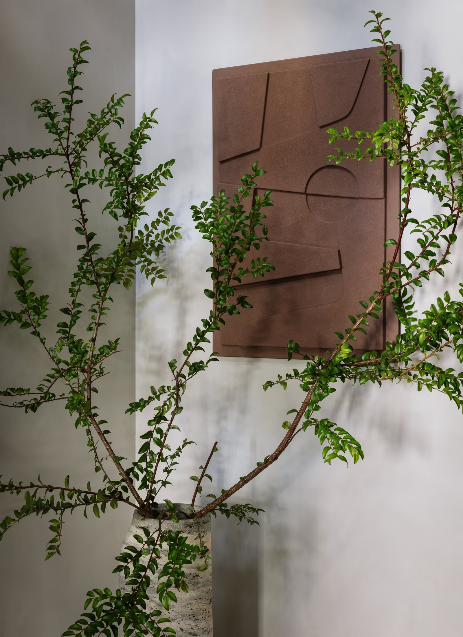
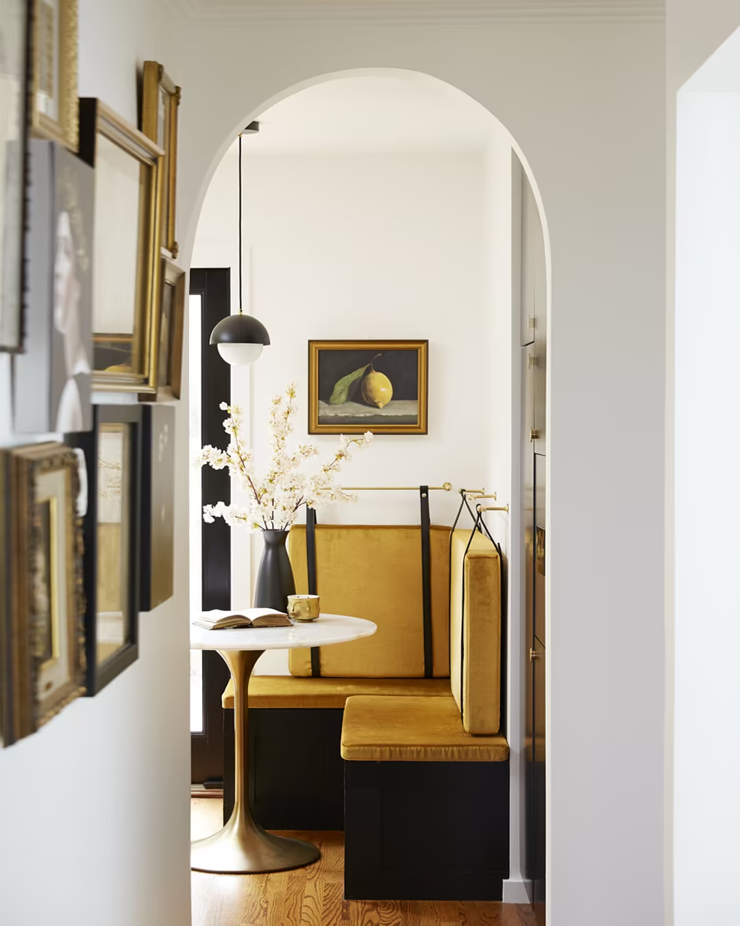
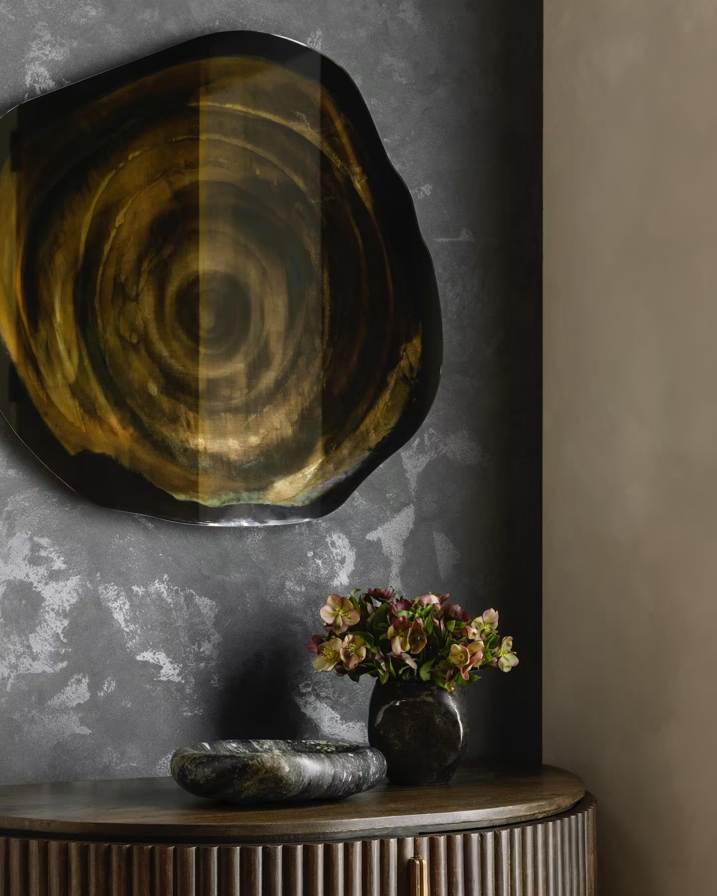
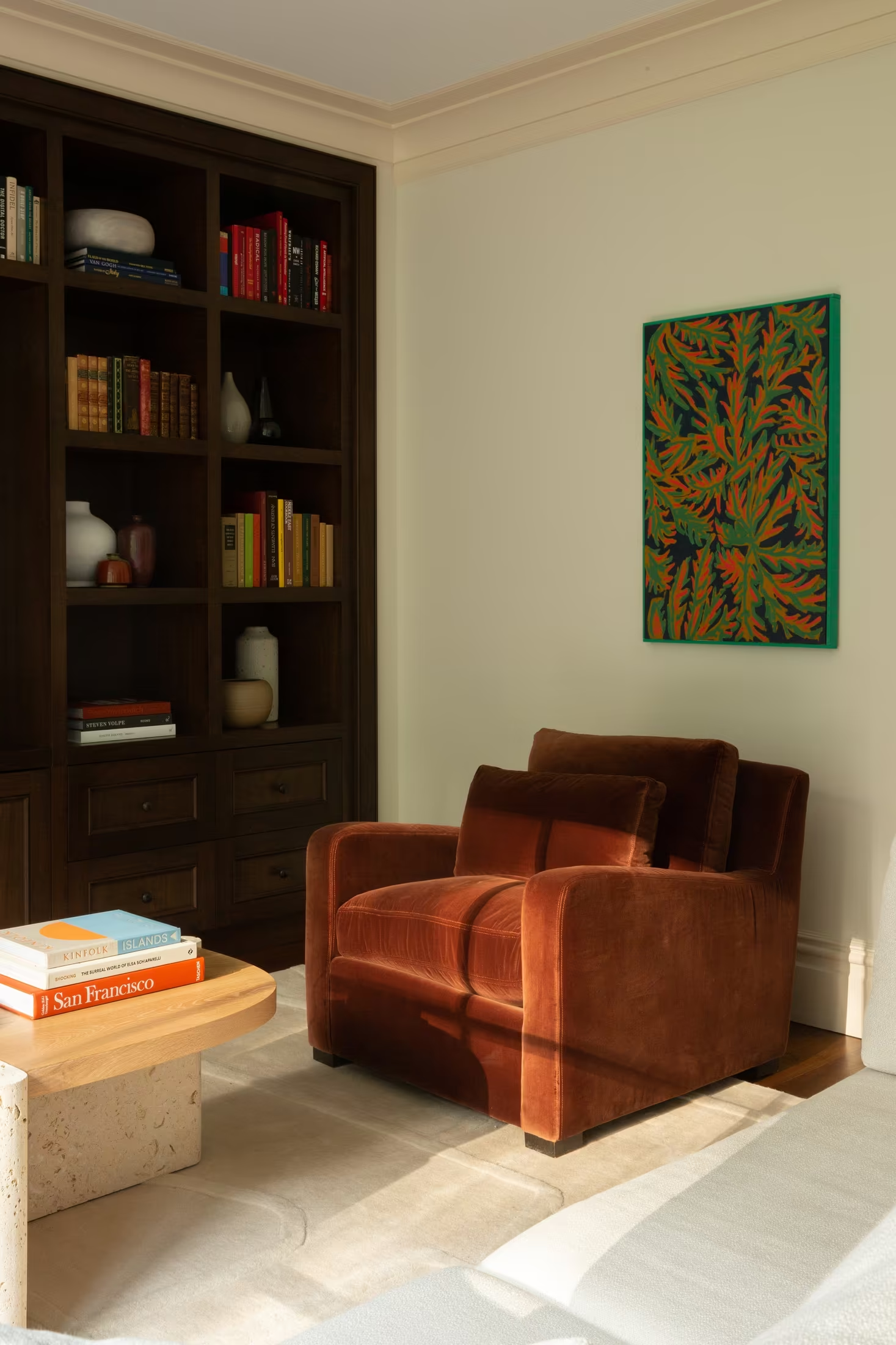
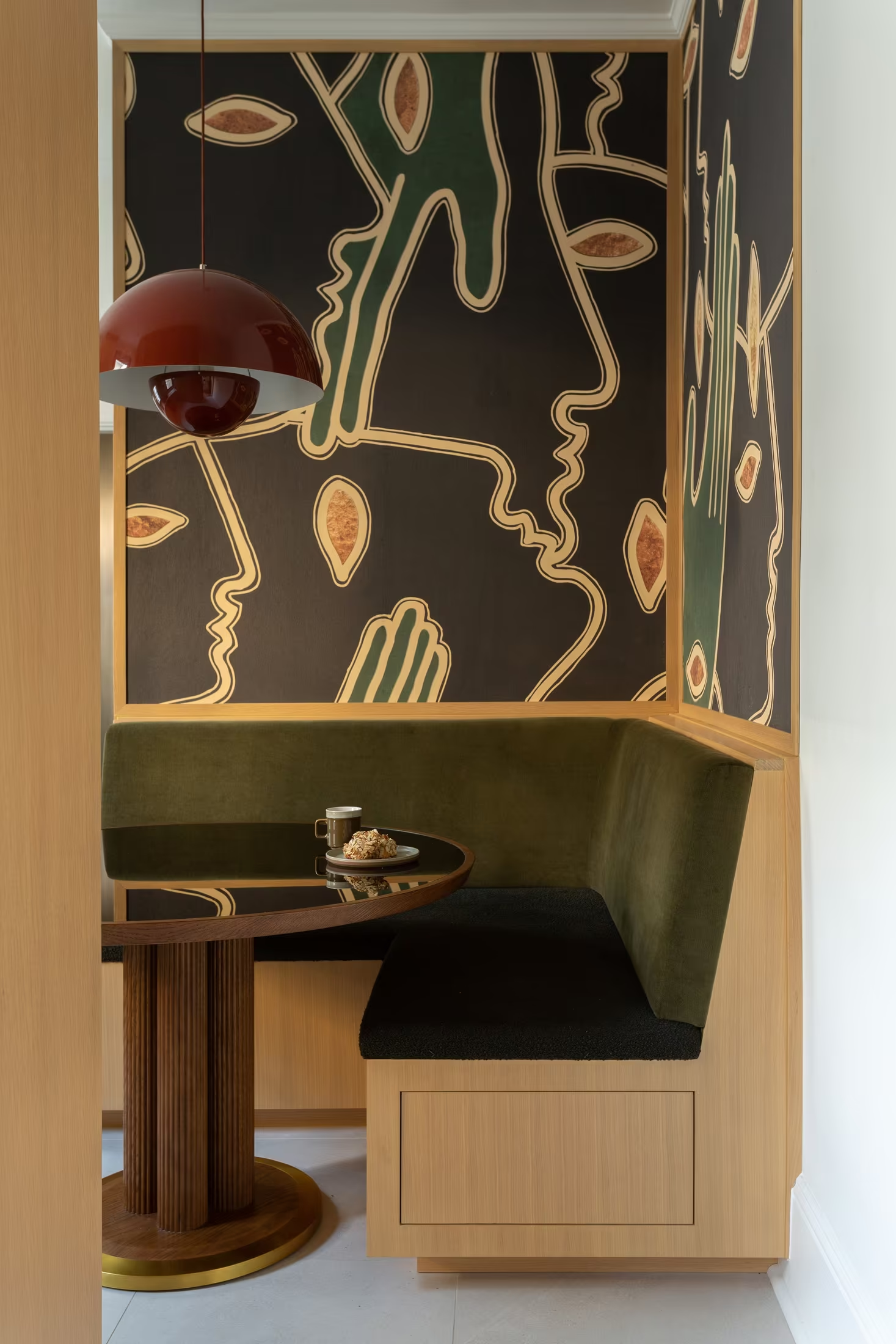
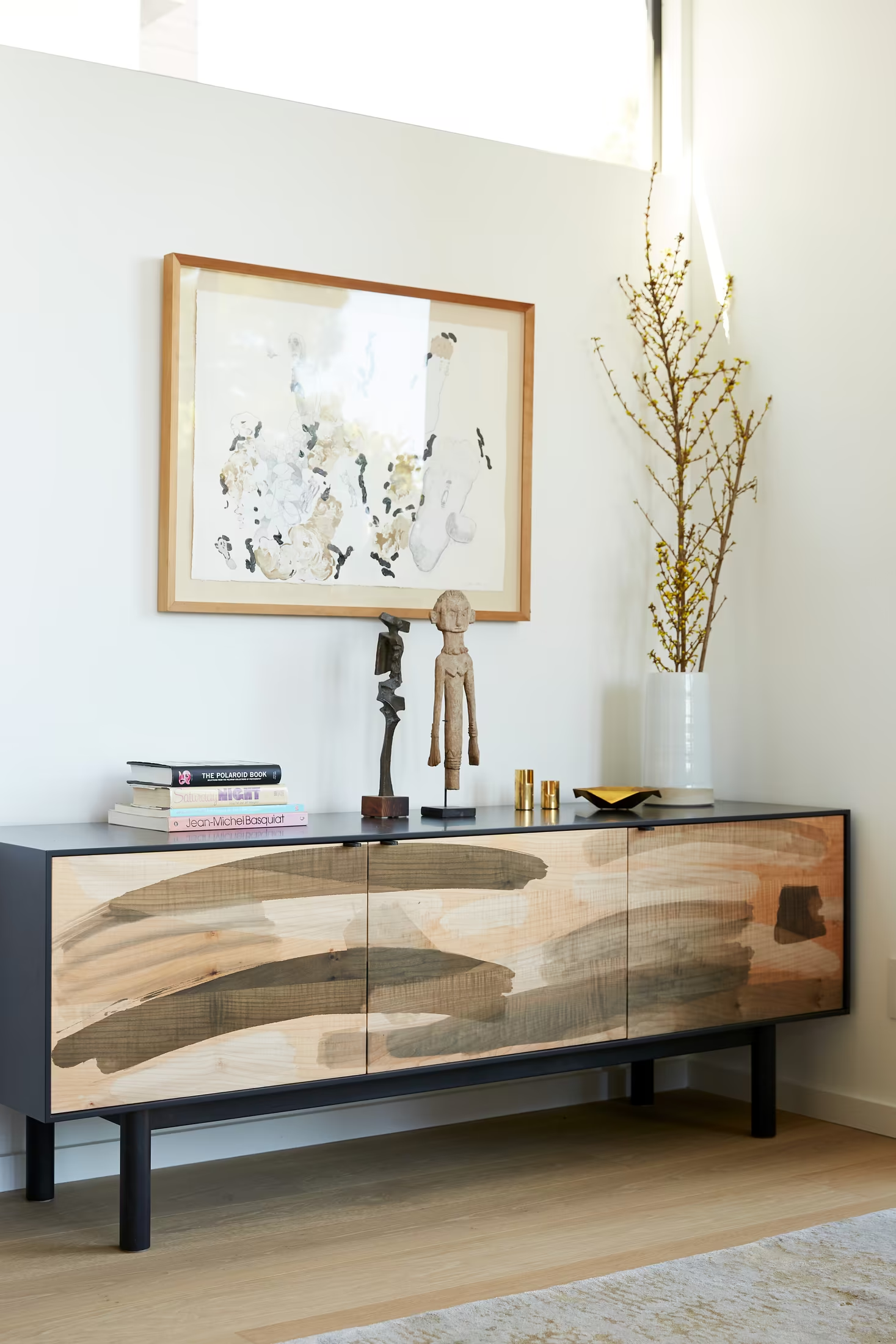
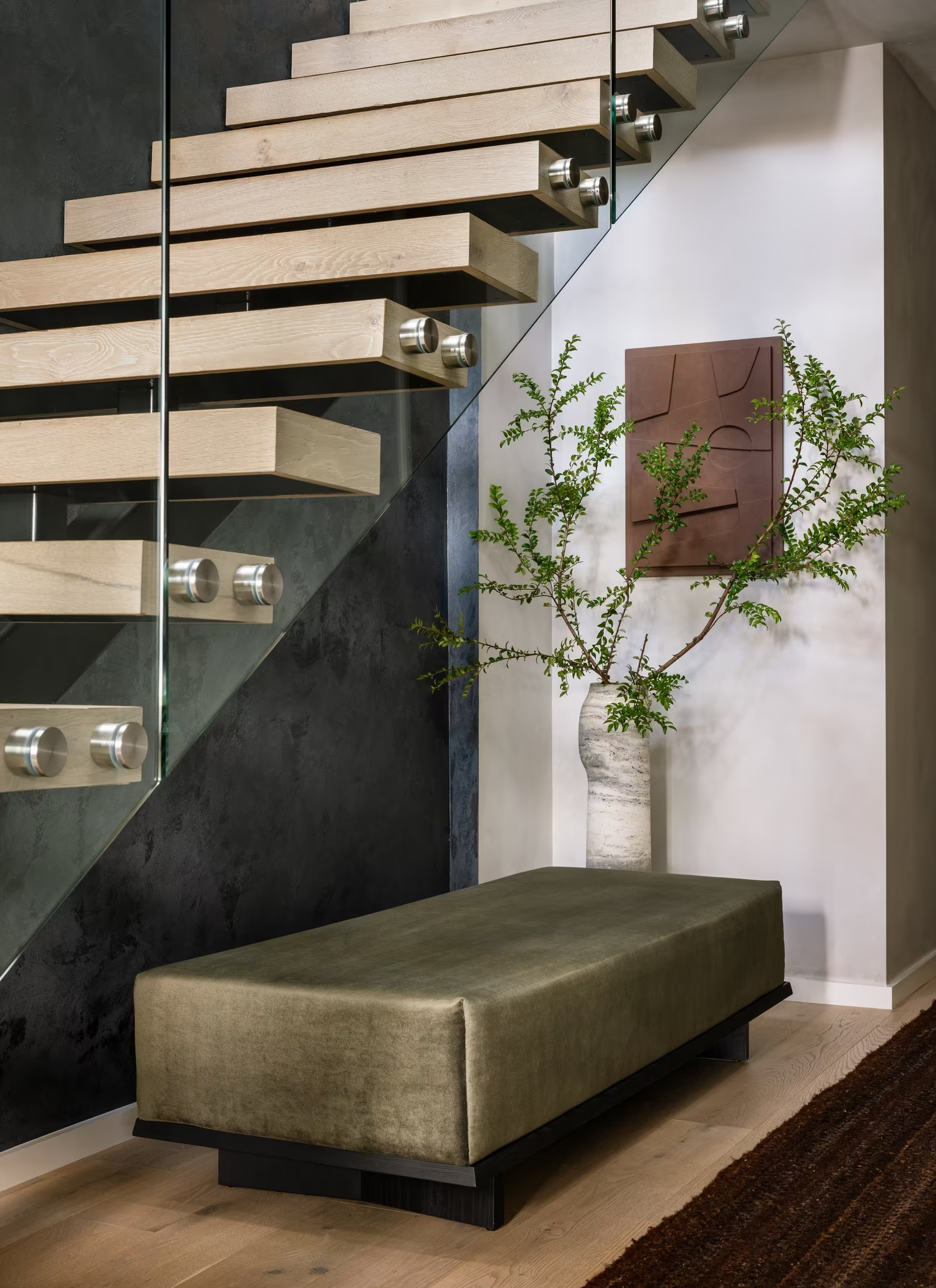
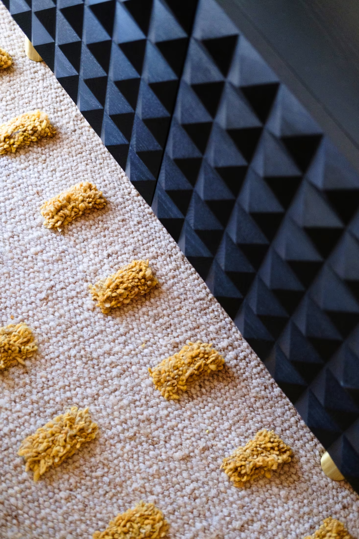
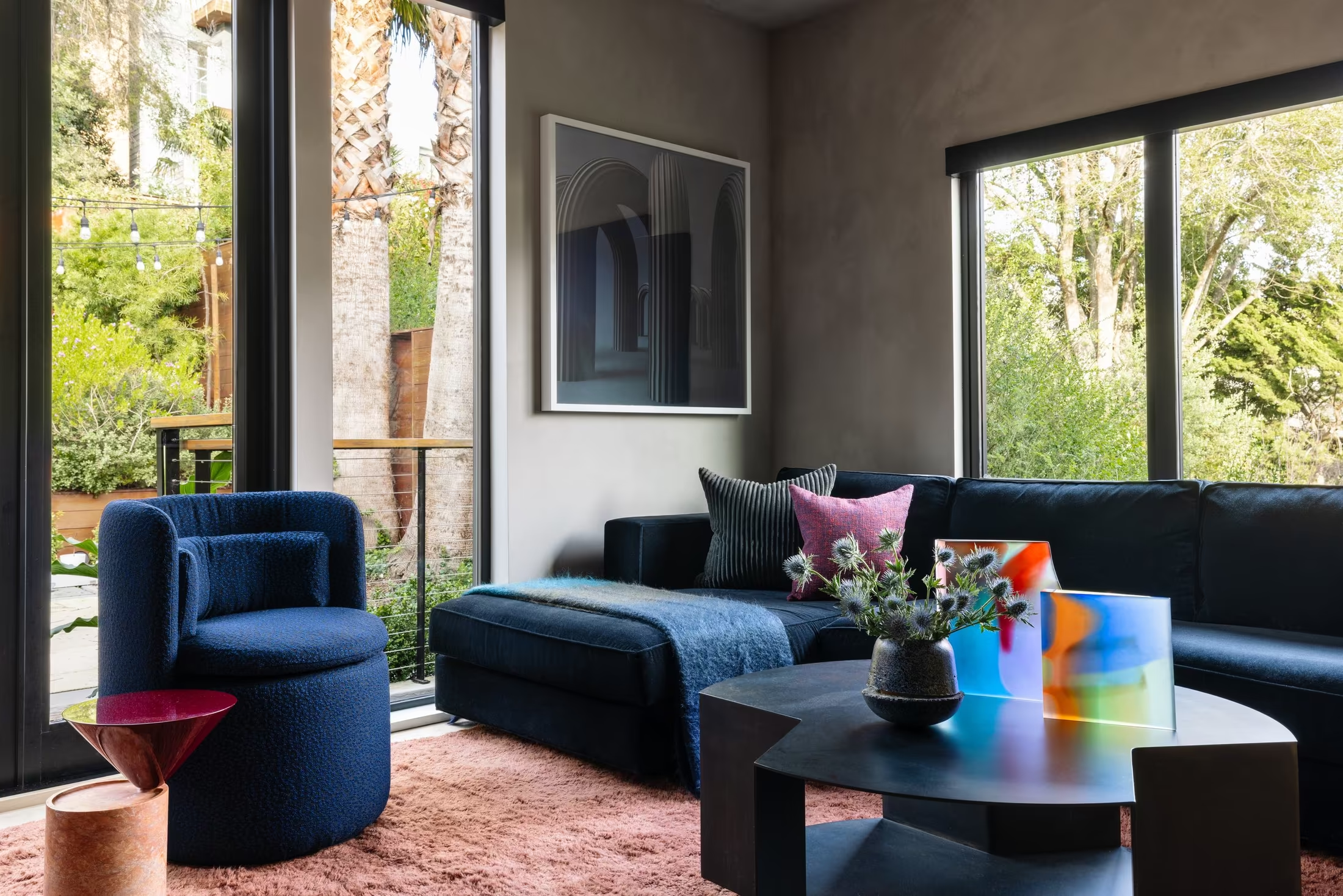
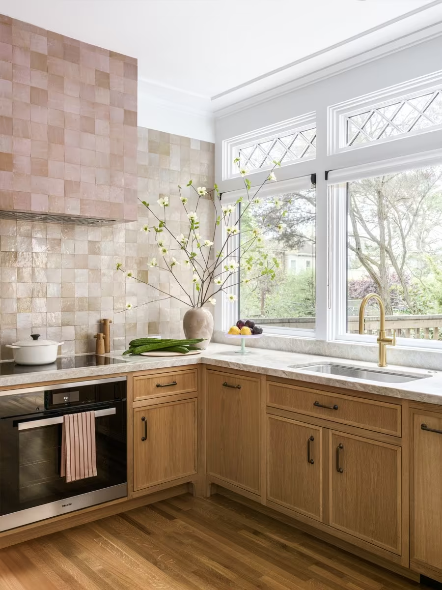
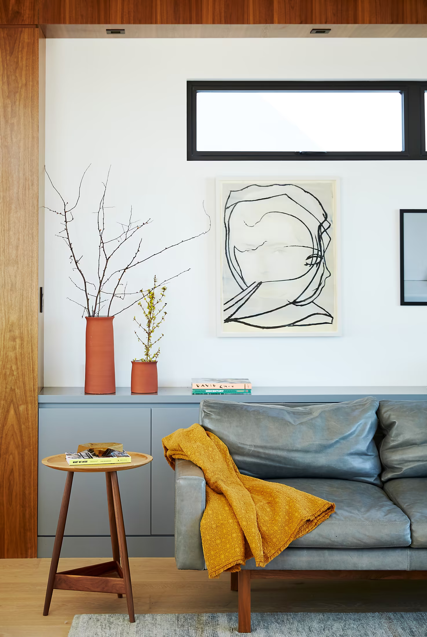
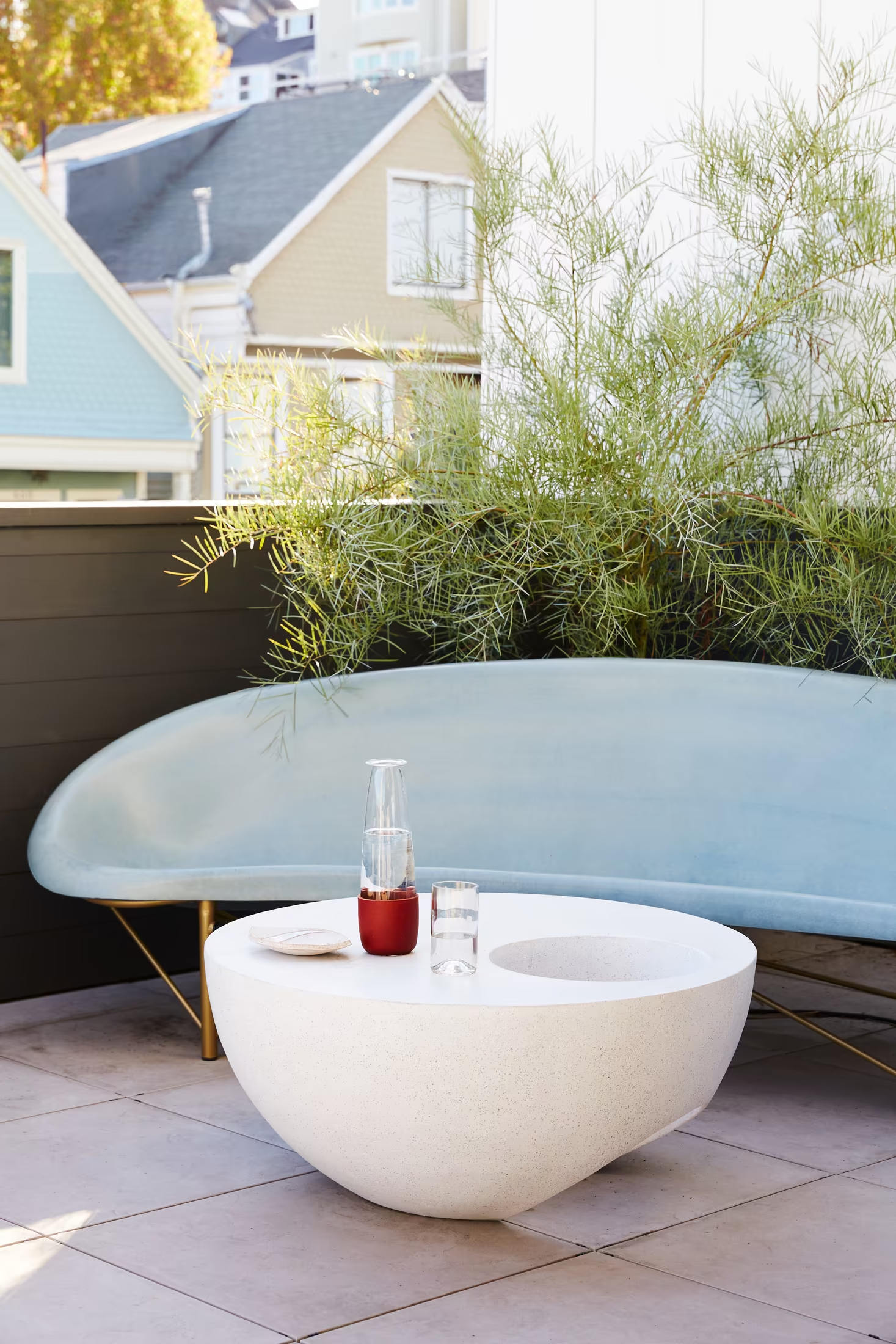
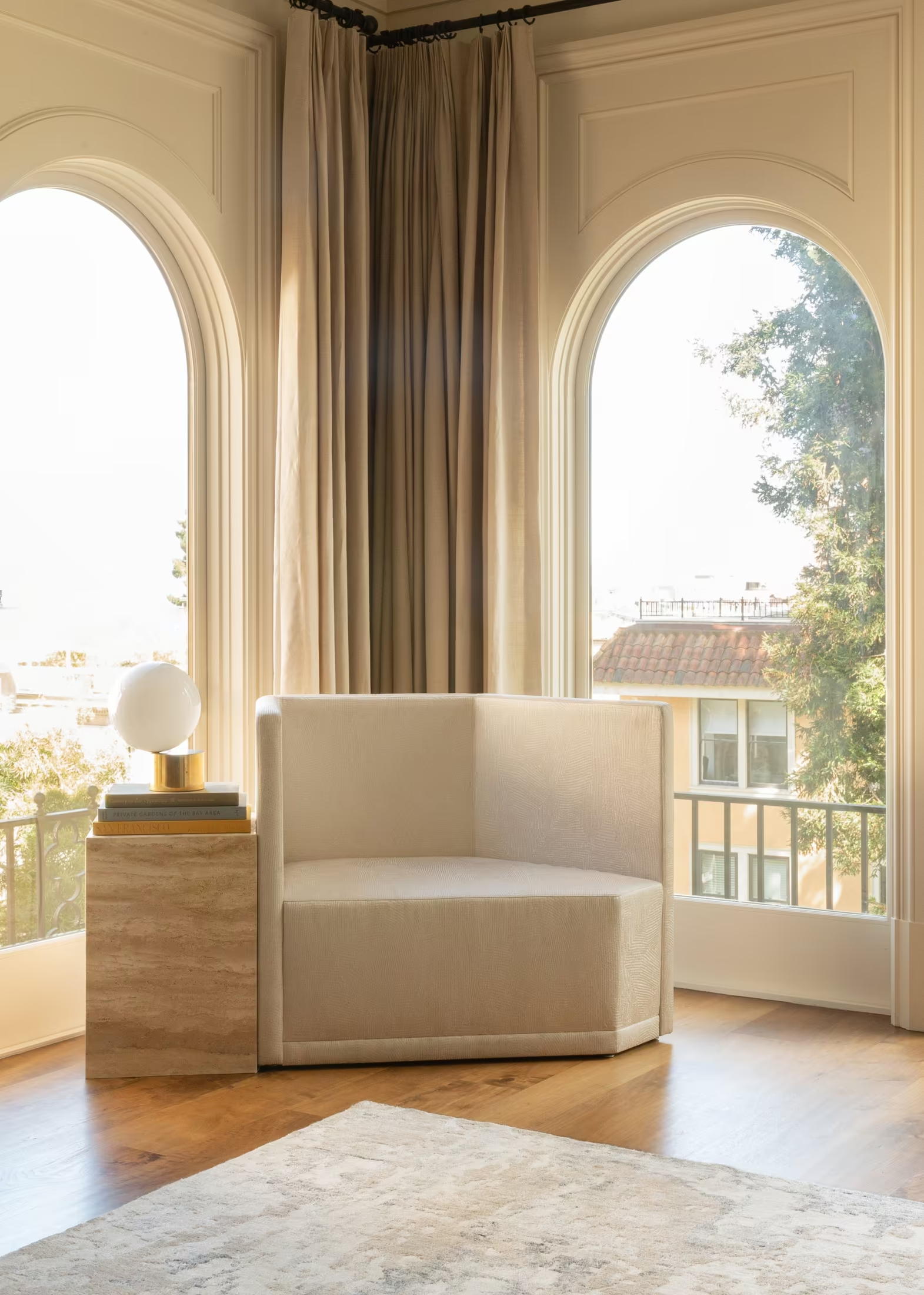
Objects, joinery and art at close range carry craft better than wide shots. A resin sun on smoked plaster says more than a floor plan.
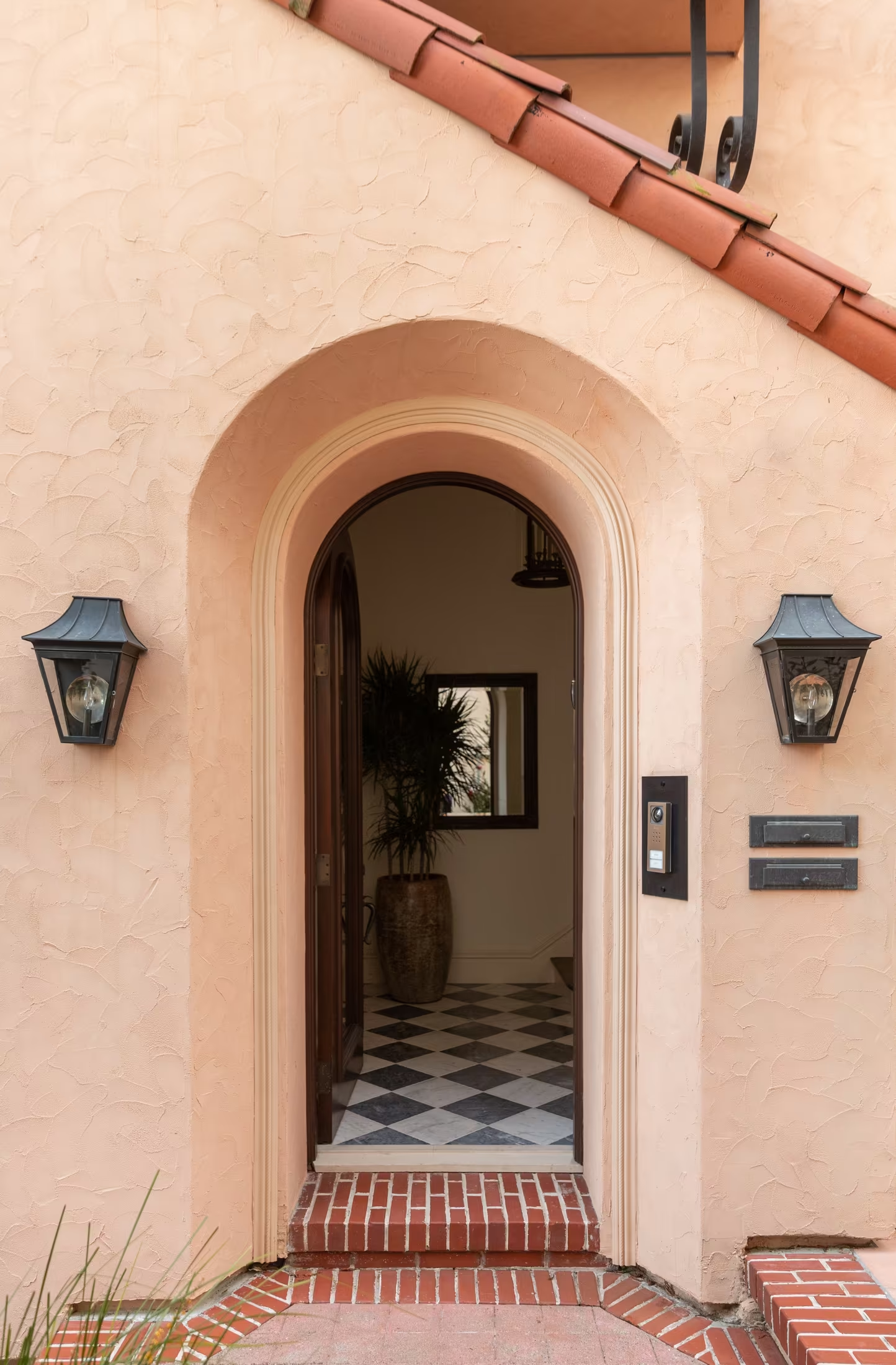
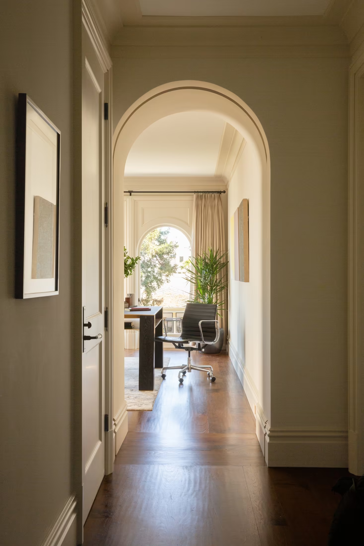
Doorways, arches and enfilades invite the viewer in. The Art of Belonging, made visual.
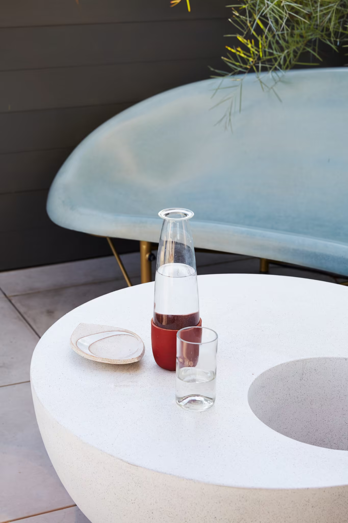
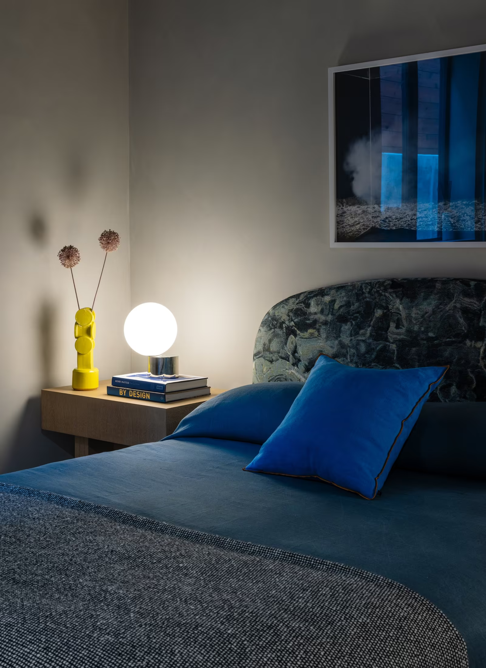
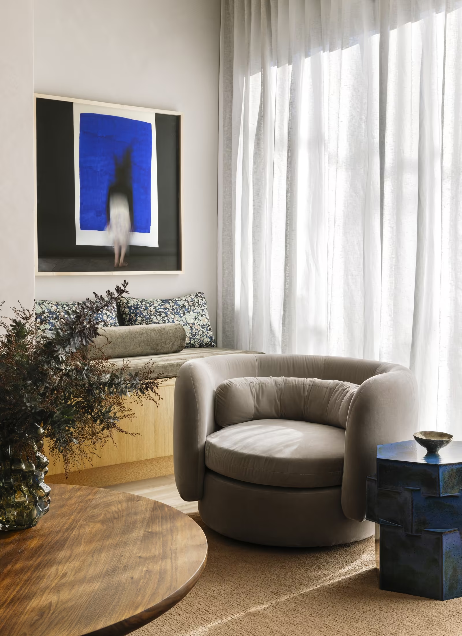
Show colour at full strength, with no desaturated grading: the rooms are the palette. Show life lightly, a carafe, a book, a dog, without staging it.
Renderings, phone snapshots, empty showroom staging, and older neutral projects that could belong to any studio.
Photography
The strongest asset is already here
It needs an edit, not a reshoot.
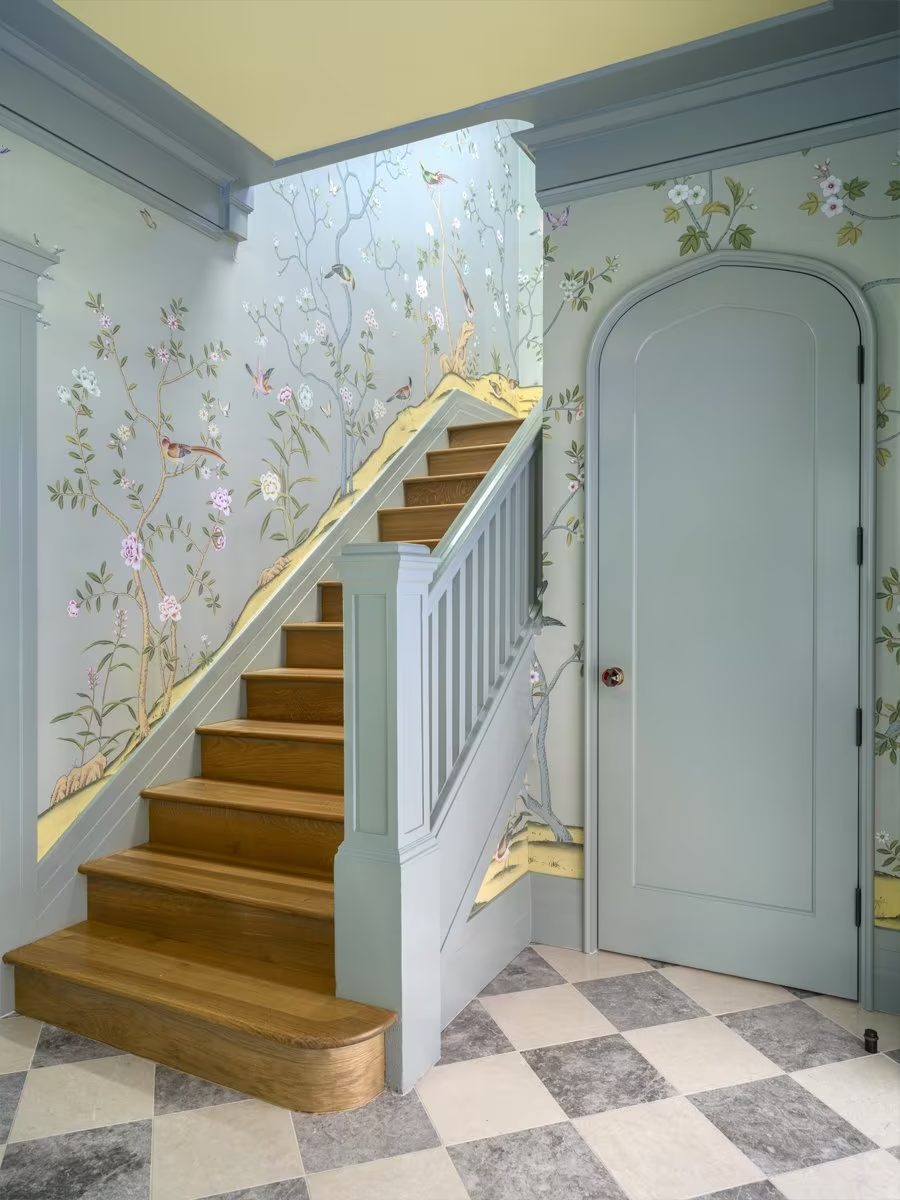
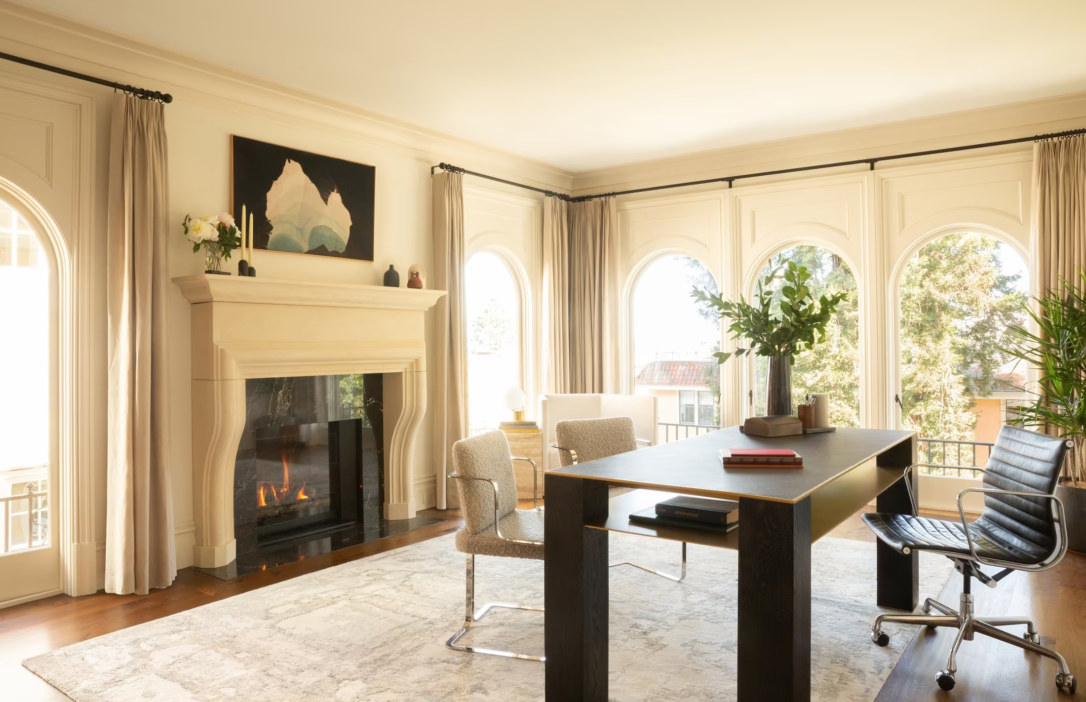
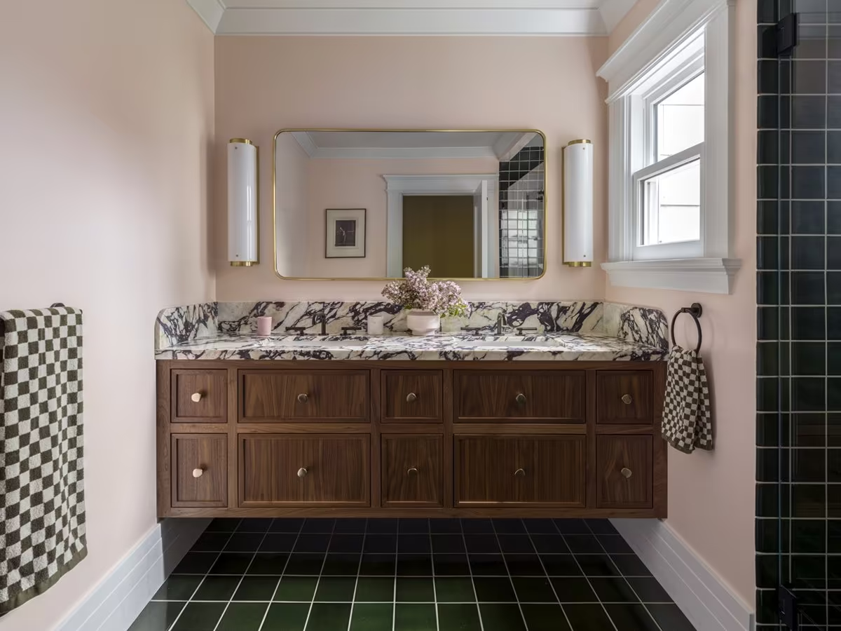
Presidio Heights, Valley Street, Lyon’s Den and Prosper House set the bar: colour-confident, art-led and witty. Keep recent, professionally photographed houses with a point of view.
Retire renderings, phone snapshots and neutral work that could belong to any studio. Fewer projects, told more deeply.

Visual Direction
03
Approach
Translating the Idea
into Visual Worlds
The following worlds represent distinct interpretations of the Art of Belonging. Each is a different place the studio could live: the salon, the edit table and the collection.
Each explores a different facet of the identity, so we can define the right balance of warmth, wit and restraint for the visual language that follows.
Approach
The following slides present each visual direction individually
Direction 01
The Host
A studio that makes you feel expected.
Warm · Seductive · Assured
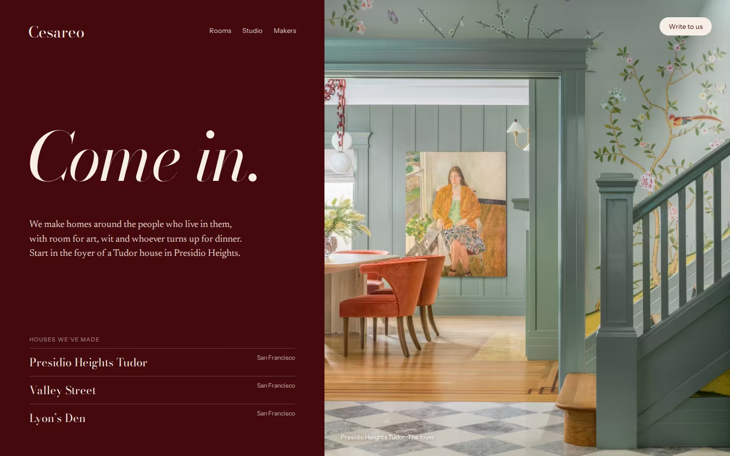
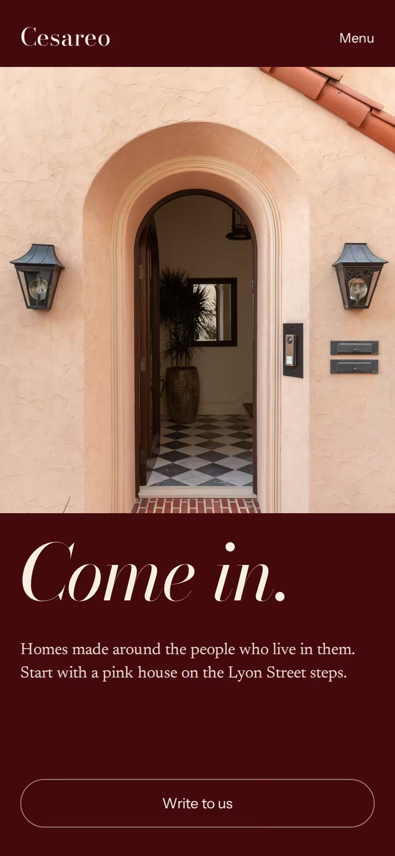
The host of the best dinner in town: generous, curious about you, a little theatrical after dark. This world is built around the reference you named, oxblood with white type, and around the idea of belonging.
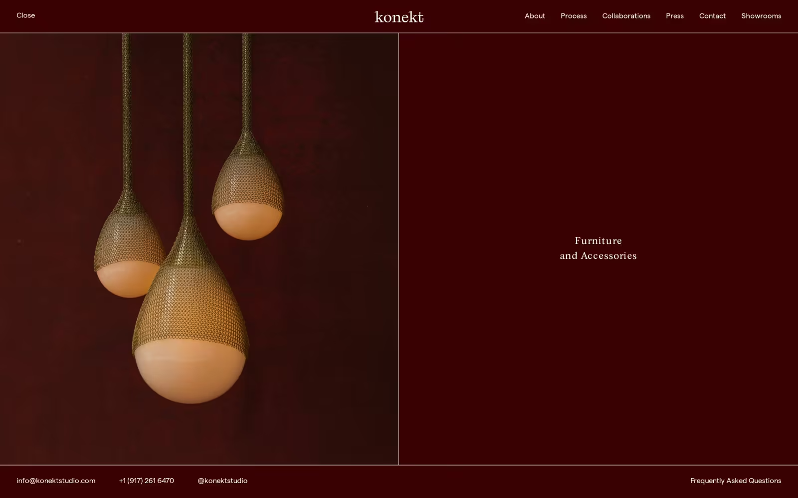
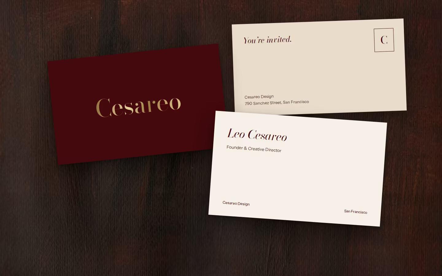
Oxblood becomes the room you enter: menus, cards and envelopes in full colour, a brass-foiled wordmark on deep grounds. The language is one of invitations rather than calls to action. “Come in.” “Write to us.” Doorways, thresholds and tables set in evening light keep their own white ground, so the colour frames the rooms instead of competing with them.
In ten seconds: an oxblood welcome and one open door. The risk: a hospitality tone tips into hotel branding if the writing gets glib.

Moodboard
Menus, cards and envelopes in full colour, so the brand is recognisable before a word is read.
Come in. Write to us. A tone of welcome carried through every button and caption.
A foiled Didone wordmark on oxblood and walnut, warm in the hand.
Doorways and tables set in evening light, kept on white so the colour never fights the rooms.
Direction 02
The Director
Every room composed like a shot, every client cast as the lead.
Curious · Unexpected · Precise
The director at the edit table: decisive and visual, telling you why this frame and not the others. This world draws on the studio’s lineage in illustration, architecture, fine art and film, where environment and character are inseparable.
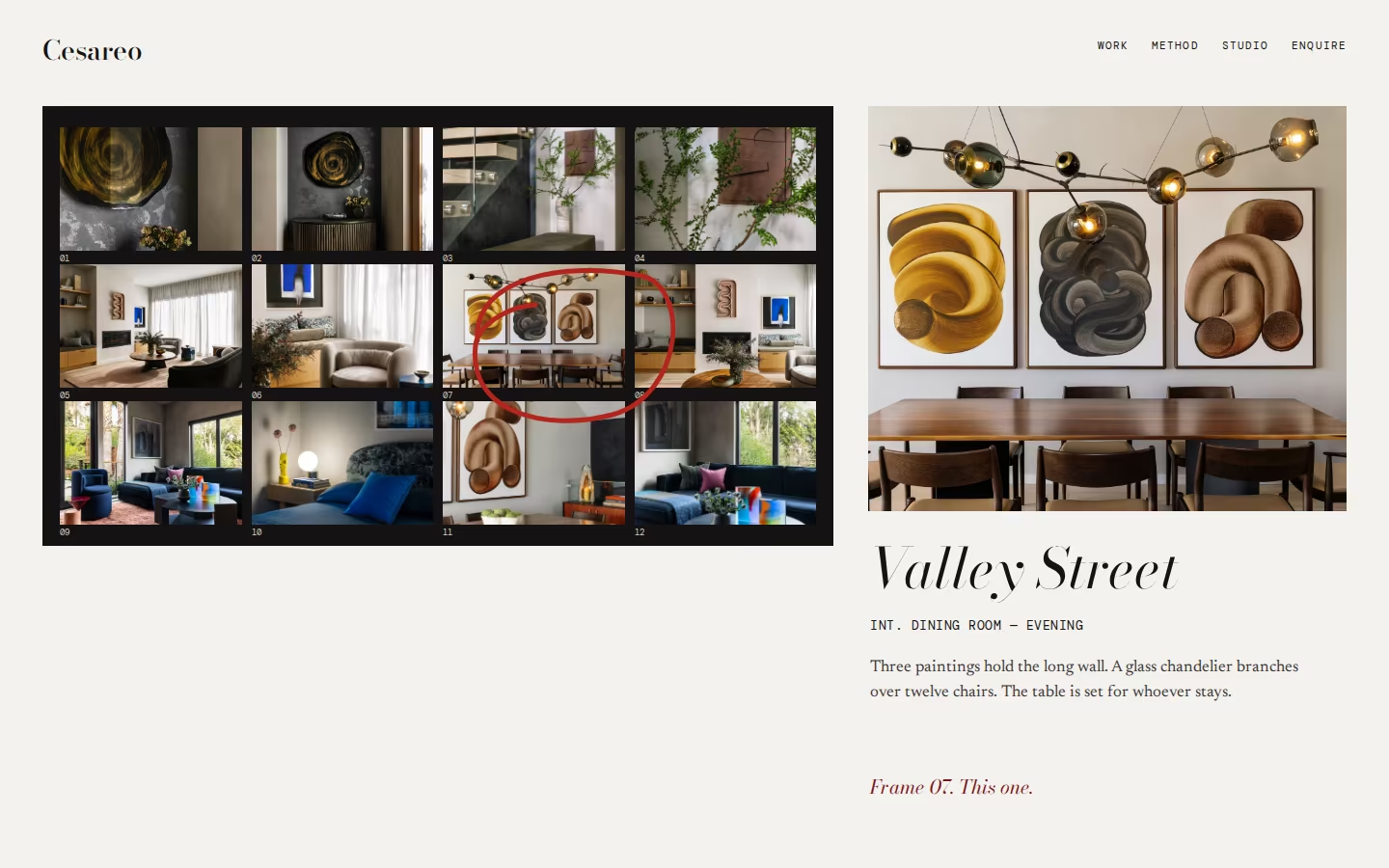
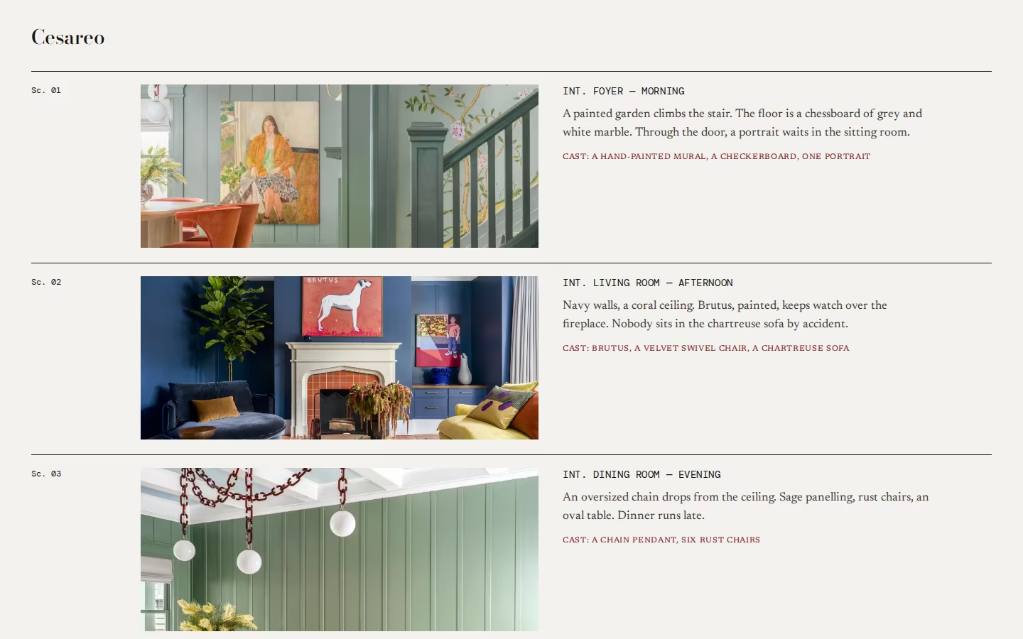
Houses arrive as contact sheets with one frame circled in red pencil. Rooms are introduced like scenes, INT. DINING ROOM, EVENING, with cast lists of objects, artists and makers. Sequences follow the order you walk through a house, which shows the editing and the thinking a client is paying for.
In ten seconds: a contact sheet and a red circle. The risk: film references become a gimmick if overused, and every project needs sharp writing.

EVENING
Moodboard
Selections made visible: the frame chosen and the ones left out.
Screenplay-style headings introduce each room: place, time of day, light.
Objects, artists and makers credited like a cast, giving craft its billing.
Houses shown in the order you walk through them, from the front door inwards.
Direction 03
The Collector
A catalogue of houses and the things in them.
Cultured · Personal · Worldly
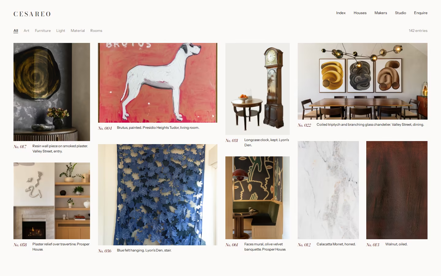
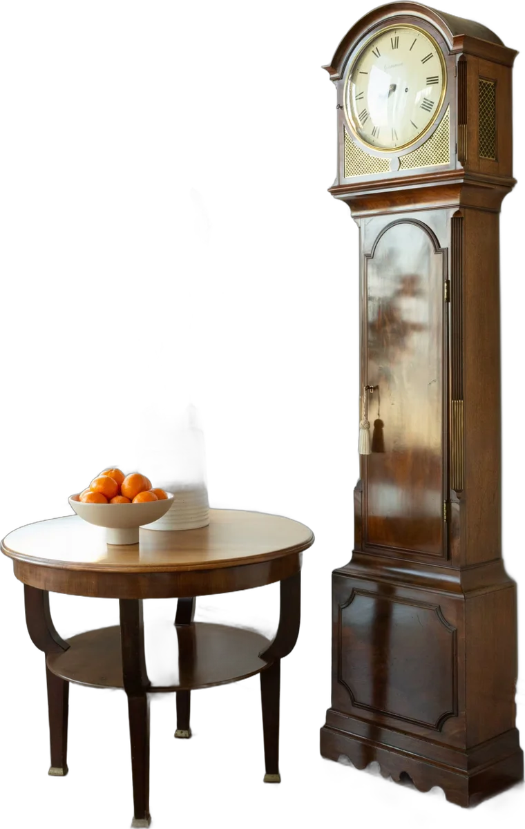
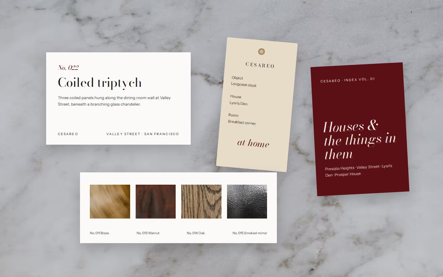
The collector who knows the story of every object in the room and the name of whoever made it. This world turns the portfolio into an index of rooms, art and objects, each with a number and a museum-style caption.
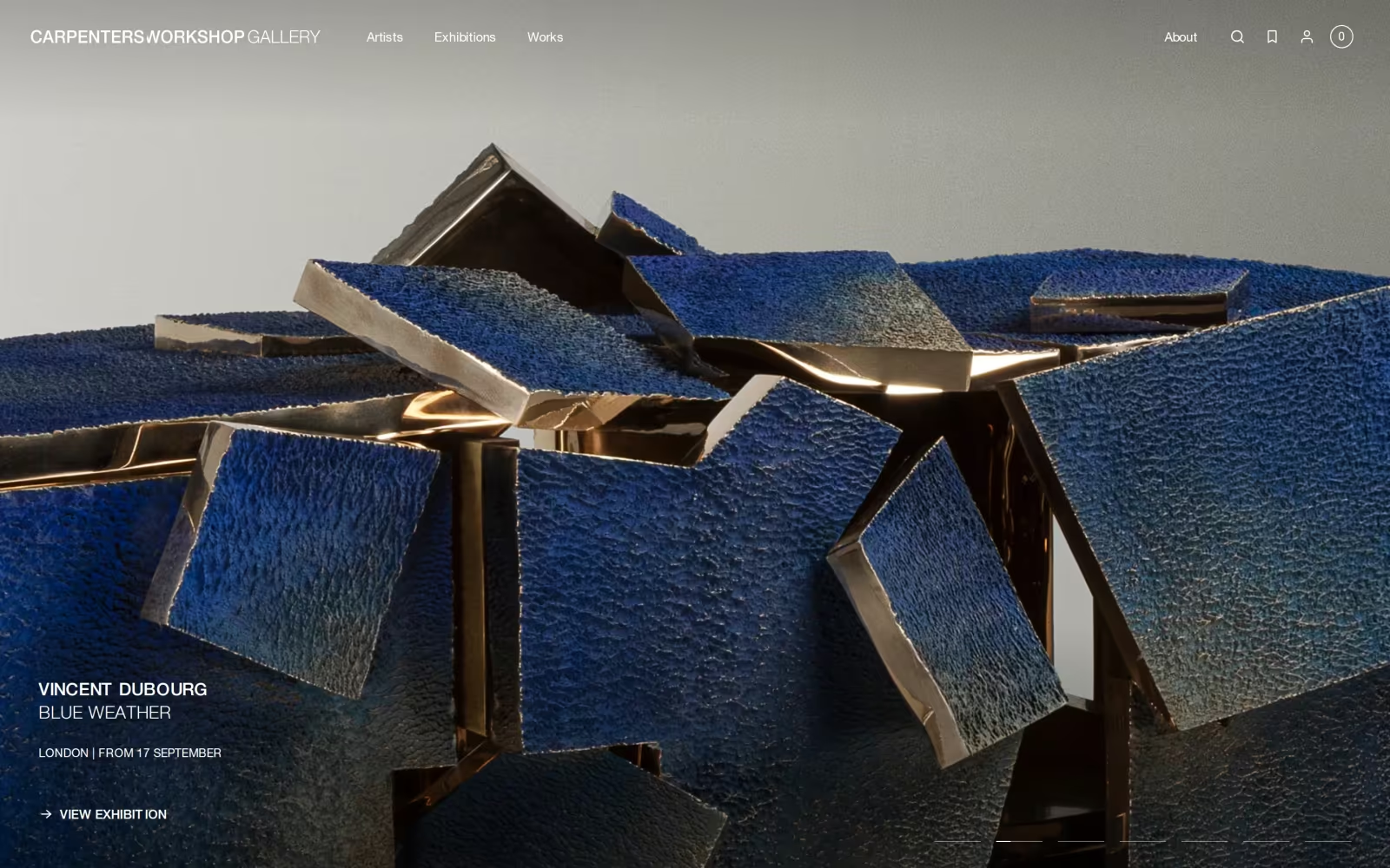
Makers and artists are credited by name, and samples of brass, walnut, oak and smoked mirror become part of the identity. Objects and details appear as often as rooms. It gives the website the strong gallery it needs, celebrates craft, and scales naturally as the studio moves into furniture and objects.
In ten seconds: an index with numbers. The risk: it can feel cool or museum-like without warm writing, and it needs disciplined content for every house.
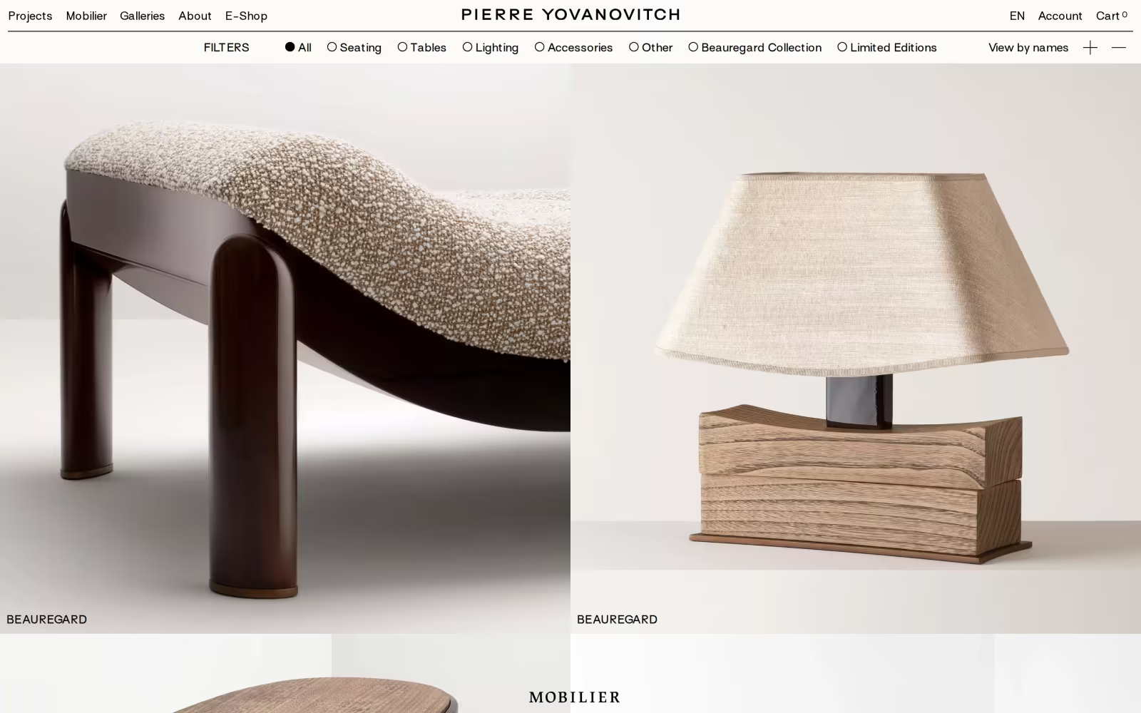
Moodboard
Every room, artwork and object indexed, so the portfolio reads as a collection.
Name, house, room, maker. Precise, never boastful.
Artists and craftspeople named on the page, as the studio wants.
Brass, walnut, oak and smoked mirror photographed flat, as part of the identity.
Next Steps
04
Selecting
Moodboard
We’ve developed three distinct worlds for Cesareo Design, each grounded in the Art of Belonging but offering a genuinely different identity path: the salon, the edit table and the collection.
What we’d like to hear
Your instincts on which world feels most like home, and which elements, across any of the three, feel worth carrying forward. In particular:
- Which world feels most like the studio you are becoming, not the one you are today
- How much oxblood feels right: a whole room, or a door
- Whether wit should live in the words, the images, or both
- What you would add, remove or combine
Feedback and
Discussion
To align on a direction, we’ll arrange a call to discuss your responses in detail. Please send one consolidated set of comments from the studio, so we can move quickly and keep the direction coherent.
What we would do
The Host, with the Collector’s captions.
The Host is closest to what you asked for, oxblood and white type, and to the idea of belonging. Its main risk, colour fighting the rooms, is solved by giving photography its own white ground. The Collector’s index and captions give the website the strong gallery it needs and put makers and artists on the page. The Director’s red pencil is worth keeping for process pages and social.
Following review and discussion of the three worlds, the next stage will focus on developing the chosen pathway into a full identity system.
This will include:
- Week 1 · Review call and agreed direction
- Week 2 · Logotype and mark options, palette, typography, photography
- Week 3 · One round of refinement
- Week 4 · Brand guidelines, ready for the website
We look forward to hearing which world feels like home.