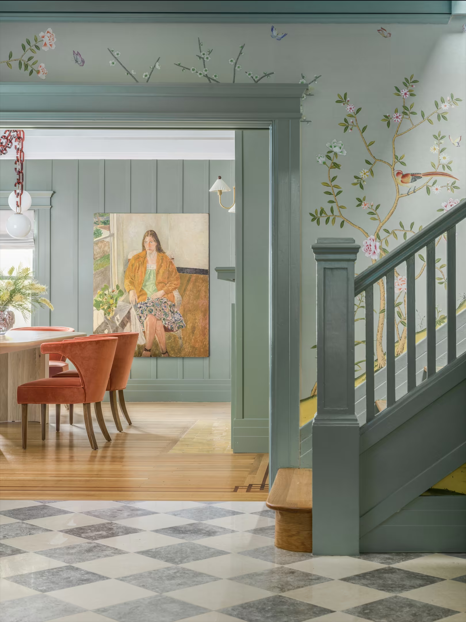
This document outlines our strategic approach for the visual identity and digital presence of Cesareo Design.
The objective is to create a distinctive, cultured and personal brand that reflects Cesareo Design’s position at the meeting point of interiors, art, architecture, craft and storytelling.
This document translates key insights from the discovery phase into a cohesive creative direction, establishing a foundation for a brand that feels collected, assured and built to keep evolving.
- 01Overview
- 02Creative Strategy
- 03Visual Direction
- 04Next Steps
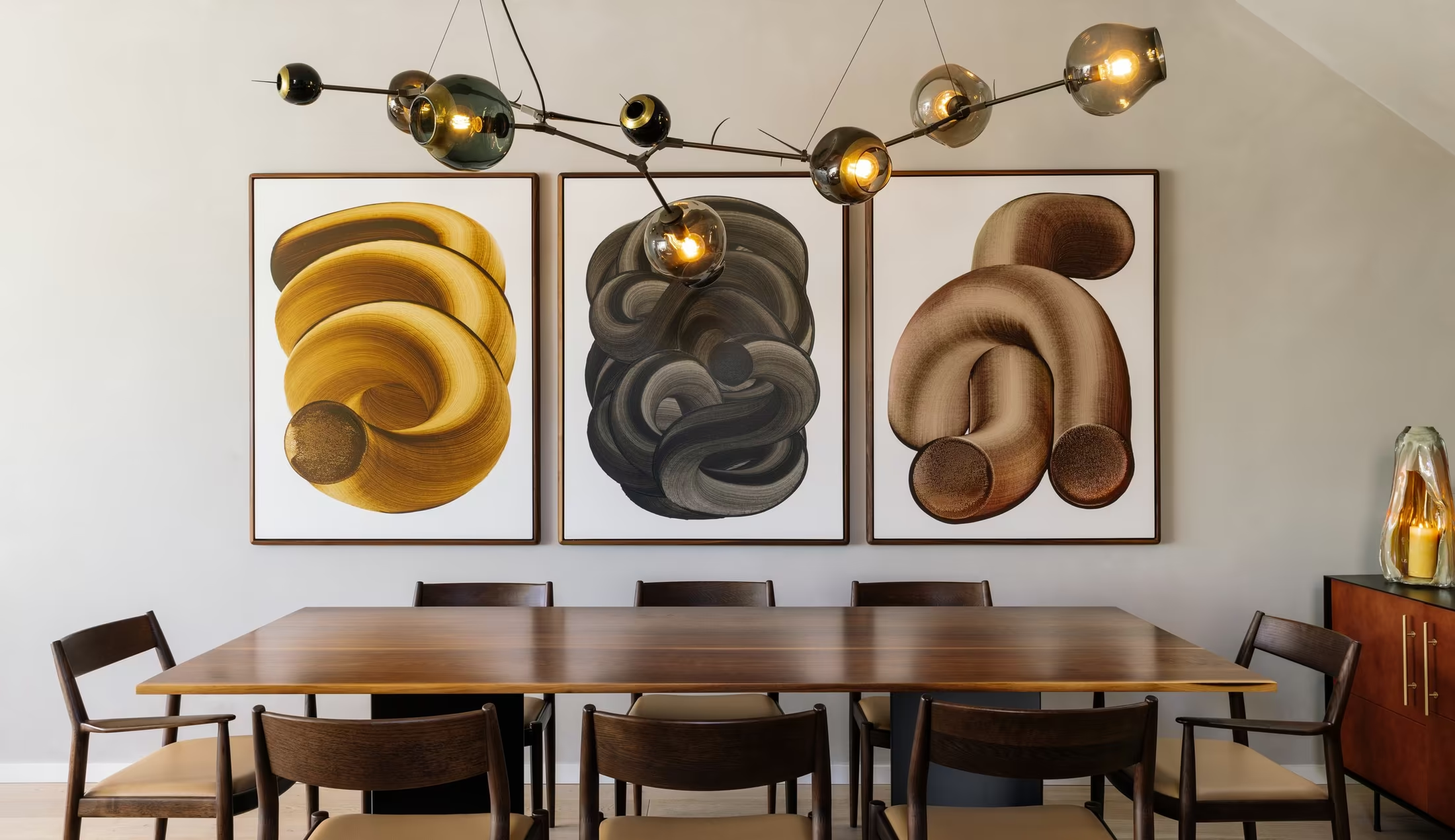
Brand Overview
01
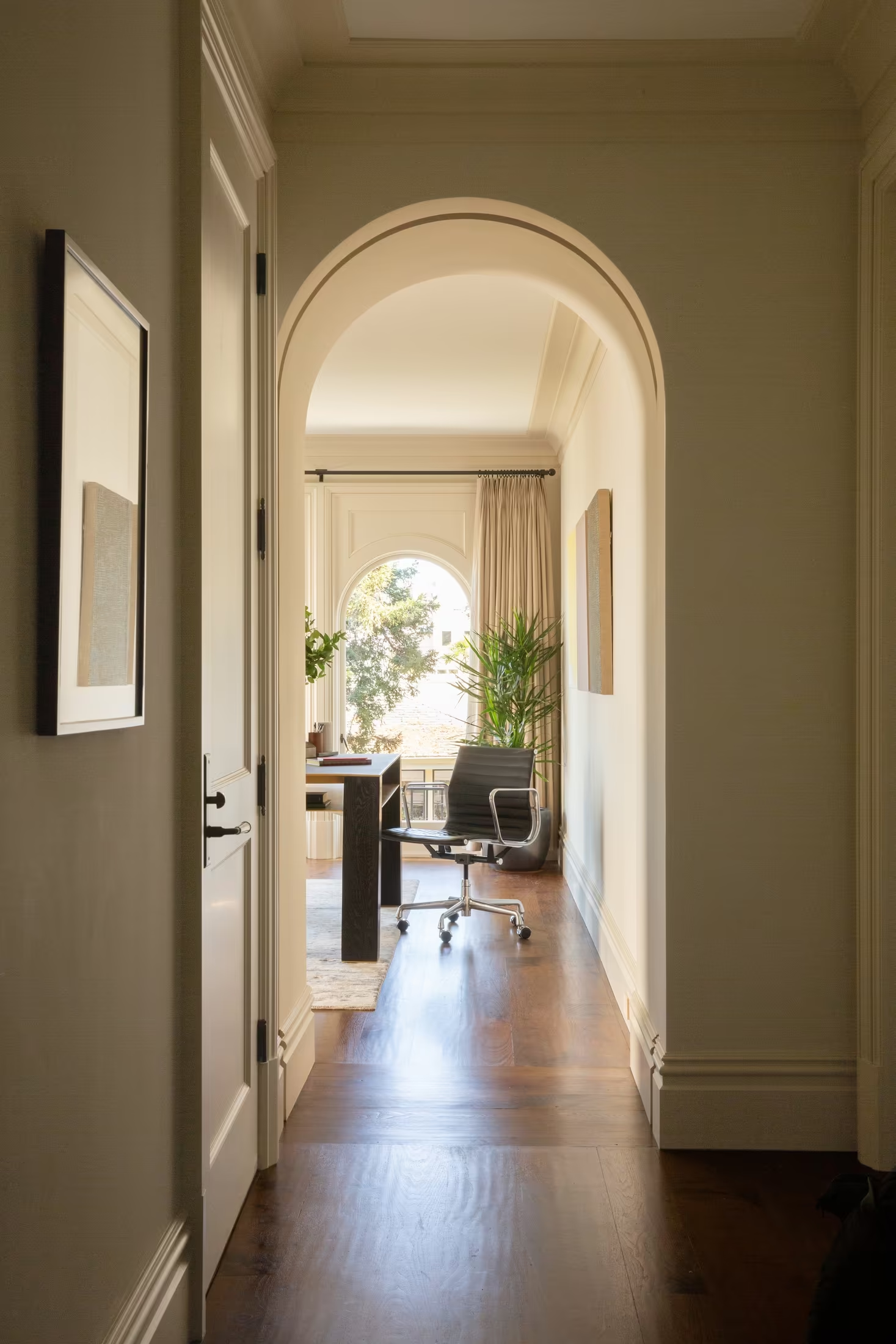
“A space that couldn’t belong to anyone else.”
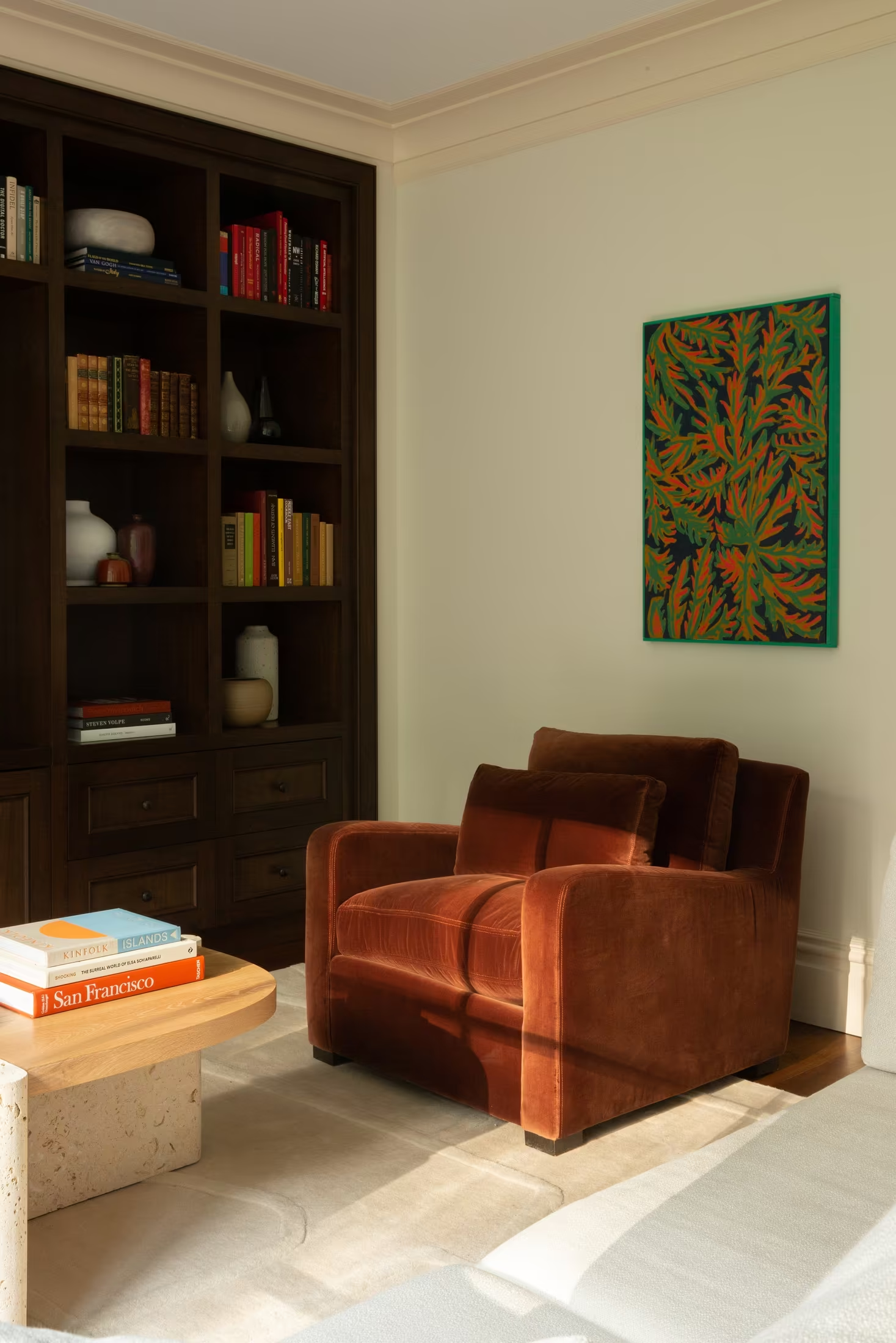
Cesareo Design is an art-driven California interior design studio creating highly personal, collected interiors through the interplay of contemporary design, historical reference, colour, materiality and custom craftsmanship.
Shaped by a creative lineage that runs from illustration and architecture to fine art and film, the studio approaches interiors as compositions: architecture, furniture, art, light and objects layered until a home feels collected, personal and alive.
The studio is defined not by a signature look but by a signature point of view. The designer is not the protagonist. The client is.
What You Told Us
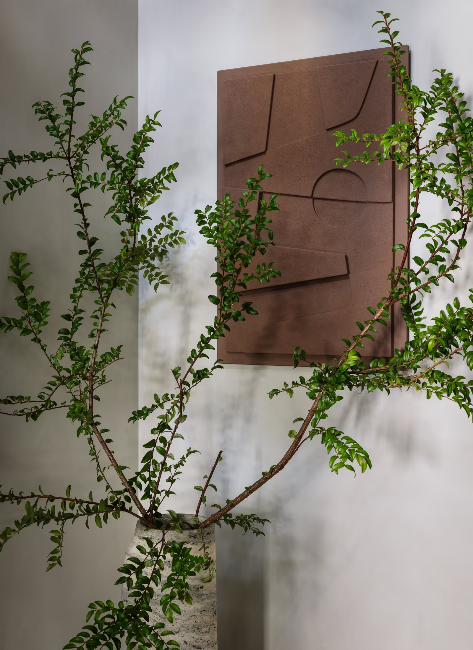
A lifelong study of art, architecture and storytelling, rooted in generations of creative practice and a background in fine art and film.
To create homes that tell the story of the people who live in them: edited, interpreted and elevated, never a display of the designer’s taste.
Operating at the highest level of design while staying warm, curious and unpretentious. Sophistication without the conventional language of luxury.
A nationally recognised, highly selective studio with a cultural point of view, invited somewhere interesting rather than everywhere.
Mission and Why Now
Why Cesareo Design Exists
A home should do more than look beautiful. It should tell the story of the people who inhabit it.
The studio is at a moment of transition. What began as Leo Cesareo Design, a founder-led practice, has become a studio with a clear point of view, an established body of work and ambitions beyond any single aesthetic.
The move to Cesareo Design is more than a shorter name. The identity now needs to show what the work already does: curiosity, cultural depth, storytelling, humour and creative experimentation.
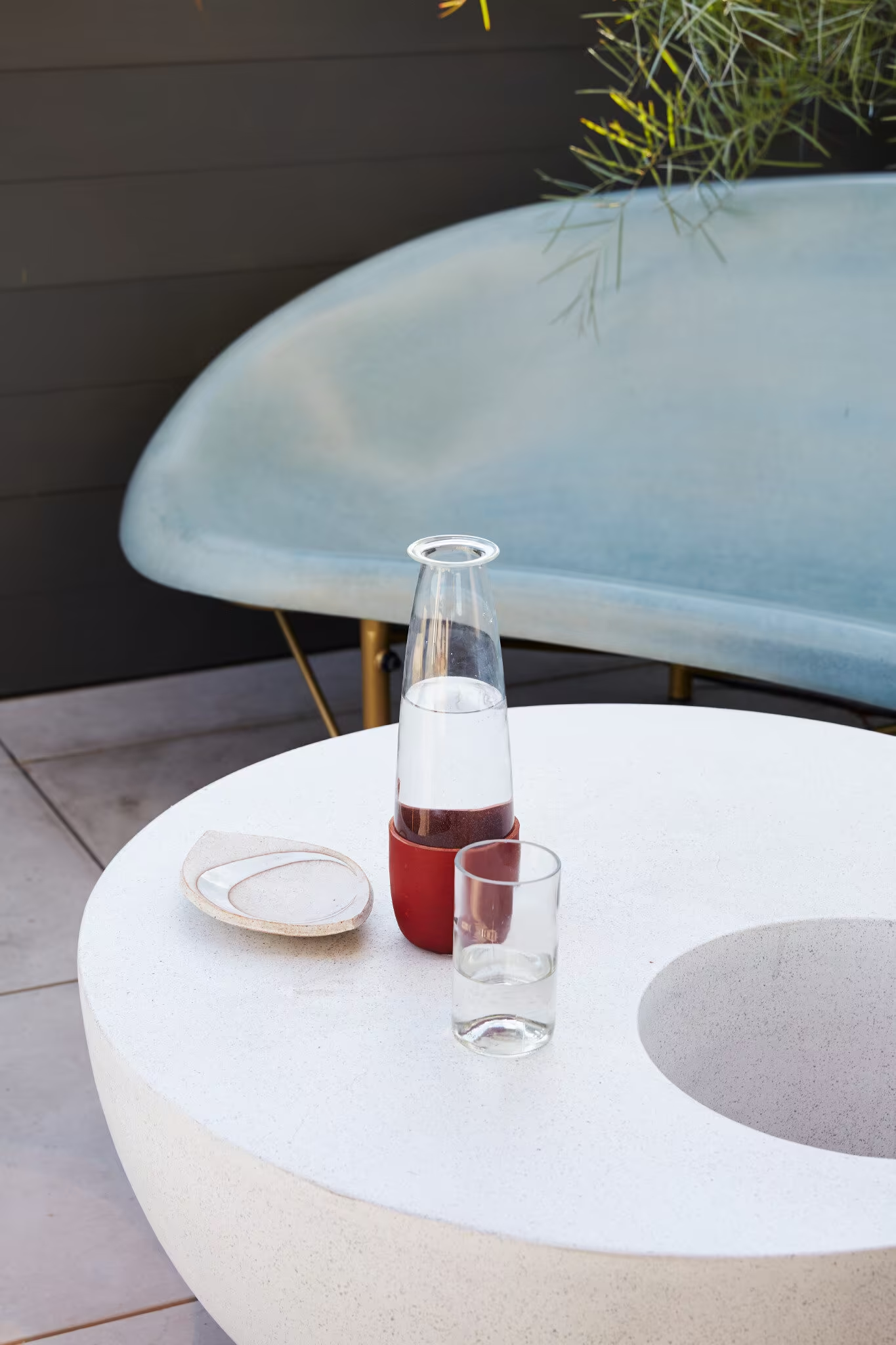
Homes that could belong to no one else.
Listen closely, then take each client somewhere they could not have reached alone, and leave a home that still feels completely like them.
Brand Foundations
Cesareo Design’s foundations define how the studio designs, collaborates and communicates. They guide every decision, from the first conversation to the last object placed in a room.
No two projects alike, because no two clients are alike. Their story leads.
Every object earns its place and carries memory, history or intention.
Open to the idea that isn’t the obvious one. Never predictable.
Custom work with artists and makers whose skill enriches the studio’s own.
Room for wit, colour, sensuality and things that are there simply for pleasure.
Architecture, art, furniture, material and light balanced as one picture.
Founder-led, studio-powered. A process built on dialogue and trust.
Interiors that grow richer through use, accumulation and time.
Brand Personality
and Voice
Cesareo Design should feel like an exceptionally interesting person you want to spend time with, not a luxury brand trying to impress you. Serious about the work, never too serious about itself.
Brand Personality
- Curious and cultured
- Confident, never self-important
- Warm and personal
- Seductive and unexpected
- Worldly and capable
Brand Tone
- Cultured, never obscure
- Warm and assured
- Witty, never glib
- Precise and specific
- Curious rather than declarative
Audience &
Positioning
Audience
Private residential clients undertaking significant renovations and highly customised homes, in the Bay Area and increasingly beyond. They value perspective over prescription, character over perfection and craftsmanship over status, and they are willing to be challenged. The brand also speaks to the artists, makers and architects the studio wants beside it.
Positioning
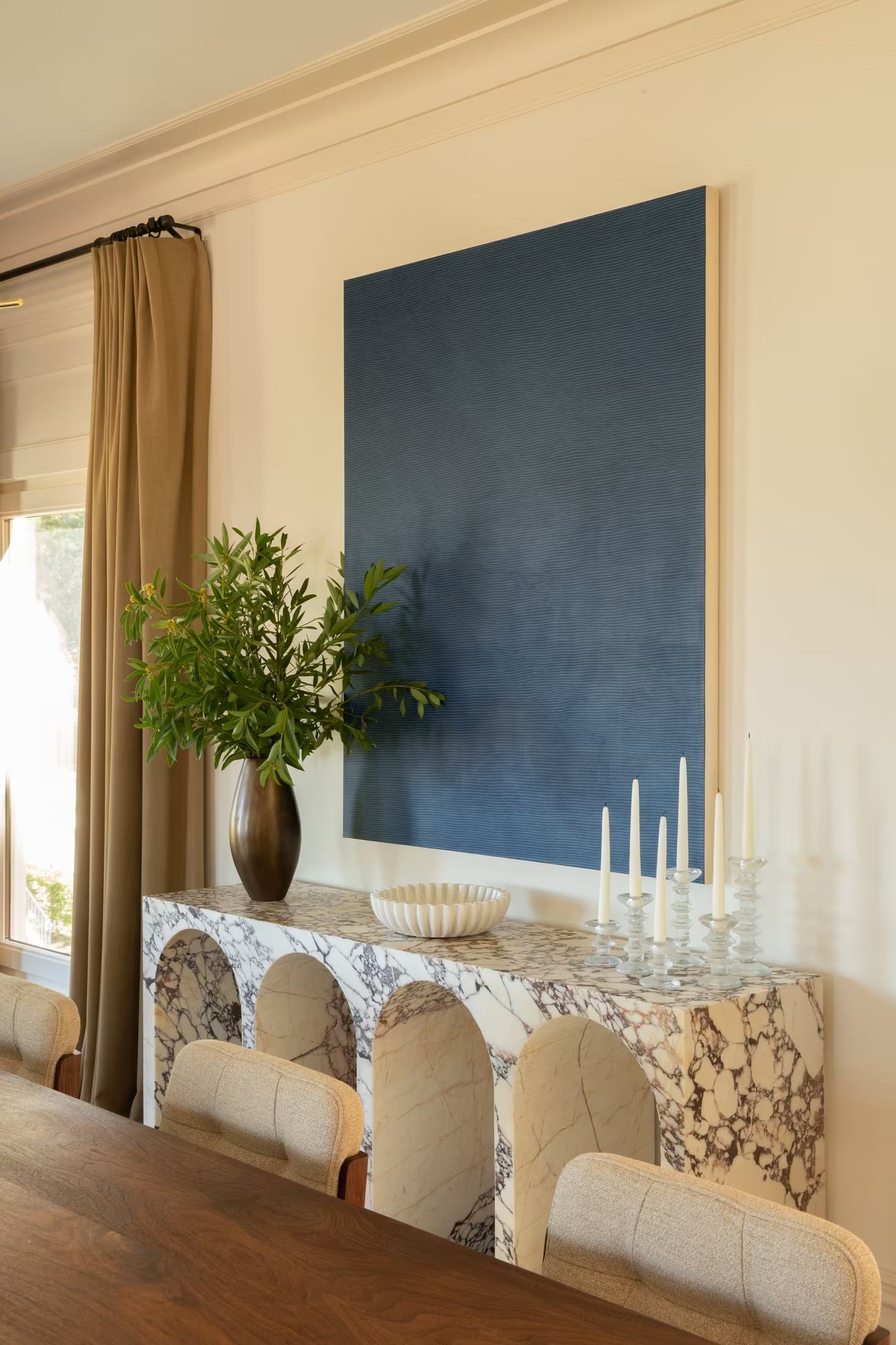
Where peers are primarily curatorial, Cesareo Design is narrative. The work is not made to culminate in a perfect photograph; it is designed to keep evolving long after the studio leaves.
Creative Strategy
02
From Brand Mission
to Visual Language
Defining how Cesareo Design’s point of view, positioning and creative lineage translate into a distinctive and credible visual identity.
This creative strategy sets a clear framework for the brand’s visual direction: cultivated eclecticism held in place by editorial restraint, so the brand feels personal, collected and assured.
Design Goals
What we aim to express through design
Point of View
Show a studio with ideas, not only a portfolio of rooms.
Right Clients
Draw in curious patrons; quietly deter formula and status briefs.
the Clichés
Sophisticated and warm, never the beige luxury formula.
Keep Evolving
Recognisable without repeating, structured without restricting.
Design Strategy
The strategy outlines the key visual pillars of the brand. It defines the proposed aesthetic, colour approach, typography style and brand mood, ensuring all elements work together.
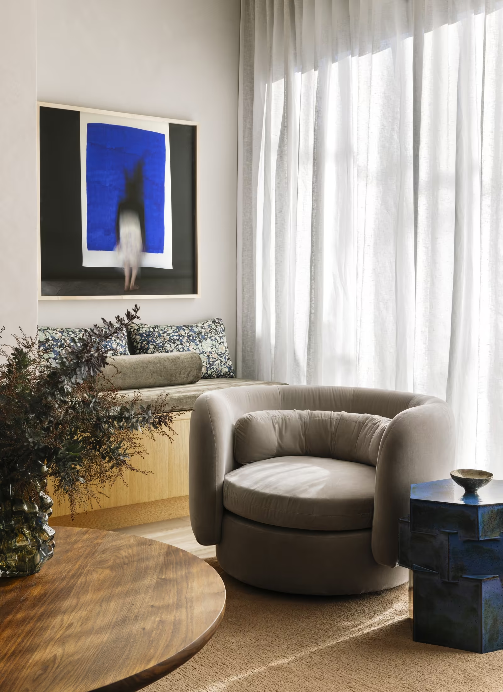
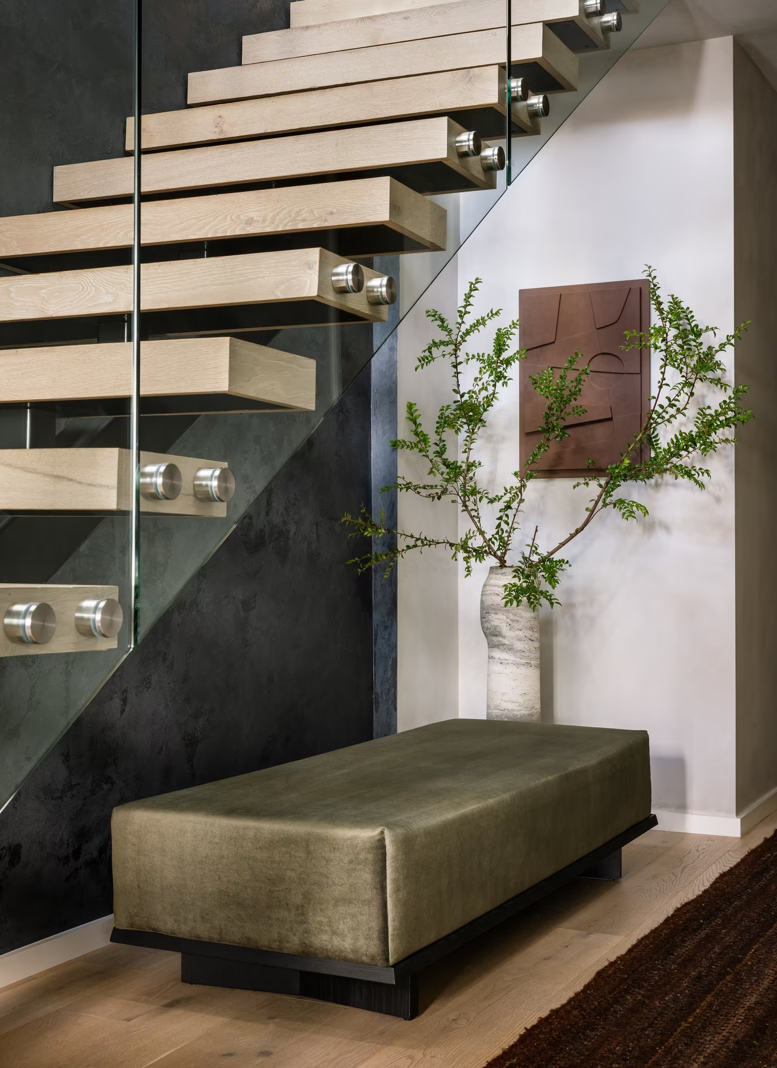
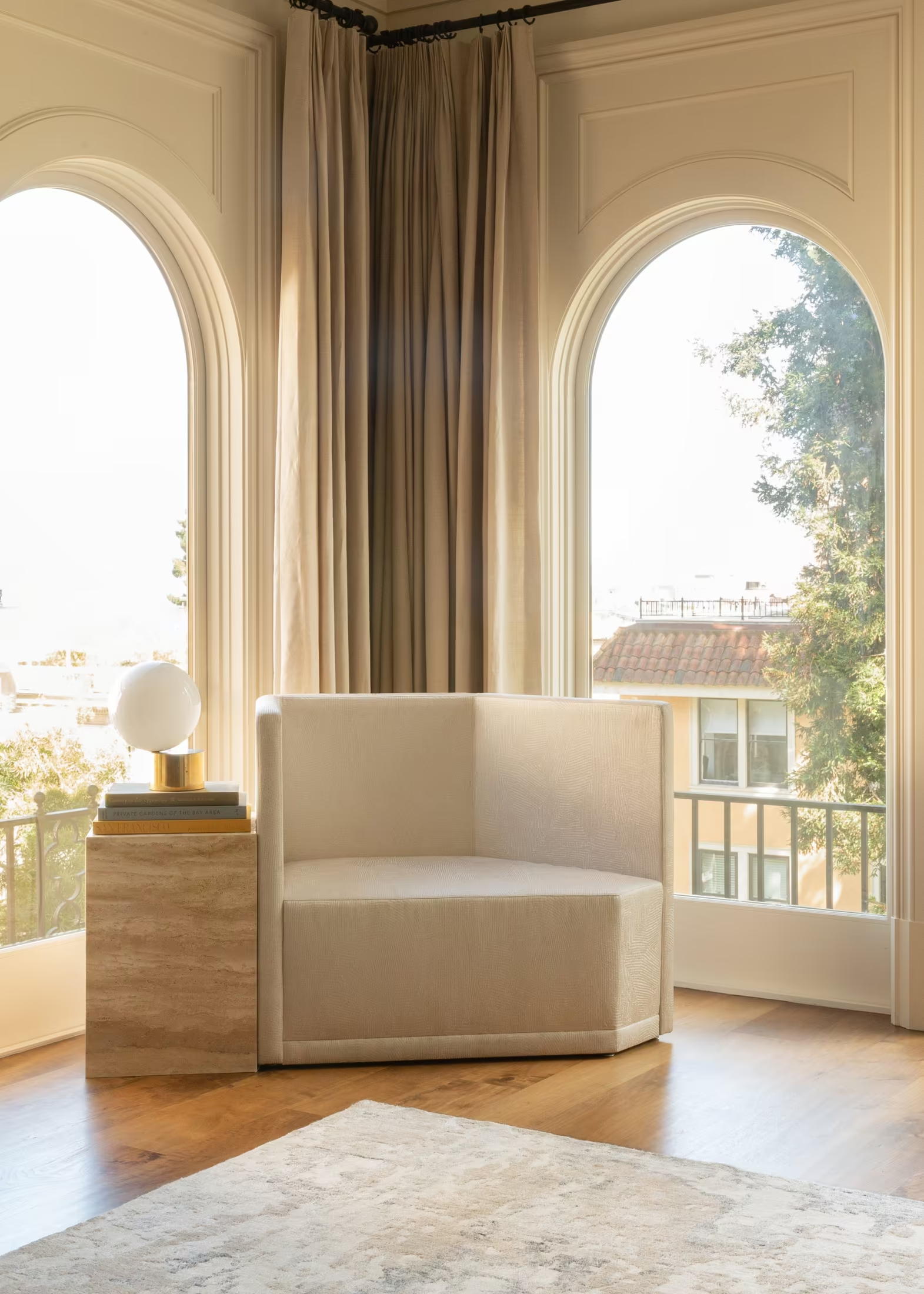
The identity will hold art, architecture, craft and history within a composed editorial frame: strong composition, generous space and photography that reads as someone’s world rather than a showroom.
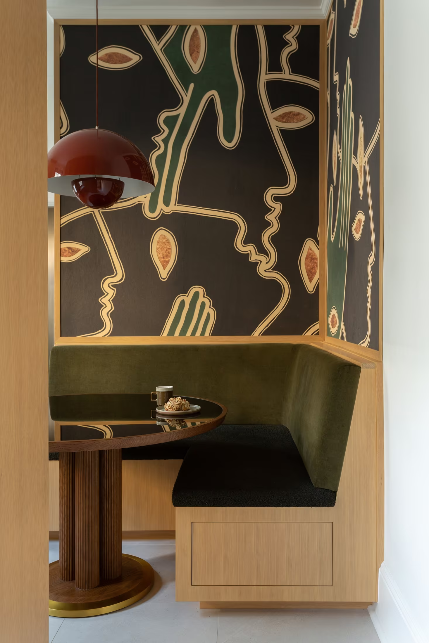
The palette will come from the studio’s own finishes: oxblood, polished nickel, burnished brass, Calacatta Monet, smoked mirror, walnut and oak. Restraint is welcome; neutrality as personality is not.
Typography will be primarily serif, in the spirit of Heimat Didone: high contrast and assured at display sizes, paired with small, precise supporting type for information.
In the first ten seconds the brand should intrigue and reassure. After a minute, the visitor should think one thing: I want to see more.
Mood &
Atmosphere
Logo
The existing Leo Cesareo Design identity established the studio as sophisticated and design-led. Its elegance and restraint are worth keeping; what it does not yet show is the curiosity, cultural depth, humour and experimentation that define the studio today.
For the logotype, we envision a primarily typographic identity built on a refined Didone: high contrast, confident at scale, and warm rather than cold at small sizes.
For the brand mark, we envision a distinctive secondary symbol drawn from the C, flexible enough for a browser tab, a brass plaque and a signature on custom pieces.
The references shown are brands that built a whole world around a point of view.








Visual Direction
03
Approach
From Strategy to Visual Language
The following directions represent distinct visual interpretations of Cesareo Design’s point of view and ambition.
Each approach explores a different expression of the identity, balancing editorial restraint, cultivated eclecticism and material warmth to define a visual language that feels personal, cultured and assured.
Visual Directions
Through analysis of the shared references and additional research, three core creative directions have been defined.
The following slides present each visual direction individually
Direction 01
Cultivated Restraint
A collected life, edited with care.
Editorial / Composed / Warm
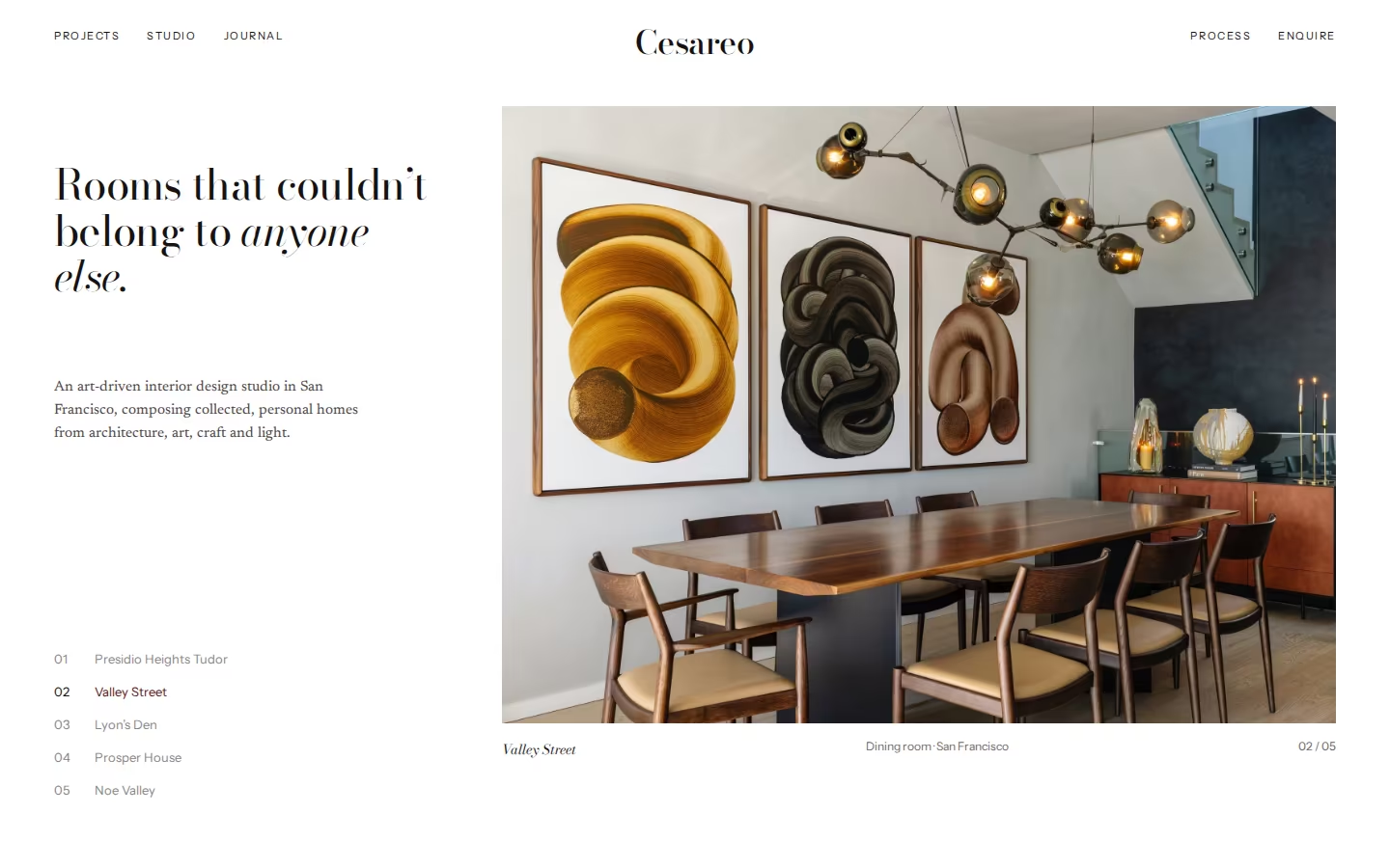
A refined, publication-like direction that frames Cesareo Design’s work with the discipline of a great interiors monograph. Bright white grounds, a high-contrast Didone, small precise captions and generous margins let the colour in the rooms do the talking. Oxblood appears only where it matters: an active link, a pull quote, a signature.
Visual Cues
White grounds rather than beige, Didone display type, small sans captions, one photograph at a time, numbered project index, oxblood used as punctuation.
Similar Brands & Websites
- Joseph Dirand
- Apartamento
- Pierre Yovanovitch
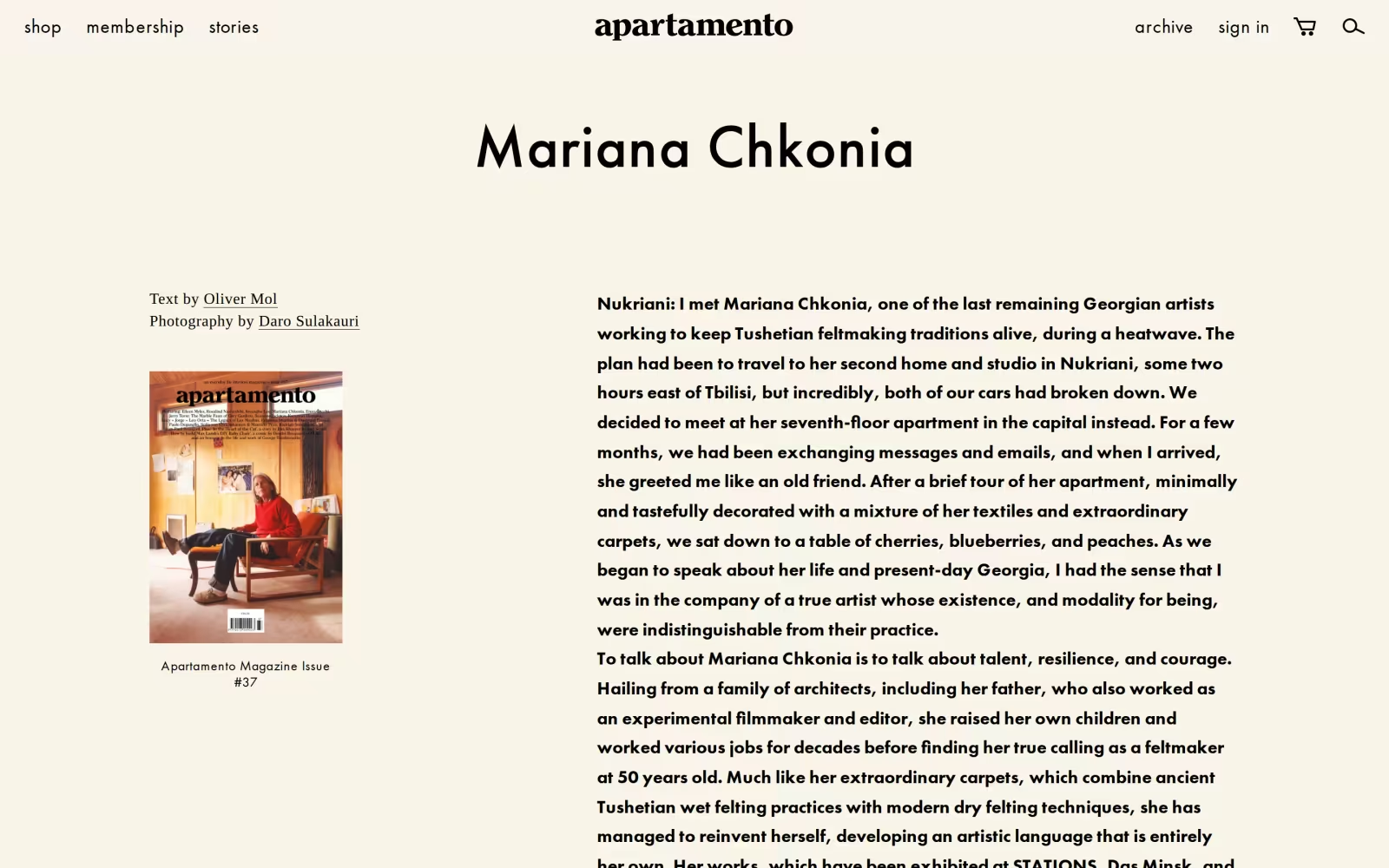

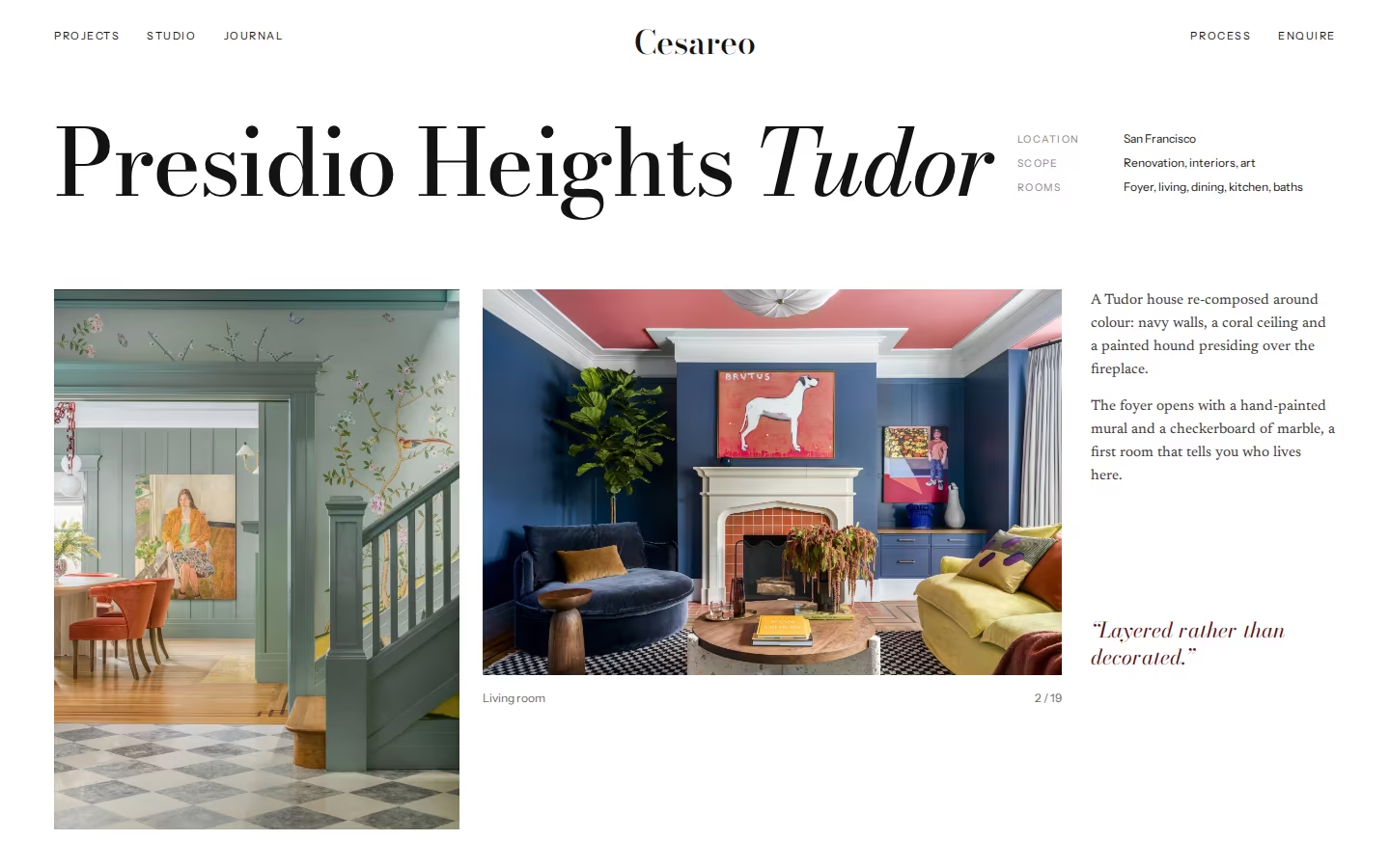
Direction 1
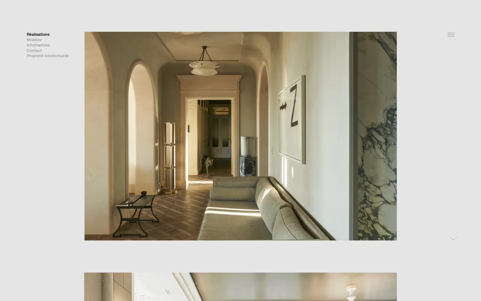
One composed image at a time, given room, so each house reads like a feature rather than a feed.
A refined serif with presence at display sizes, set small and precise everywhere else.
White space and a numbered index create calm and let colour-rich rooms stay the loudest thing on the page.
The signature colour used sparingly: a link, a quote, a signature. Restraint without neutrality.
Direction 02
The Oxblood Room
Deep colour, white type, a room you don’t want to leave.
Seductive / Graphic / Assured
Built around the reference Cesareo Design named: oxblood with white type. Oxblood becomes a place rather than an accent, appearing as full-screen menus, footers and printed surfaces, finished with polished nickel and burnished brass. Photography runs full-bleed and uninterrupted, so the colour frames the work instead of competing with the navy, sage and saffron rooms inside it.
Visual Cues
Full oxblood fields, white Didone, hairline structure, full-bleed photography, brass and nickel foils, smoked mirror as a secondary dark, very small supporting type.
Similar Brands & Websites
- Konekt
- Dimore Studio
- Acne Studios
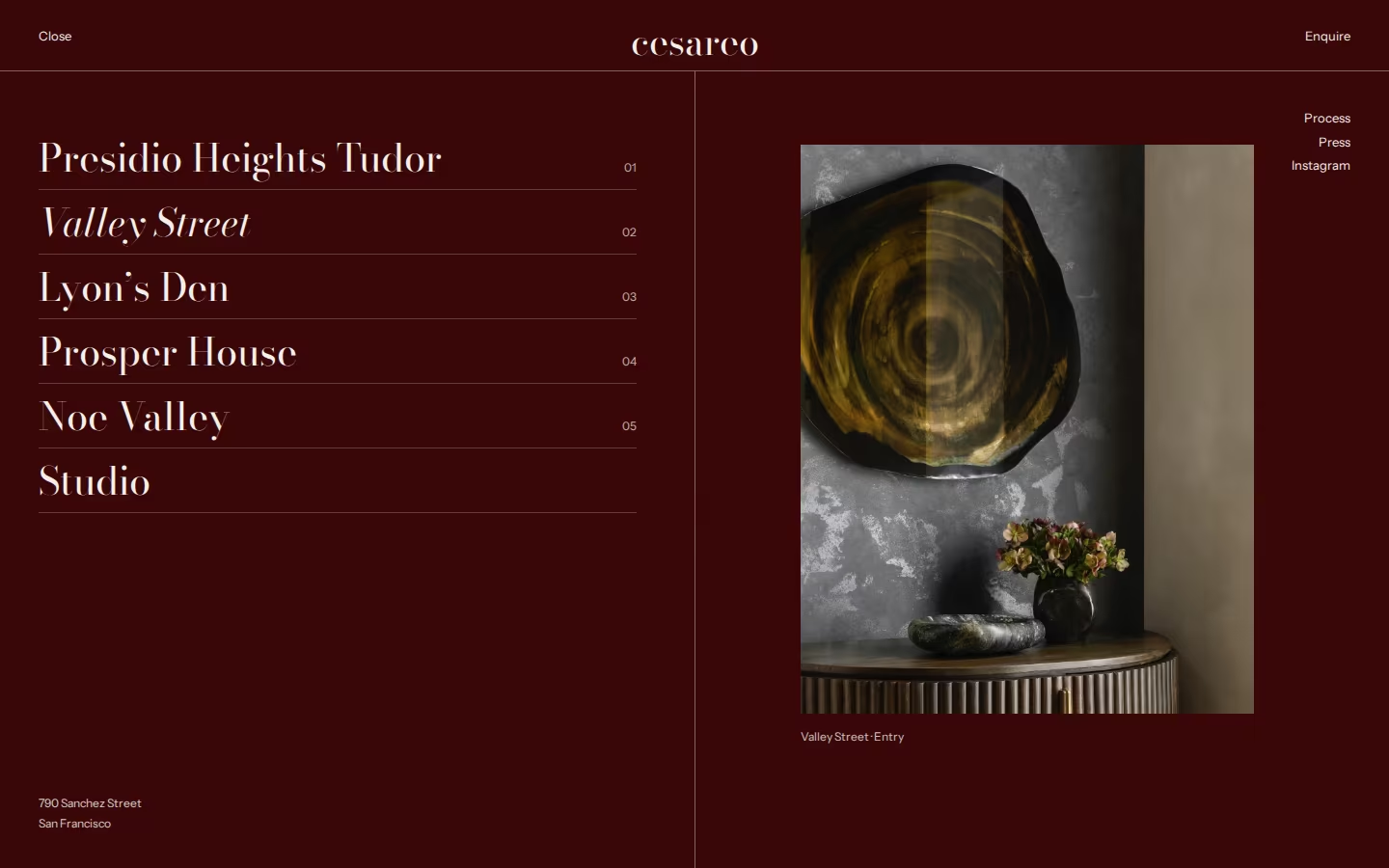
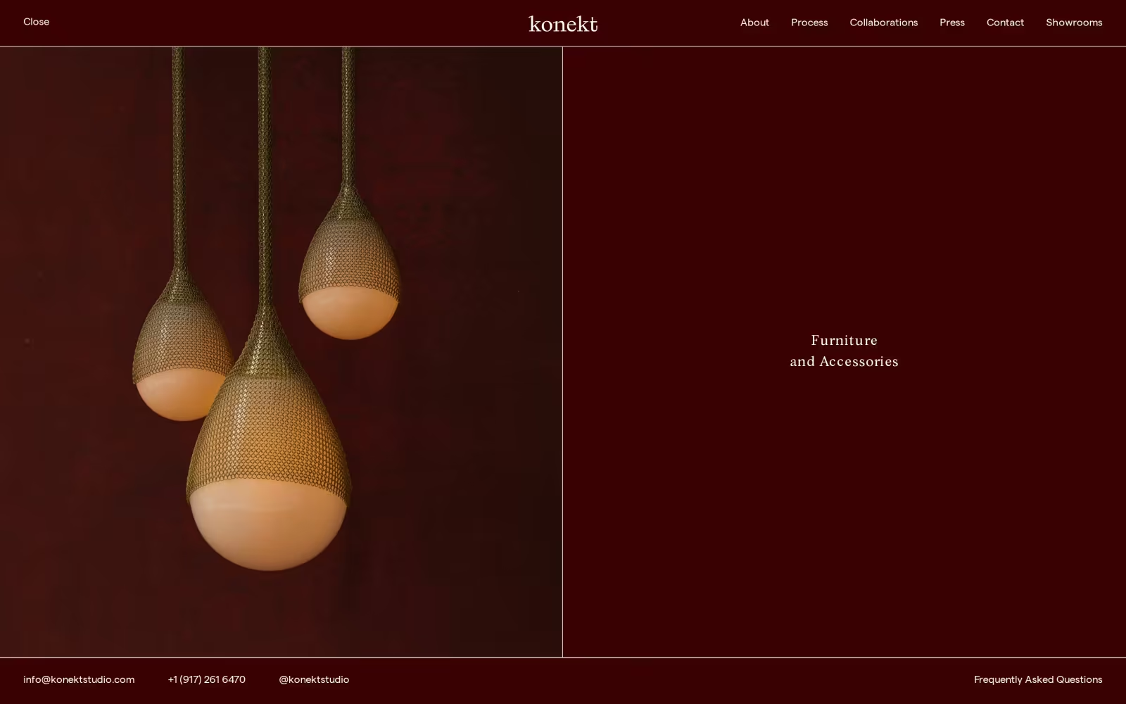
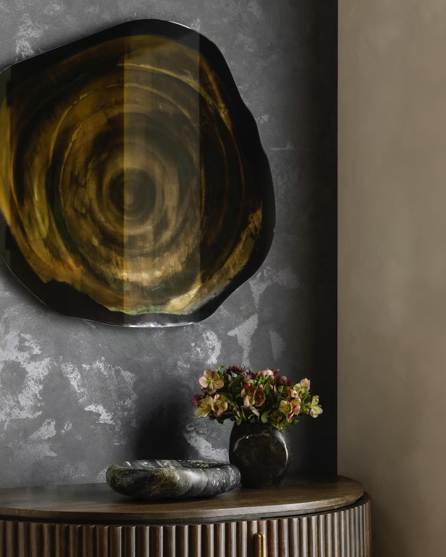
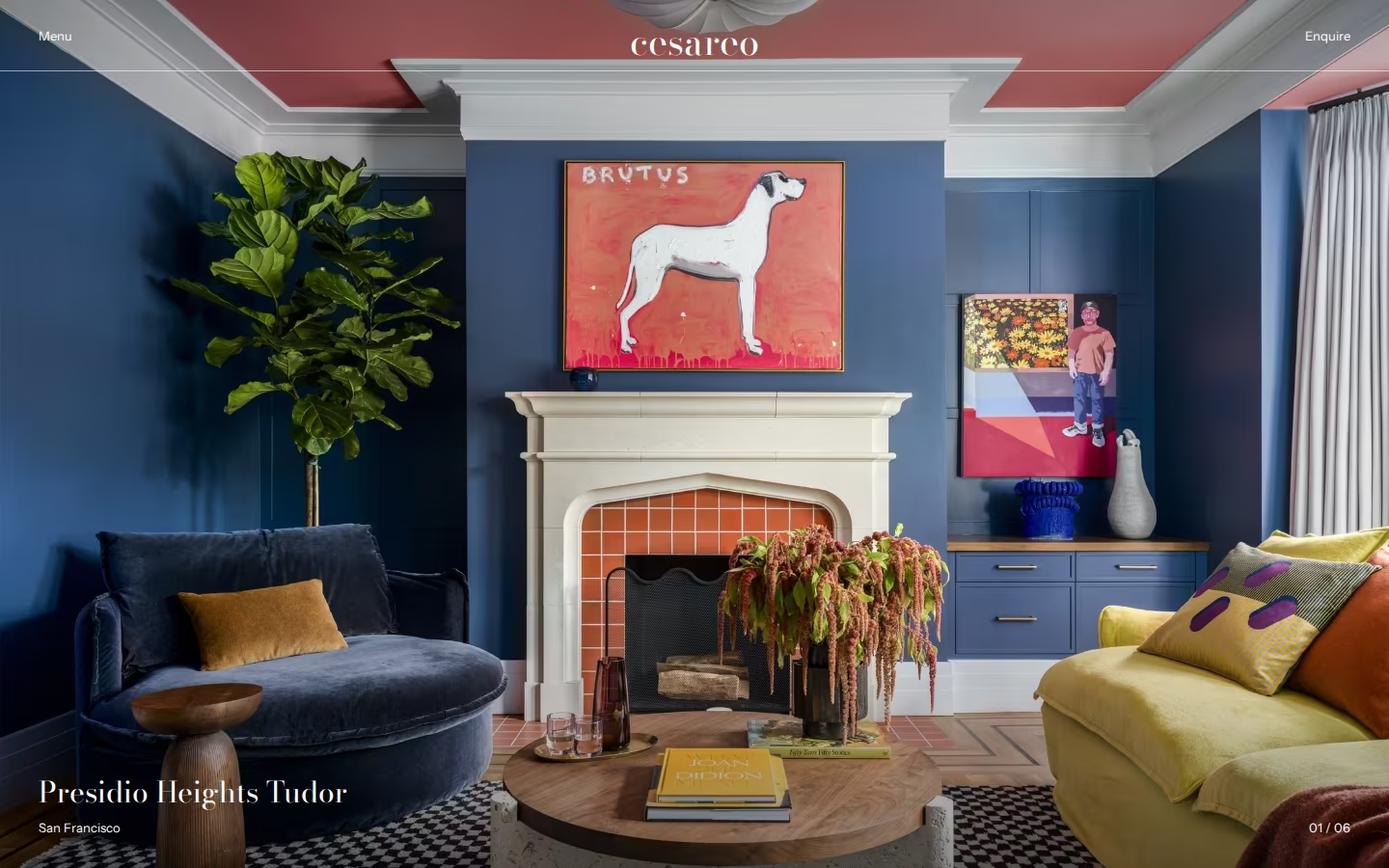

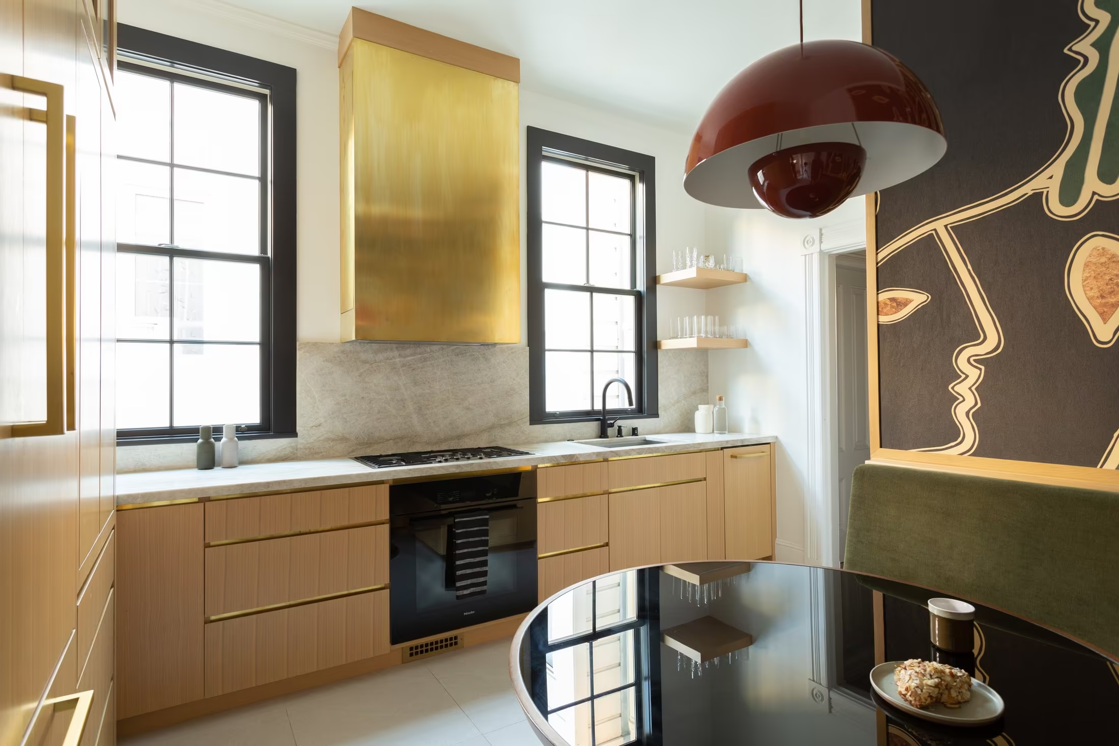

Direction 2
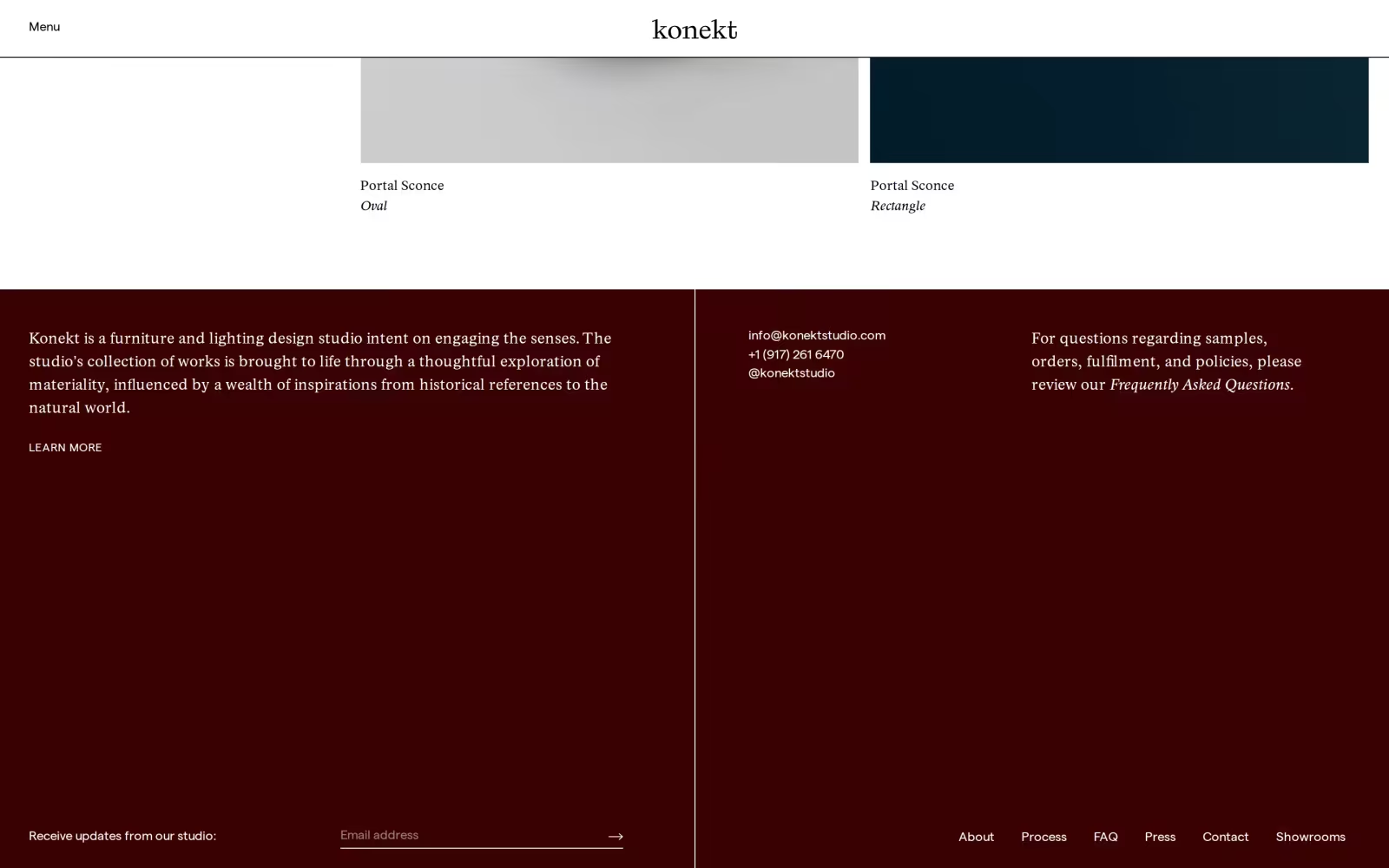
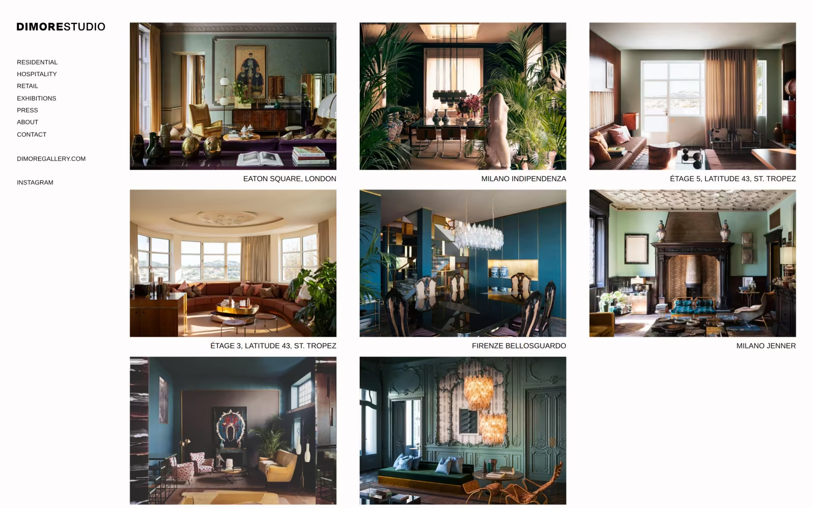
Menus, footers, cards and packaging in full colour, so the brand is recognisable before a word is read.
The client’s own reference: white serif type on oxblood, confident and warm.
Finishes from the studio’s palette carried into foils, hairlines and hover states.
Rooms run full-bleed on their own; the colour frames the work and never sits on top of it.
Direction 03
Composed Like Film
Every home a scene, every client the protagonist.
Cinematic / Narrative / Unexpected
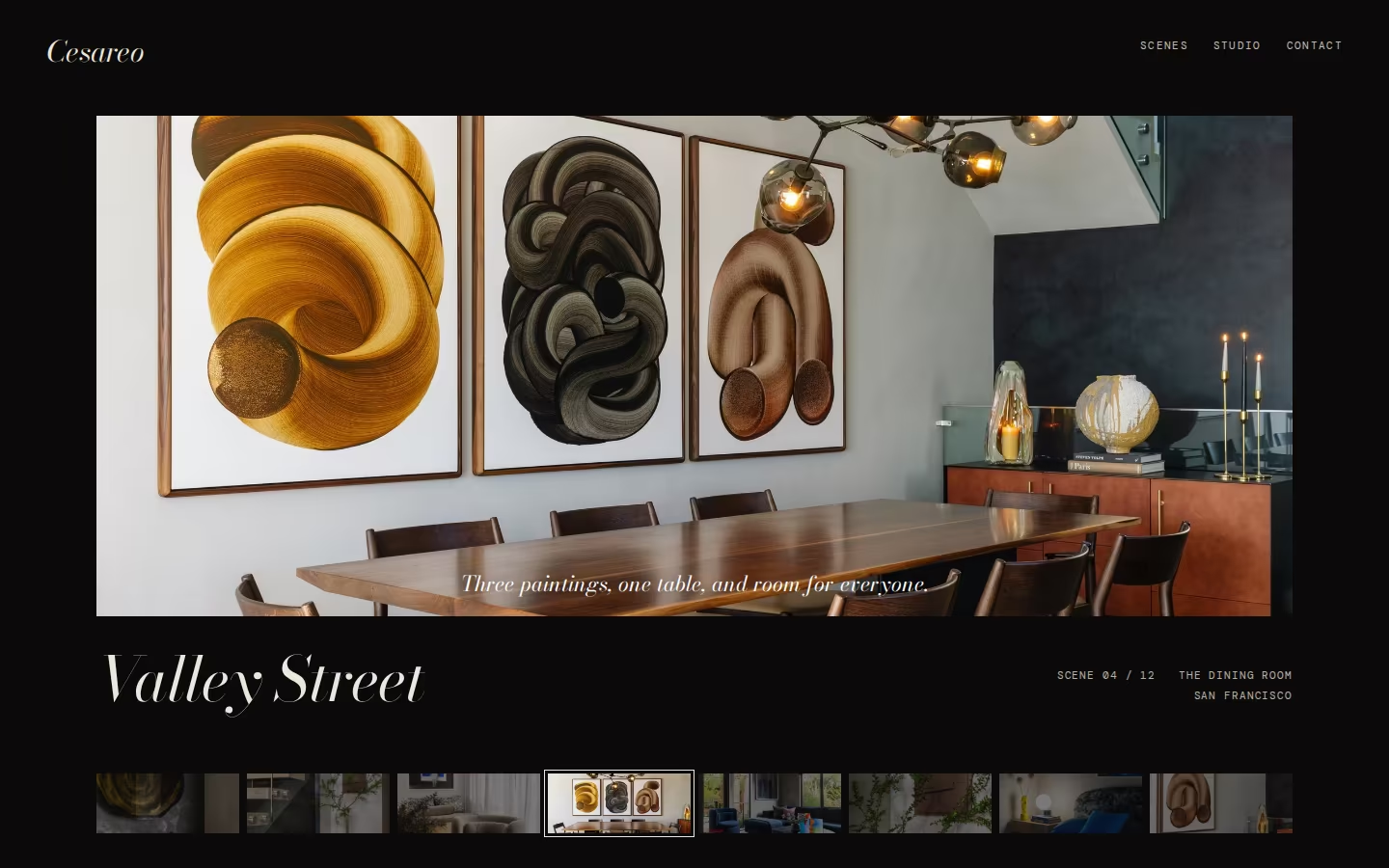
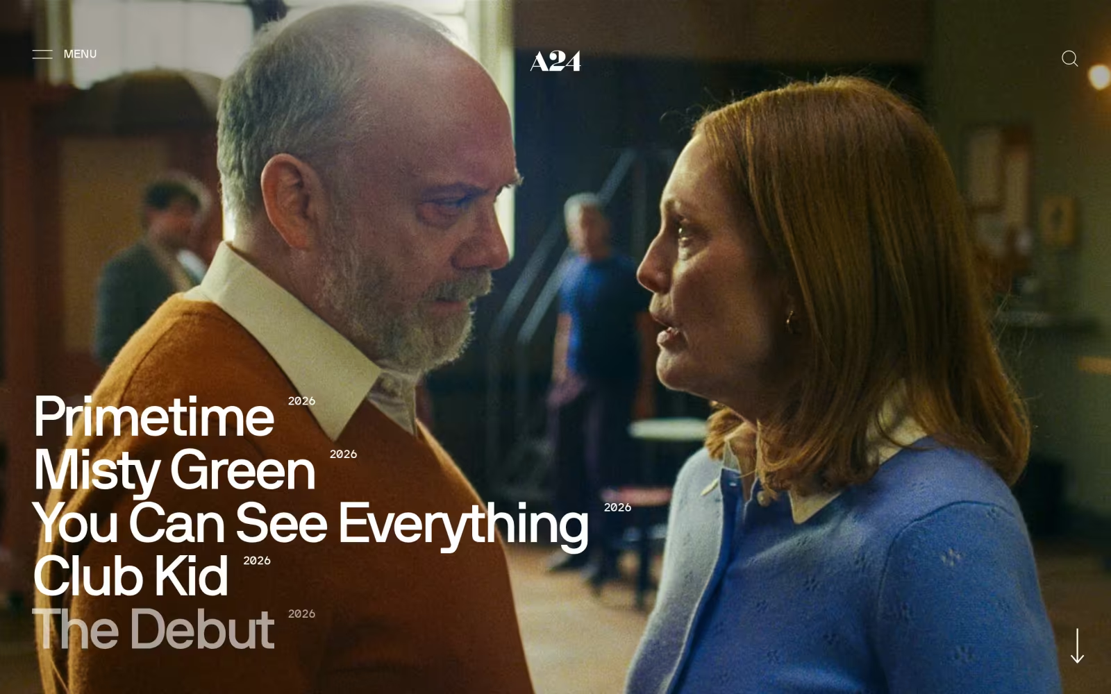
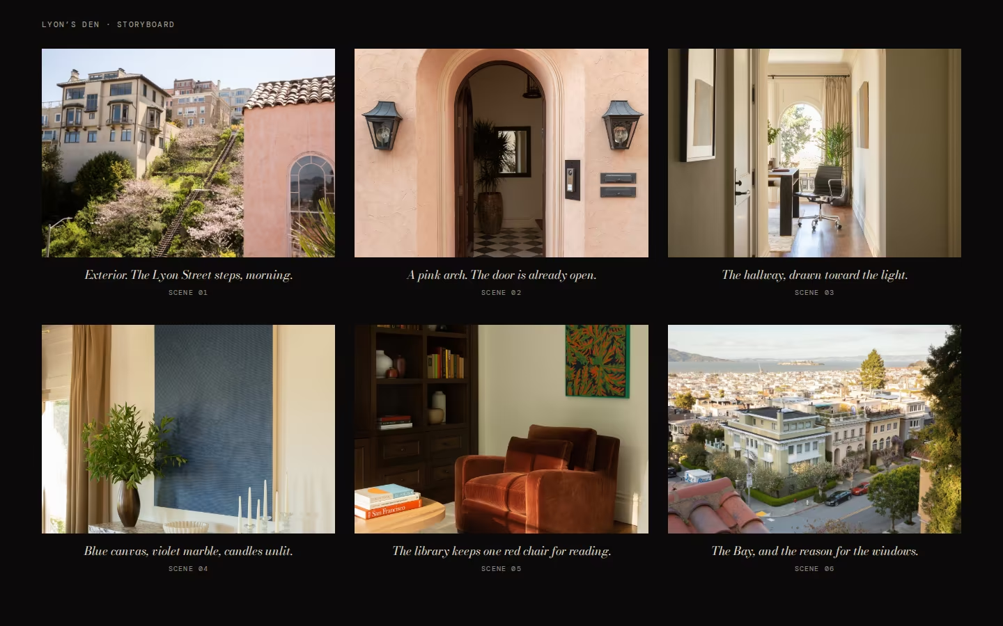
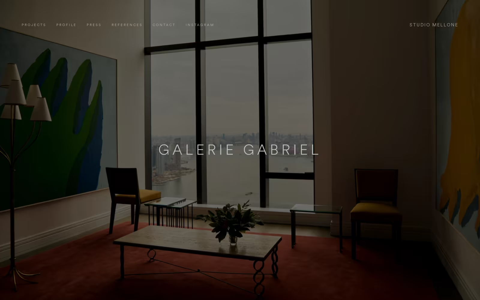
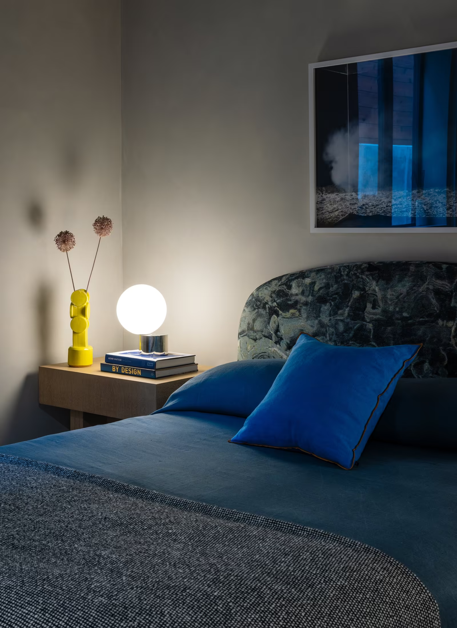
Draws on the studio’s creative lineage in fine art and film, where environment and character are inseparable. Houses are presented as sequences of scenes: letterboxed frames, subtitle-like captions and slow pacing on dark grounds. The wit comes through in the writing, and oxblood appears as a single cinematic accent.
Visual Cues
Letterboxed crops, dark grounds with ivory type, italic Didone titles, monospaced scene notes, storyboards, film-strip navigation, one oxblood accent.
Similar Brands & Websites
- A24
- Studio Mellone
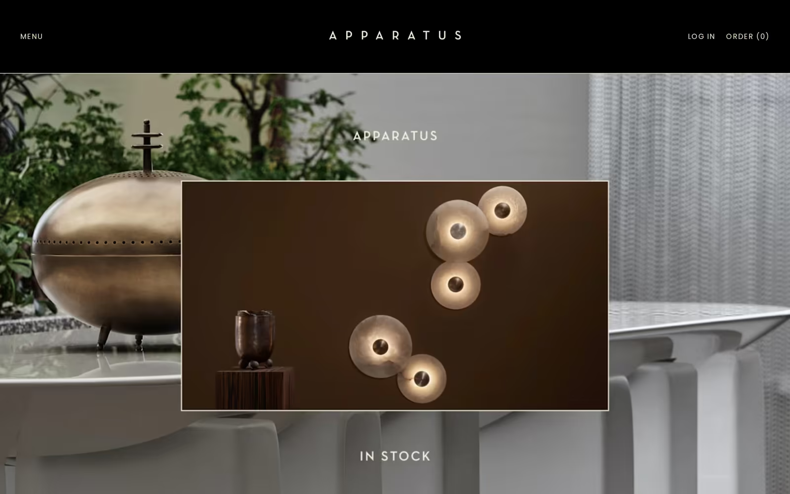
- Apparatus
Direction 3
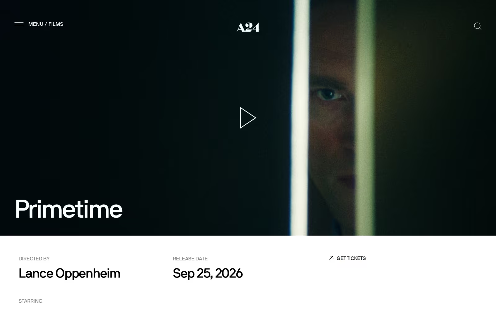
Letterboxed crops and deep shadow turn rooms into scenes with a character in them.
Projects told in sequence, from the front door inwards, with subtitle-like captions.
Expressive display type used like title cards, balanced by quiet monospaced notes.
Near-black and ivory with a single oxblood accent, giving the work depth and atmosphere.
Next Steps
04
Selecting
Moodboard
We’ve developed three distinct visual directions for Cesareo Design, each rooted in the brand strategy while exploring a different way for the studio to express its point of view: an edited editorial frame, a signature oxblood world and a cinematic, narrative language.
How to select
At this stage, the objective is to identify which direction feels most aligned with Cesareo Design’s vision, positioning and long-term ambition. In particular:
- Which direction feels most like the studio you are becoming
- Whether the tone should lean more editorial, more seductive or more cinematic
- How the typography, colour, imagery and overall visual language resonate
- Any elements you’d like us to develop further, refine or combine
To align on the preferred direction and next steps, we will arrange a call to review feedback in detail.
Following review and discussion of the creative directions, the next stage will focus on refining the selected pathway.
This will include:
- Defining the logotype and brand mark
- Defining the typography system
- Finalising the colour palette
- Developing the brand visual system
We look forward to speaking soon and refining the direction together.