Cesareo
Design
The Art of Belonging
- Document
- Creative Direction
- Version
- 2.0
- Date
- September 2026
Dear Leo,
You told us the studio’s signature isn’t a colour, a material or a style. It is a space that couldn’t belong to anyone else. We took that as a brief for this document too, so it doesn’t follow our usual template.
It reads your answers closely, names the tensions an identity for Cesareo Design has to hold, and then proposes three worlds the studio could live in, each shown at work on a homepage, a card and a caption, using your own photographs.
We have been candid about what each world risks. We end with a recommendation, but the choice is yours.
SC&CO
- IWhat we heard03
- IIThe idea09
- IIIFive tensions12
- IVRaw material15
- VThree worlds19
- VIChoosing33
The mockups use photographs from leocesareo.com. Project details, names and copy in them are illustrative placeholders.
What we heard
Your answers, read closely.
In your words
“We don’t believe the designer should be the protagonist. The client is.”
What it asks of the identityThe brand steps back so houses and their people lead: photography first, the studio’s voice second.
“Our signature isn’t a particular color, material or style.”
What it asks of the identityNo house look to lean on. The identity needs a fixed frame that stays recognisable while every project looks different.
“Cesareo can use restraint, but it shouldn’t use neutrality as personality.”
What it asks of the identityColour and material are not only allowed, they are expected. Beige is not a strategy.
“We do not aspire to be everywhere. We aspire to be invited somewhere interesting.”
What it asks of the identitySelective rather than loud. The brand should read as an invitation, never an advertisement.
Who it should draw in, and turn away
- Curious, engaged and open to discovery
- Value perspective over prescription
- Care about art, craft and history more than status
- Want a home that is theirs rather than impressive
- Are willing to be challenged
- Want to reproduce an existing aesthetic
- Want a formula, or the beige luxury look
- See the home mainly as an expression of status
- Need to know the ending before they begin
Explain phases and fees in plain language on the website.
Show the process as a dialogue, with the client’s own objects in the work.
Show drawings, samples and makers before anything is installed.
Name the thinking: listen, edit, interpret, elevate.
From Leo Cesareo Design to Cesareo Design
From an individual practice to a founder-led, studio-powered creative practice.
From interiors to interiors, furniture, objects, art, craft and collaboration.
Keep the elegance and restraint. Add curiosity, cultural depth, storytelling and wit.
What we saw on leocesareo.com
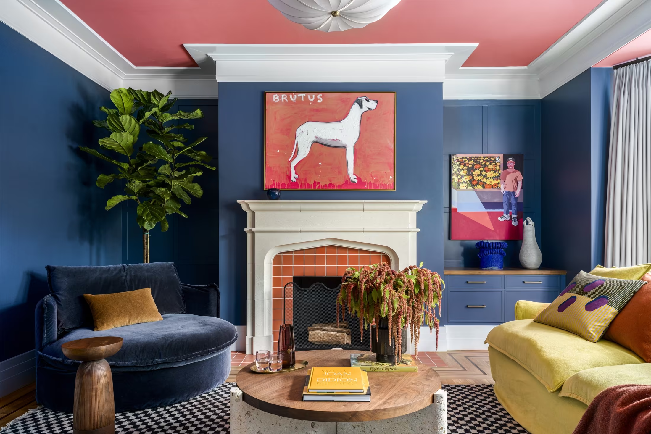
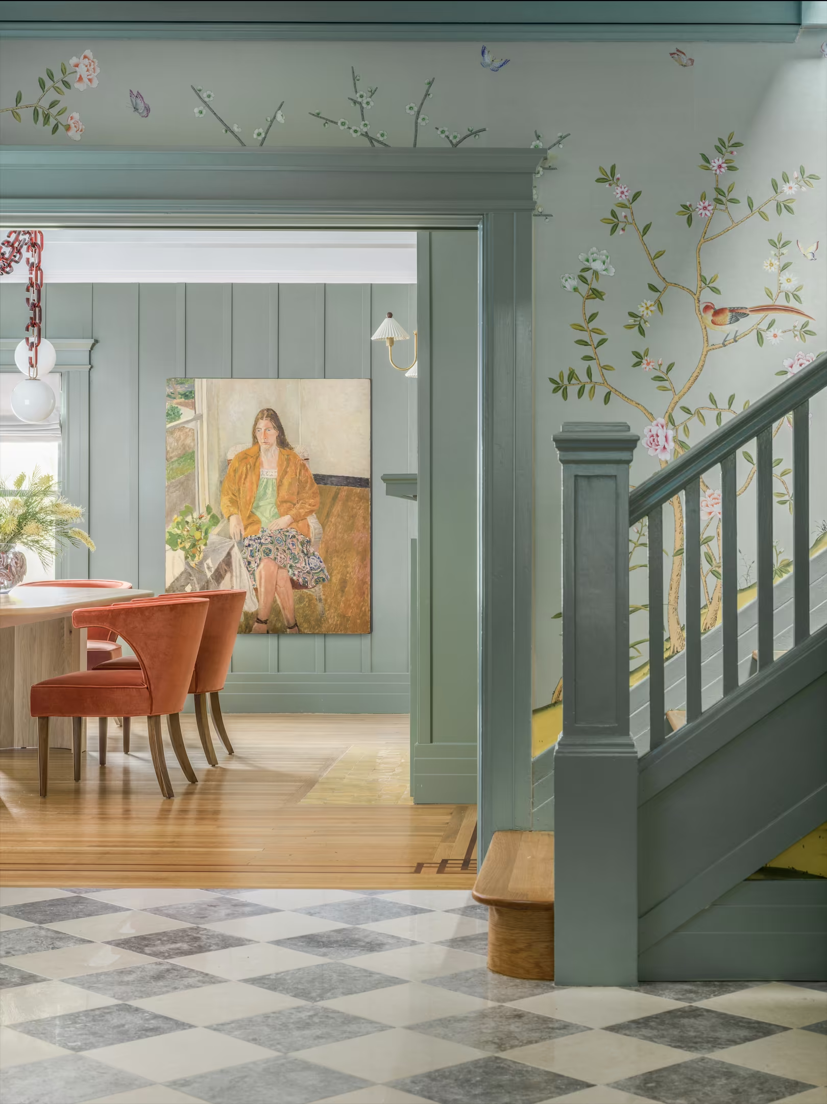
The best work is colour-confident and witty.
Navy walls under a coral ceiling, a painted hound over the fire, a chain for a chandelier. Nothing about it is beige.
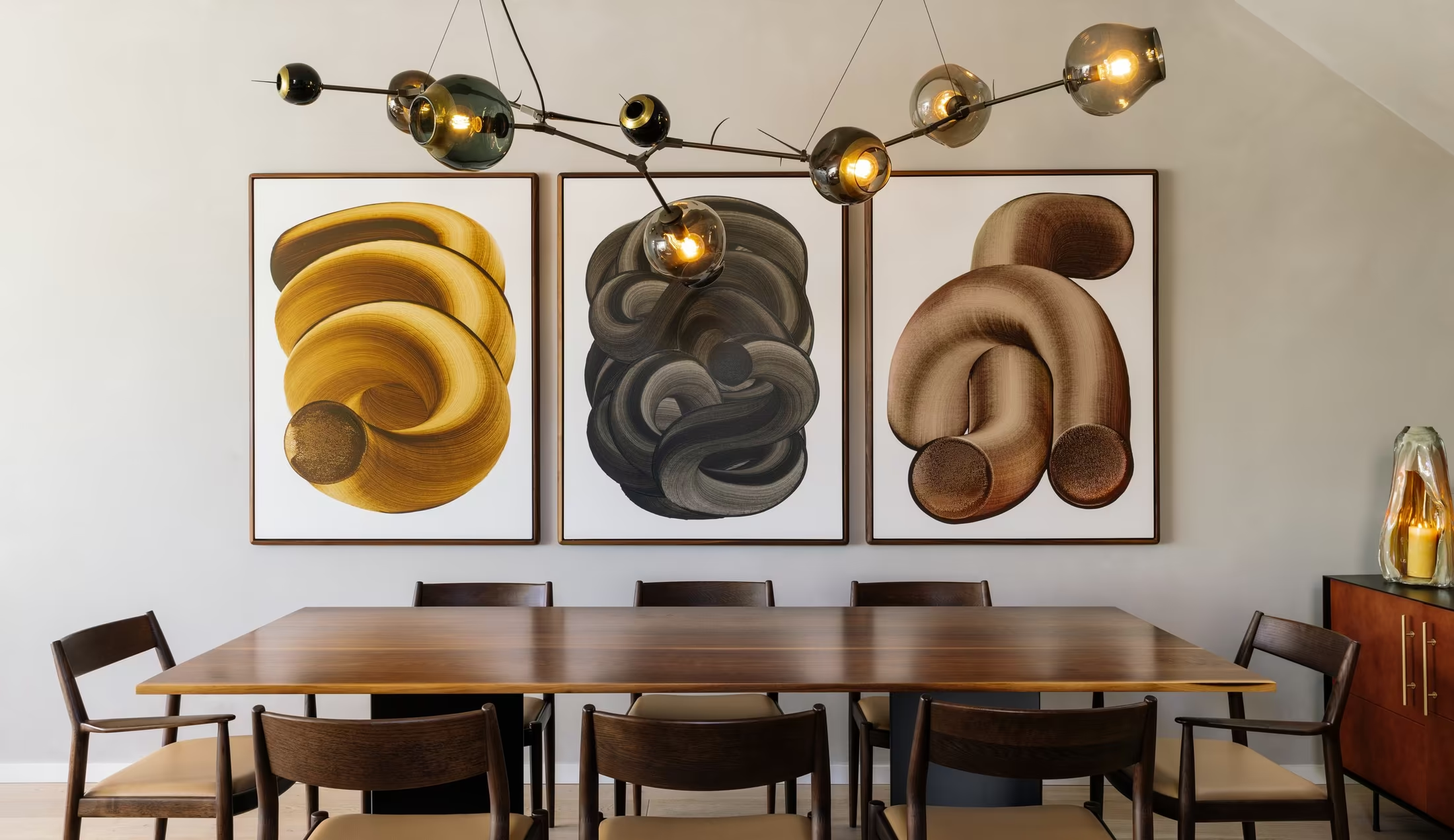
The recent houses are far ahead of the older ones.
Presidio Heights, Valley Street, Lyon’s Den and Prosper House set the bar. Renderings and older, neutral projects pull the average down.
The stories are missing.
Project pages are image grids with no place, scope, makers or narrative. The studio’s differentiator is narrative, and the site says nothing.
The Look Book is ahead of the website.
The 2024 Look Book already uses colour, moodboards and press with more personality than the site’s template.
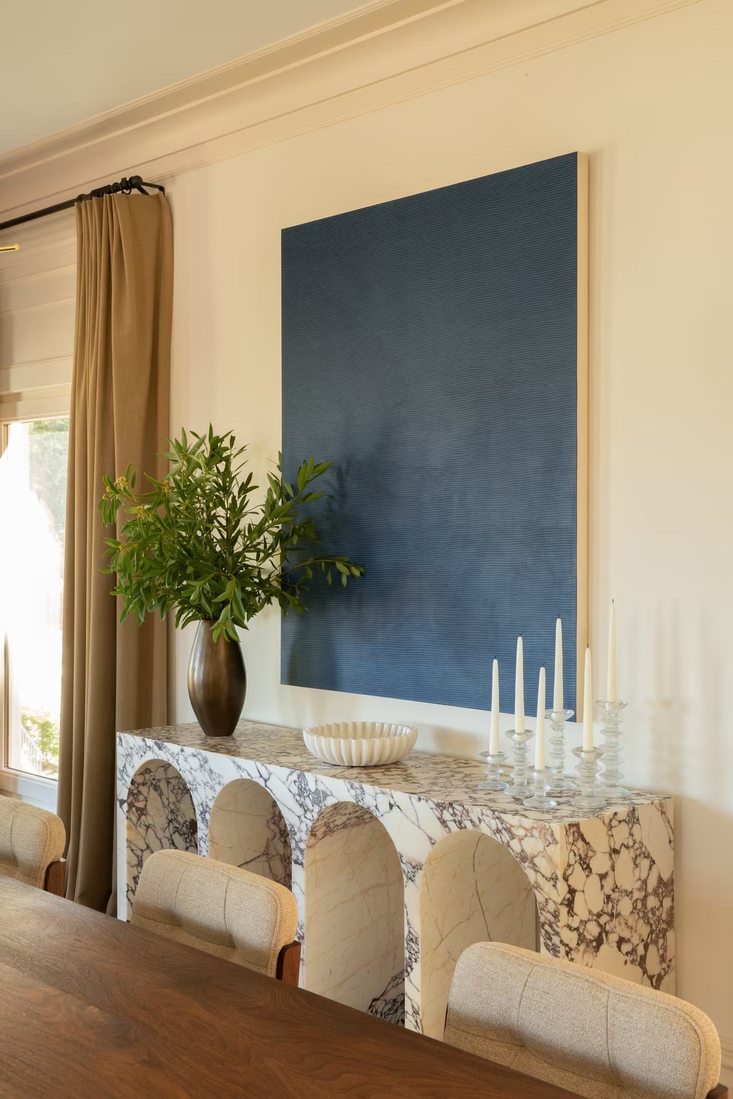
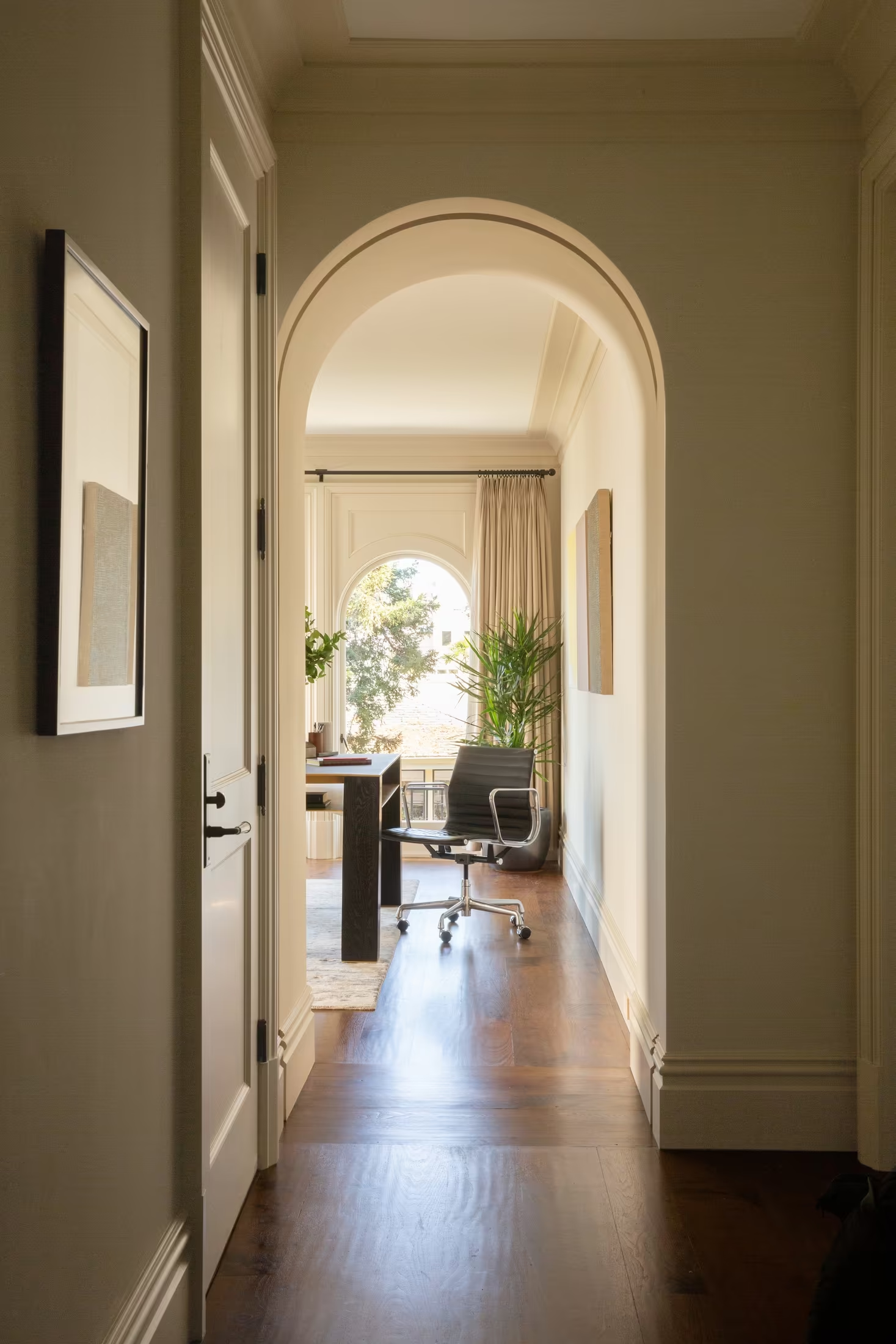
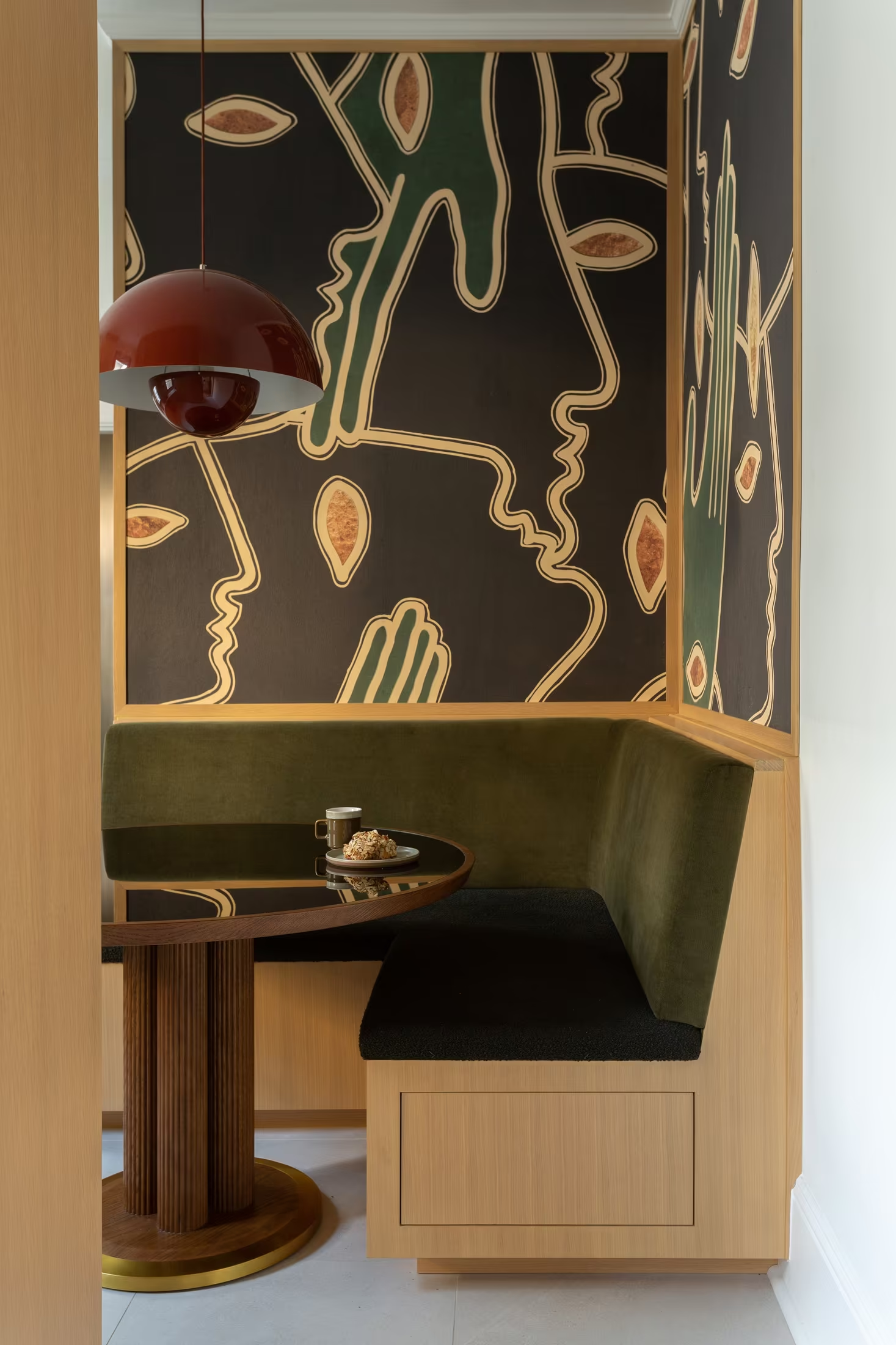
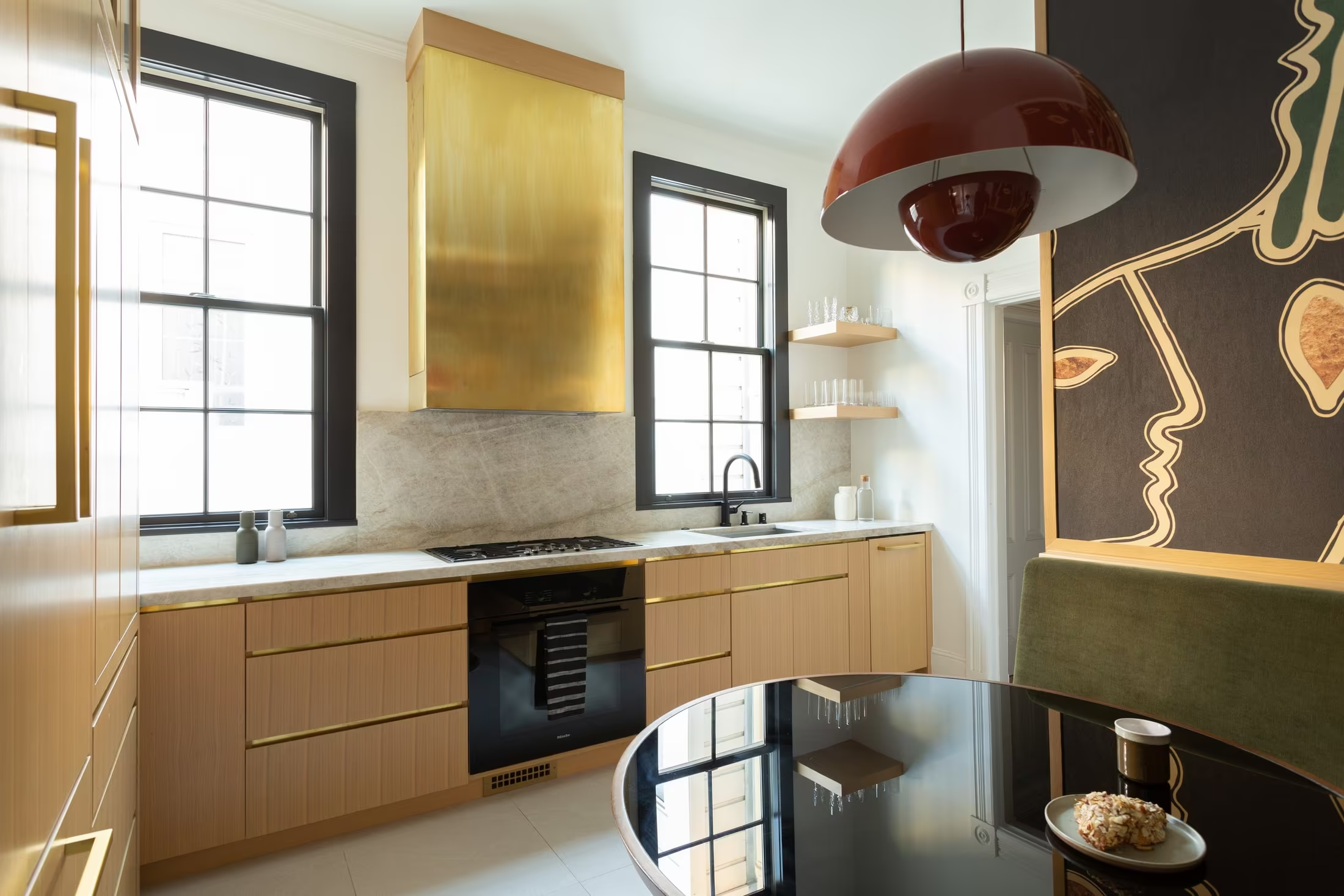
The best asset is already here
Keep: recent, professionally photographed houses with a point of view. Retire: renderings, phone snapshots and neutral work that could belong to any studio.
The idea
One thought to build everything around.
The Art of Belonging
Not a tagline. A test for every decision: does this help a home, a client or a collaborator belong?
A space that couldn’t belong to anyone else. Their histories, collections, rituals and eccentricities, edited and elevated.
Clients who return for what might come next. Artists, makers and architects who find a place for ambitious work.
Rooms that couldn’t belong to anyone else.
How it should feel, over time
Intrigued. Drawn in. Assured.
One arresting image and very few words. Confidence shown, not claimed.
“I want to see more.”
Houses told as stories, each opening onto the next. Captions that reward reading.
Confident, worldly, capable.
Makers, press and process shown quietly. The sense of a studio you would trust with a risk.
Five tensions
What the identity has to hold at once.
Five tensions to hold
The dot marks where Cesareo Design should sit on each line.
Hold back on layout and type. Never on colour and material.
Precise grids and captions. Warmth comes from photography and writing.
Wit is welcome in words, captions and the occasional object.
A fixed frame of type, mark and colour around work that always changes.
Leo’s lineage visible. The team and makers credited by name.
Eight rules for everything that follows
The work is the display. Type is the voice.
Colour comes from materials, never from a trend.
One unexpected thing on every page.
Every house gets a story, not only a gallery.
Name the makers and the artists.
Caption like a curator. Write like a host.
Fewer projects, told more deeply.
Show the process plainly. It answers the cost question.
Raw material
Finishes, type and photographs we start with.
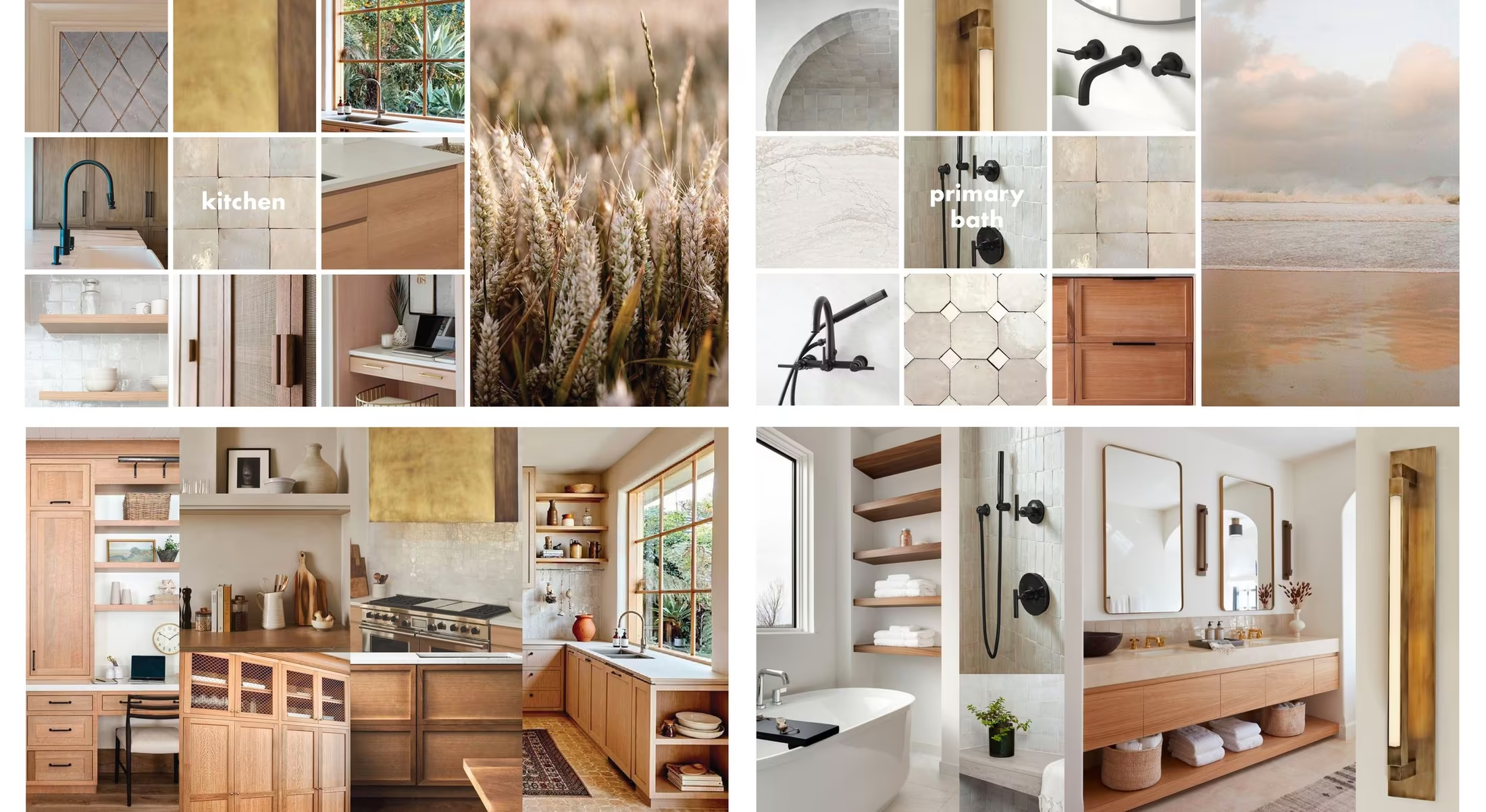
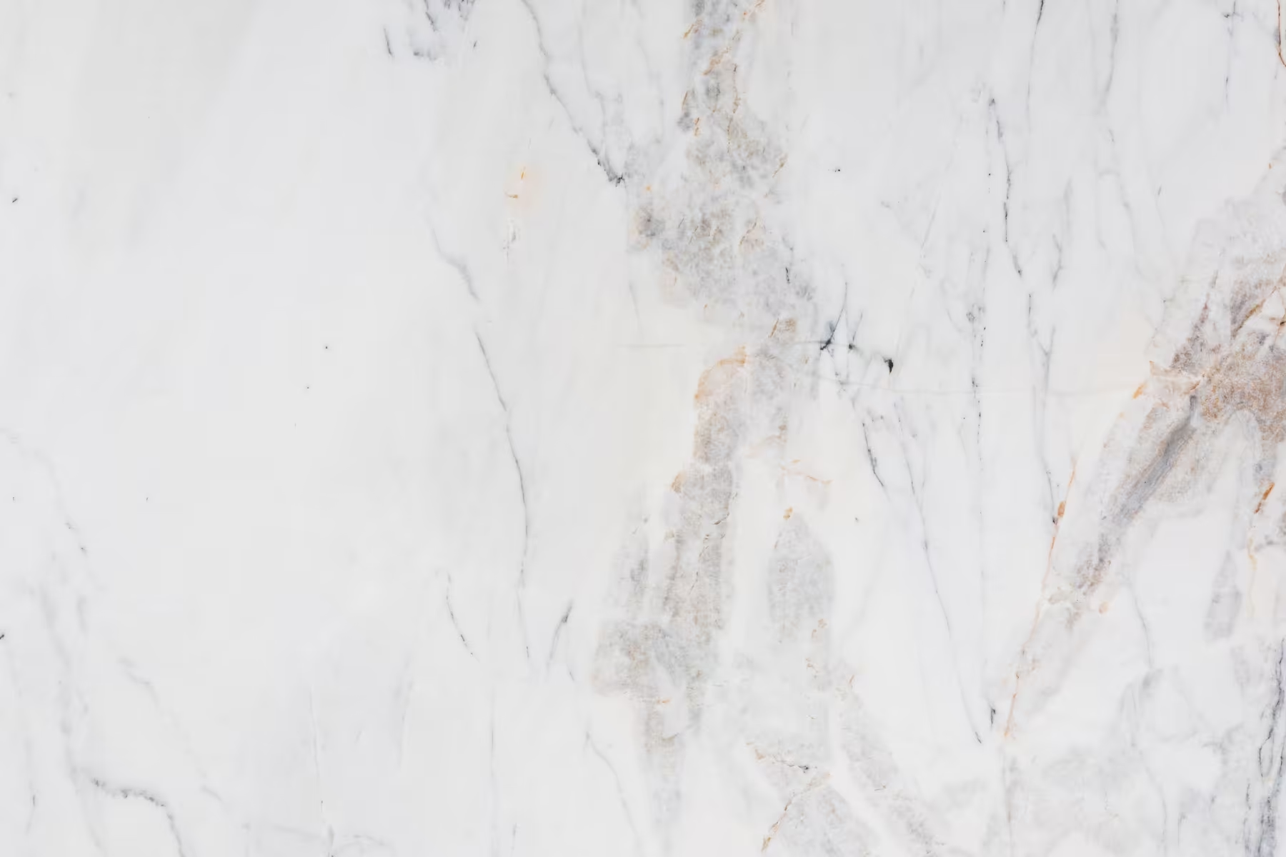
The finishes you named, as a palette
Values are starting points for the identity stage, sampled to sit well beside the navy, sage and saffron already in the work.




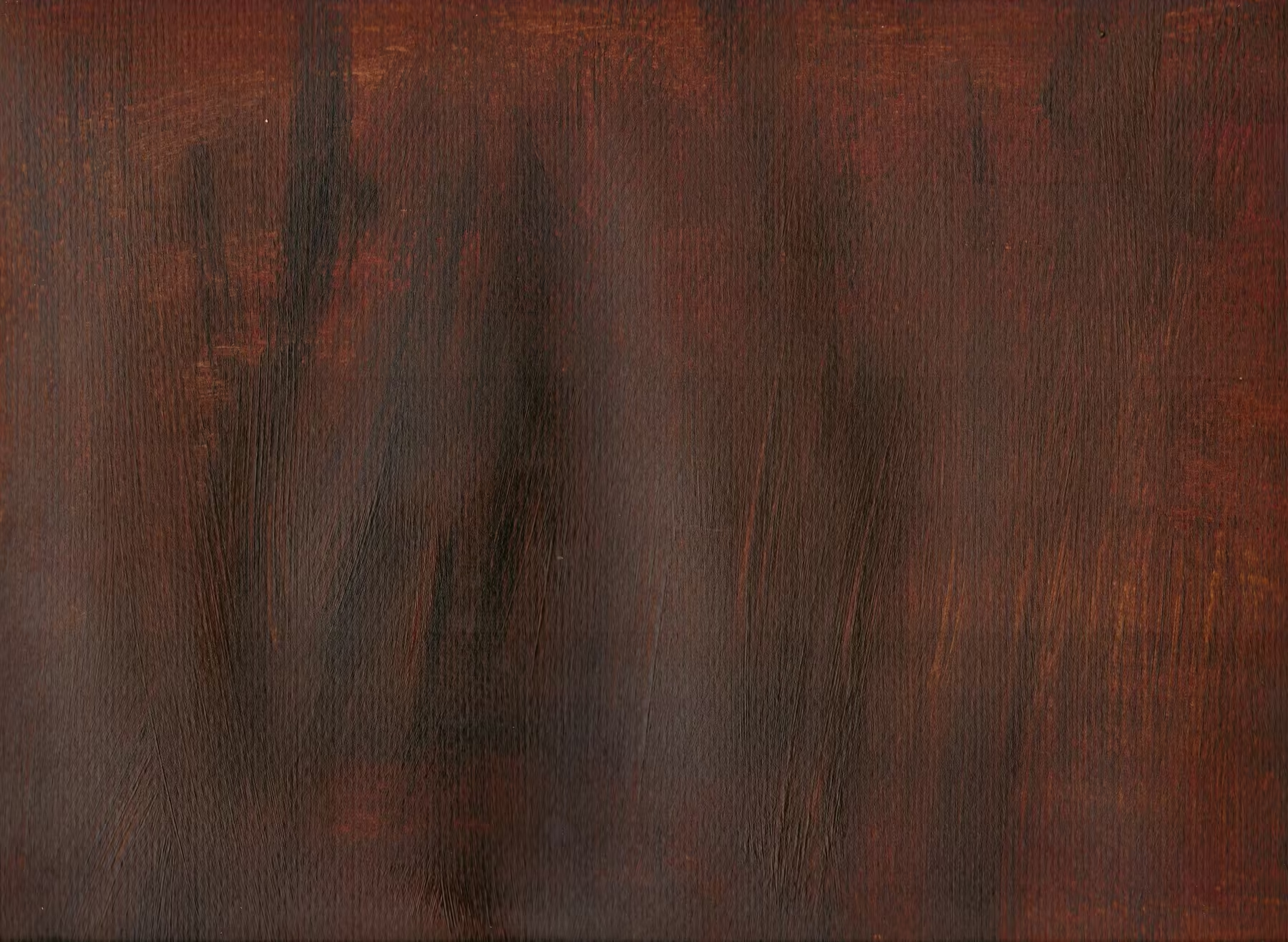
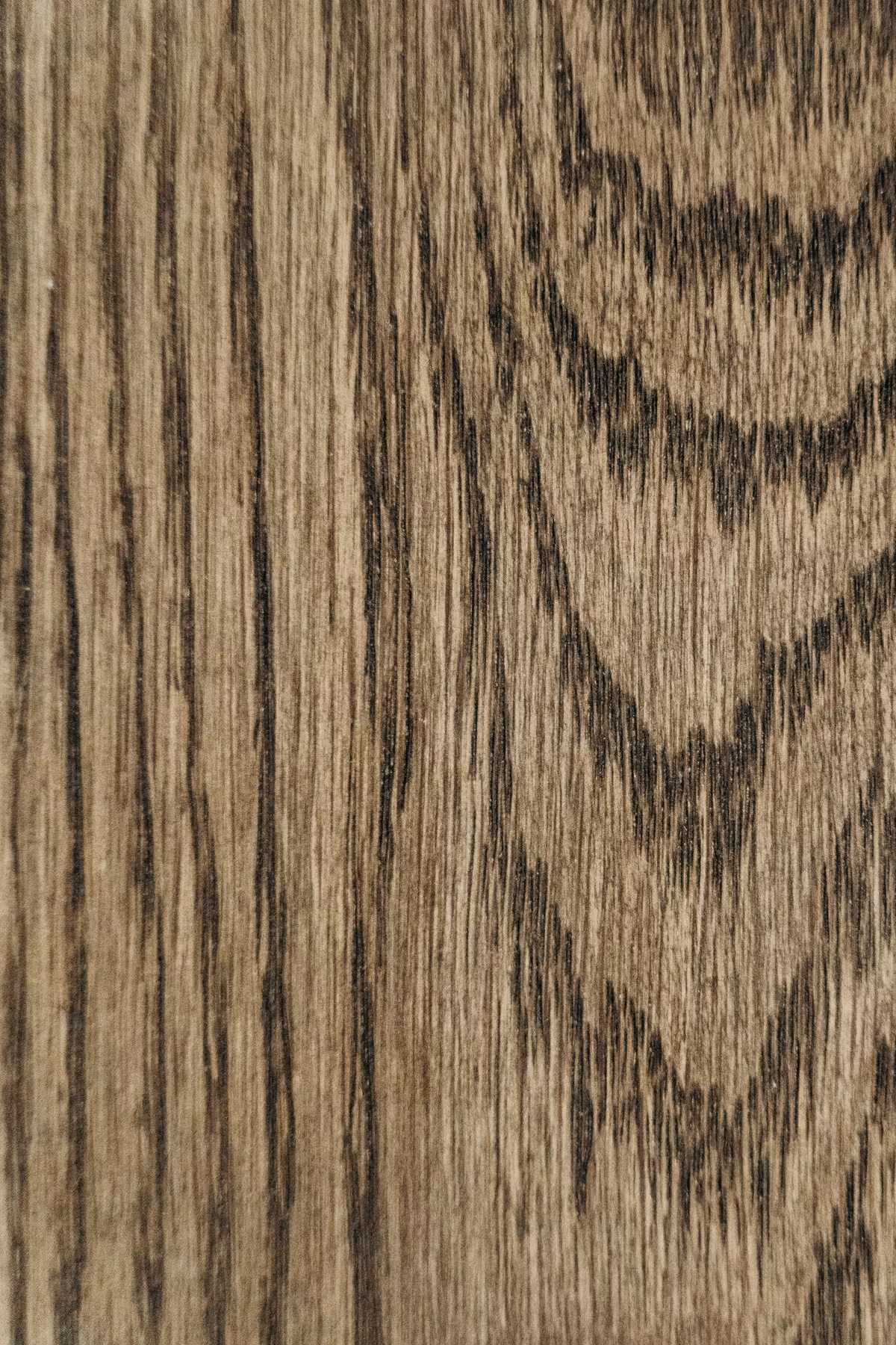
The Didone question
Heimat Didone
Your example. A contemporary Didone with sturdy hairlines, so it stays elegant at small sizes where classic Didones break up. It is a commercial typeface and would need a licence.
Stand-ins used in this documentBodoni Moda Open licence, closest in contrast
Playfair Display Open licence, warmer italics
Gloock Open licence, heavier, more graphic
Newsreader for reading, Instrument Sans for information.
Photography that already works
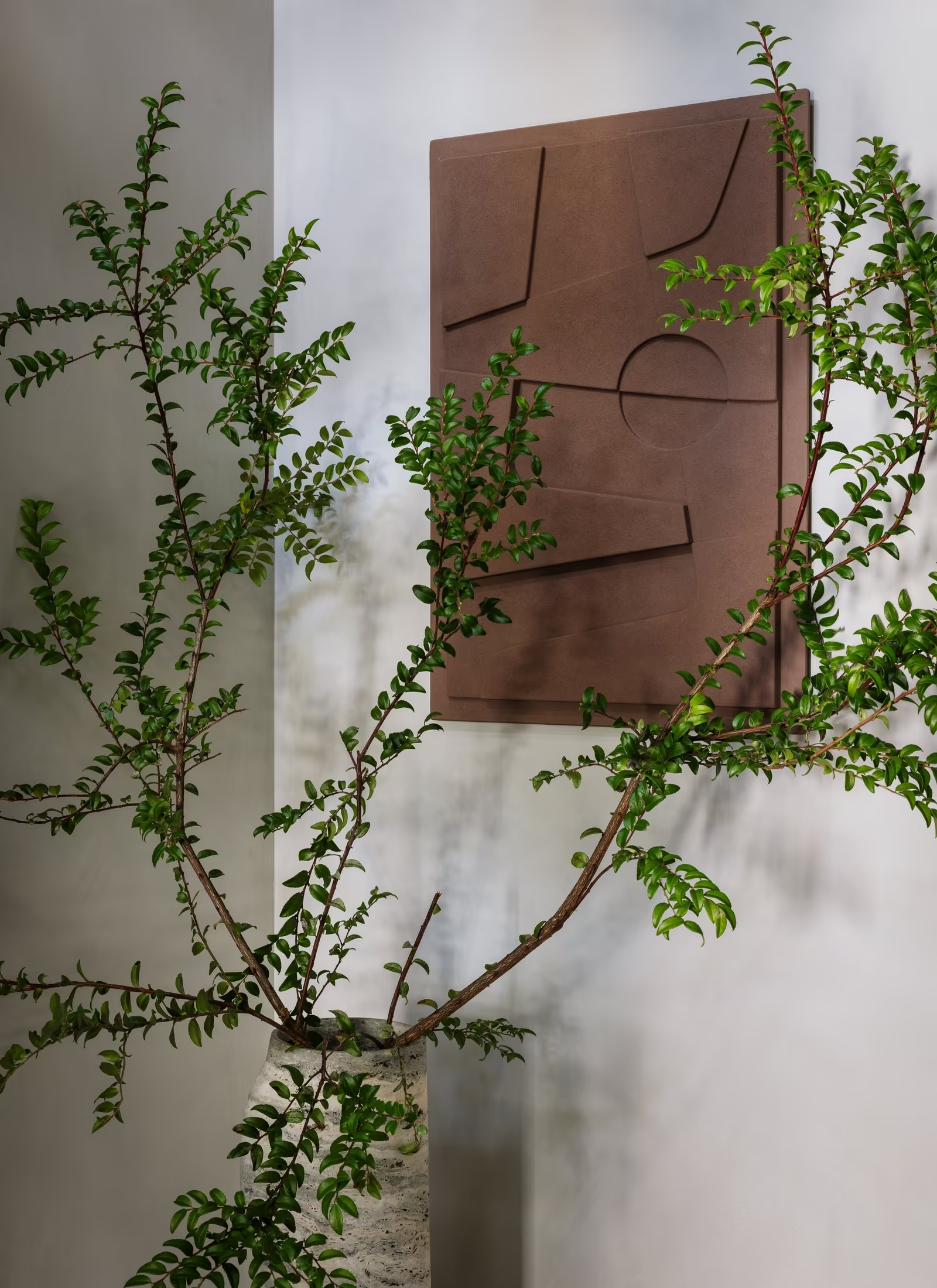
Details as much as rooms
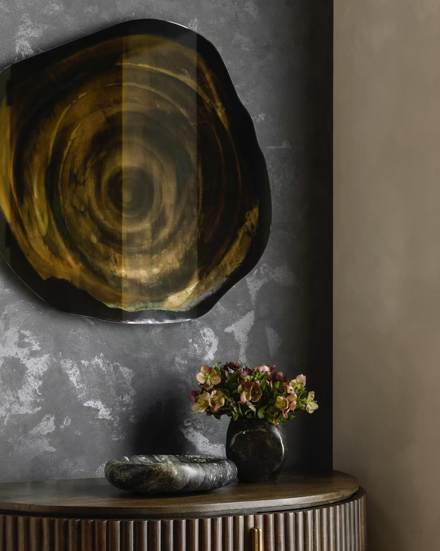
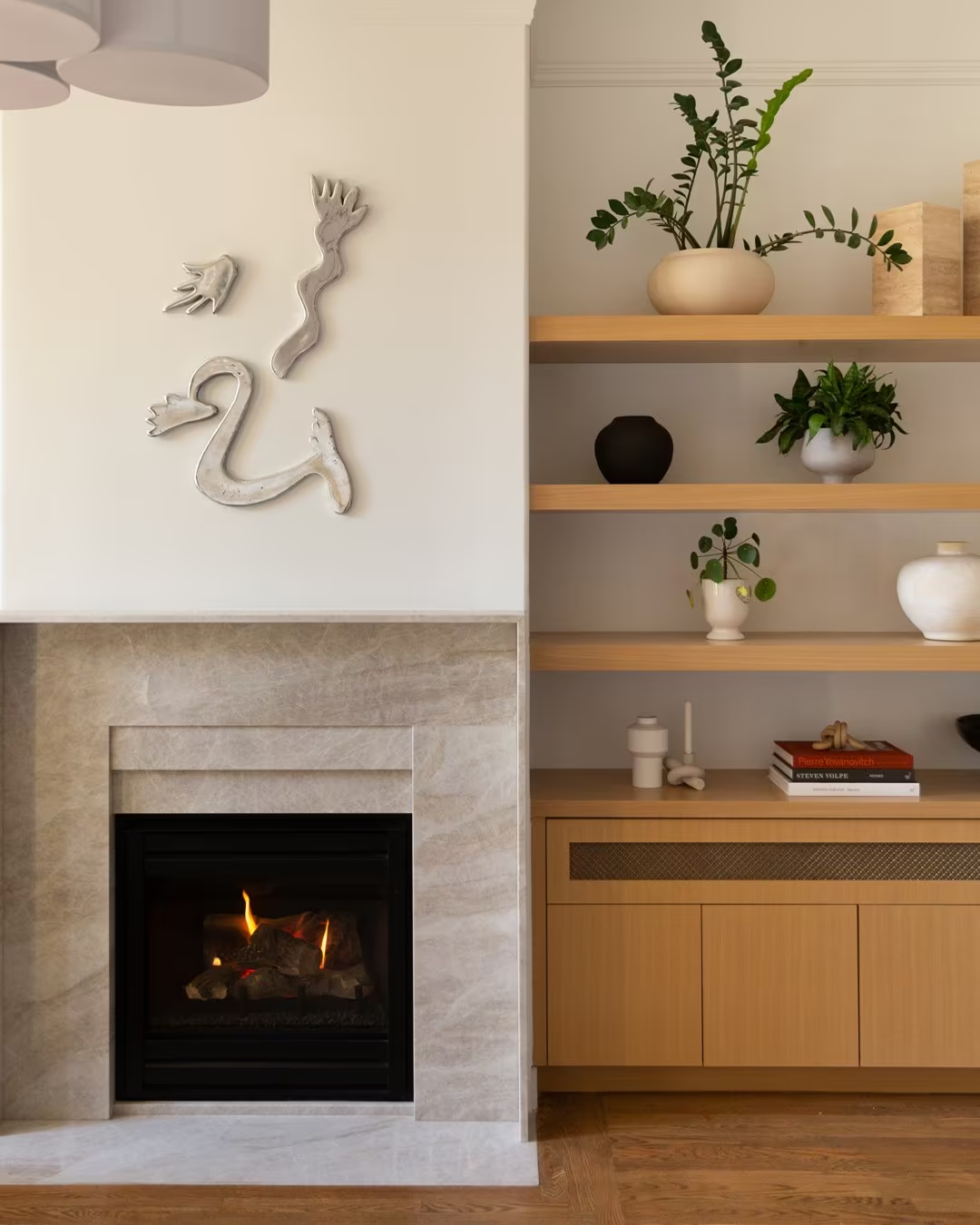
Objects, joinery and art at close range carry craft better than wide shots.
Thresholds and depth
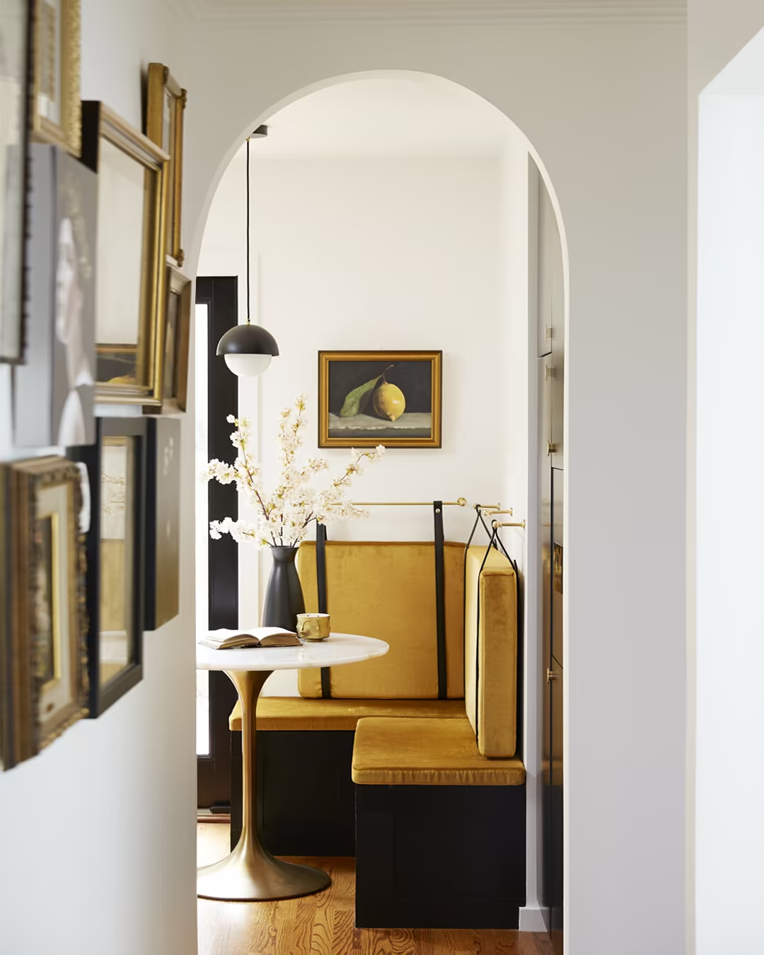
Doorways and enfilades invite the viewer in, the Art of Belonging made visual.
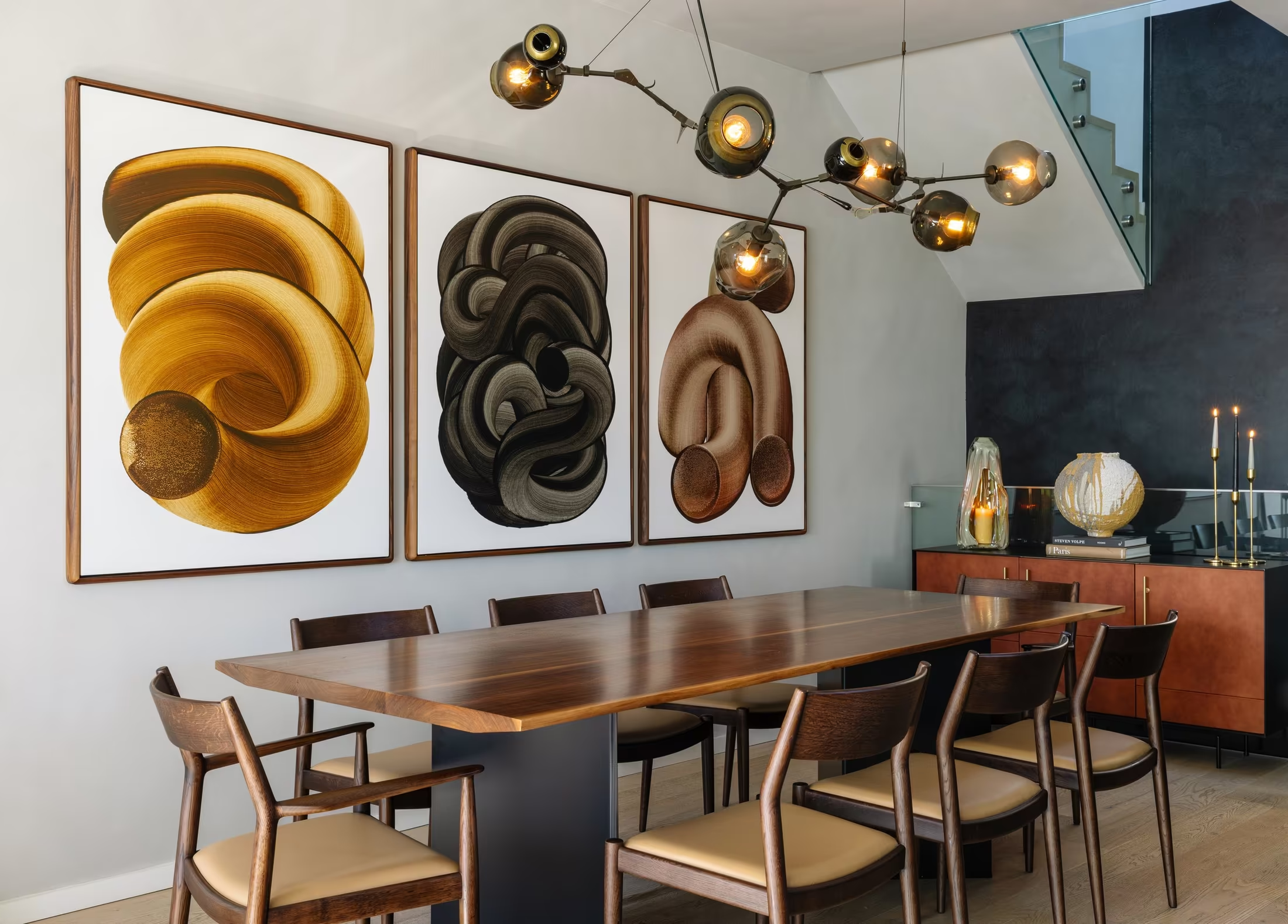
Colour at full strength
No desaturated grading. The rooms are the palette.
Life, lightly
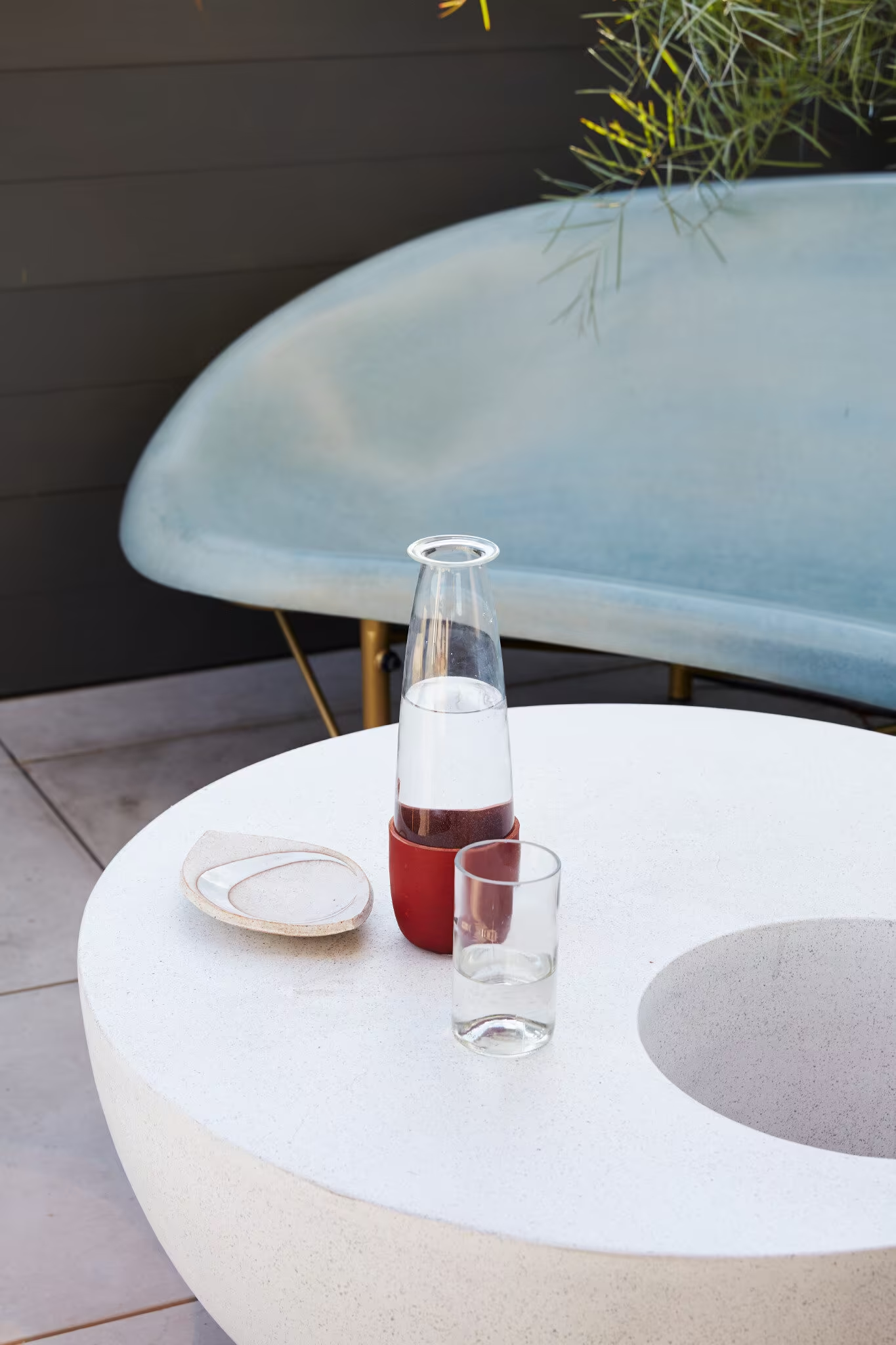
A carafe, a book, a dog: signs of people without staging them.
Three worlds
Three places the studio could live, shown at work.
Three worlds
The Host
A studio that makes you feel expected.
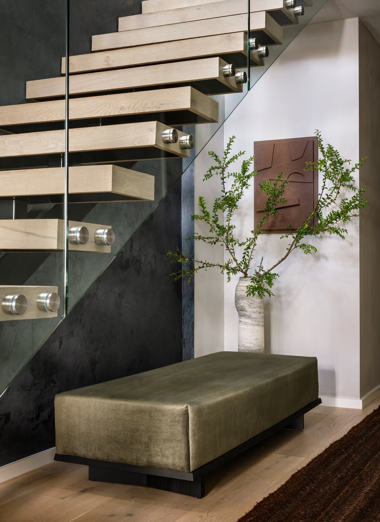
The Director
Every room composed like a shot, every client cast as the lead.
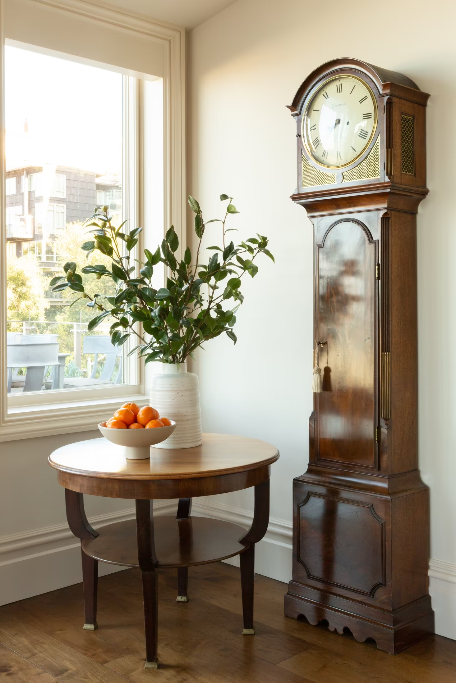
The Collector
A catalogue of houses and the things in them.
The Host
A studio that makes you feel expected.
Warm · Seductive · Assured
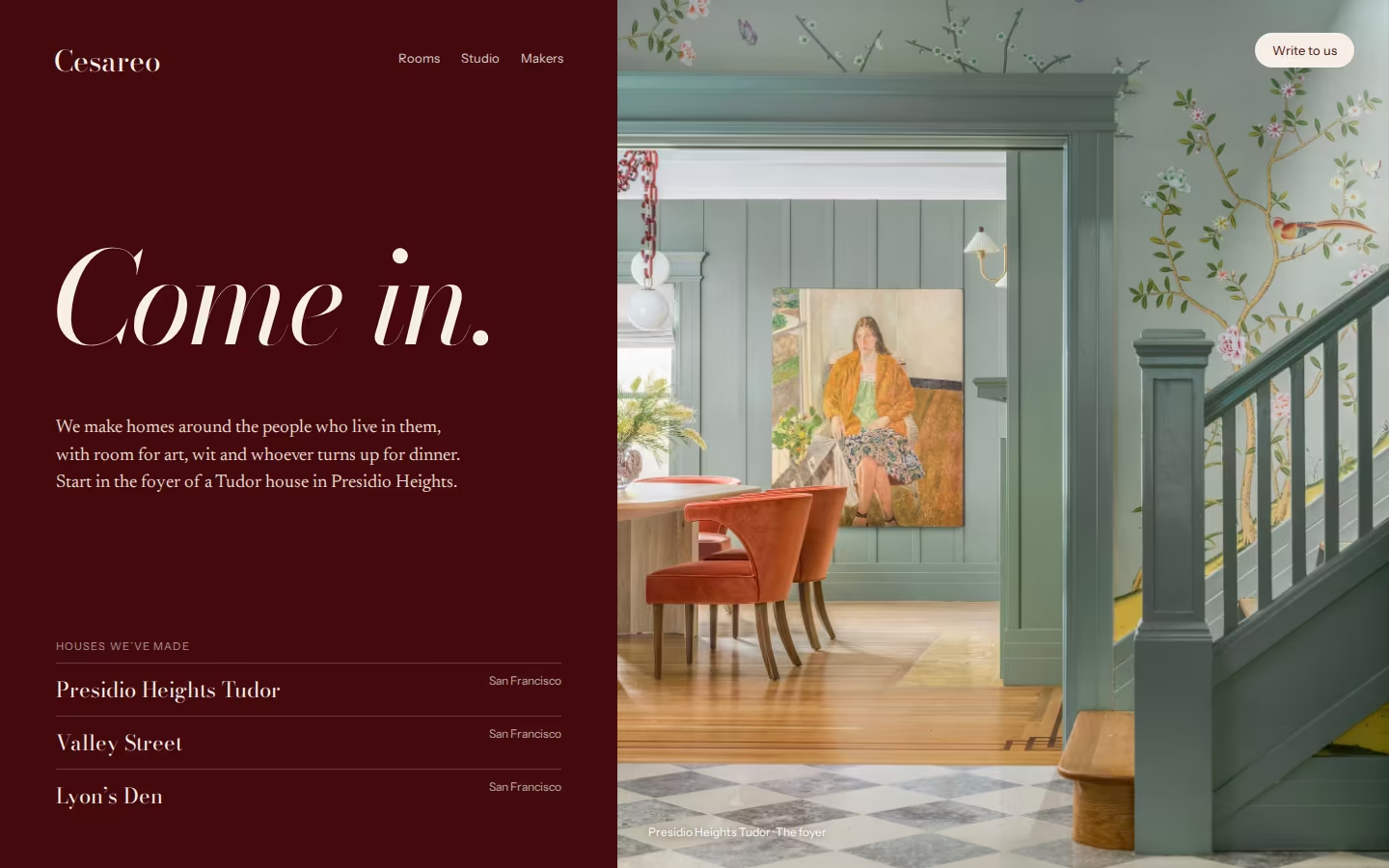
The Host: character and system
The host of the best dinner in town: generous, curious about you, a little theatrical after dark.
The first ten secondsAn oxblood welcome and one open door.
Signature moves- Oxblood as the room you enter: menus, cards, envelopes
- Invitations instead of calls to action: “Come in”, “Write to us”
- Brass-foiled wordmark on deep grounds
Come in.
Bodoni Moda + Newsreader for textDoorways, thresholds, tables set, evening light.
The Host: on the website
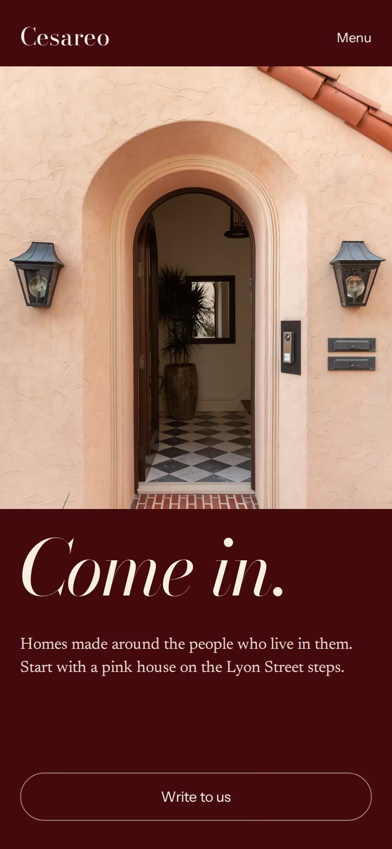
The Host: in the hand, and honestly
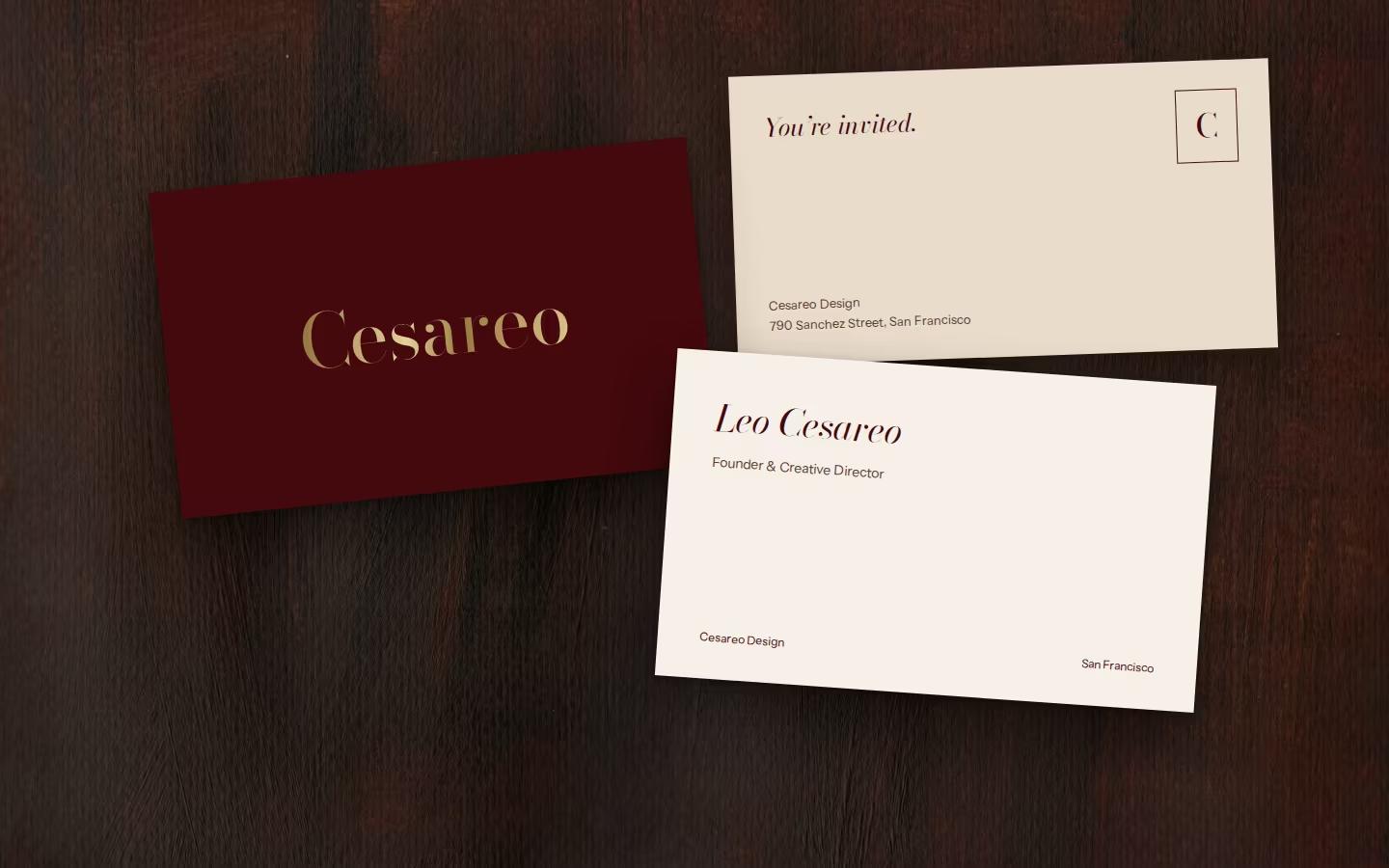
- Closest to the reference you named: oxblood with white type
- Warm and seductive within seconds
- The strongest print and packaging presence
- Oxblood beside navy and coral rooms can clash. Photography must keep its own ground
- A hospitality tone tips into hotel branding if the writing gets glib
The Director
Every room composed like a shot, every client cast as the lead.
Curious · Unexpected · Precise
The Director: character and system
The director at the edit table: decisive and visual, telling you why this frame and not the others.
The first ten secondsA contact sheet with one frame circled in red pencil.
Signature moves- Contact sheets and red-pencil selections
- Rooms introduced like scenes: INT. DINING ROOM, EVENING
- Cast lists of objects, artists and makers
Valley Street
Bodoni Moda + DM Mono for notes, Newsreader for textSequences in the order you walk through a house; crops chosen in front of you.
The Director: on the website
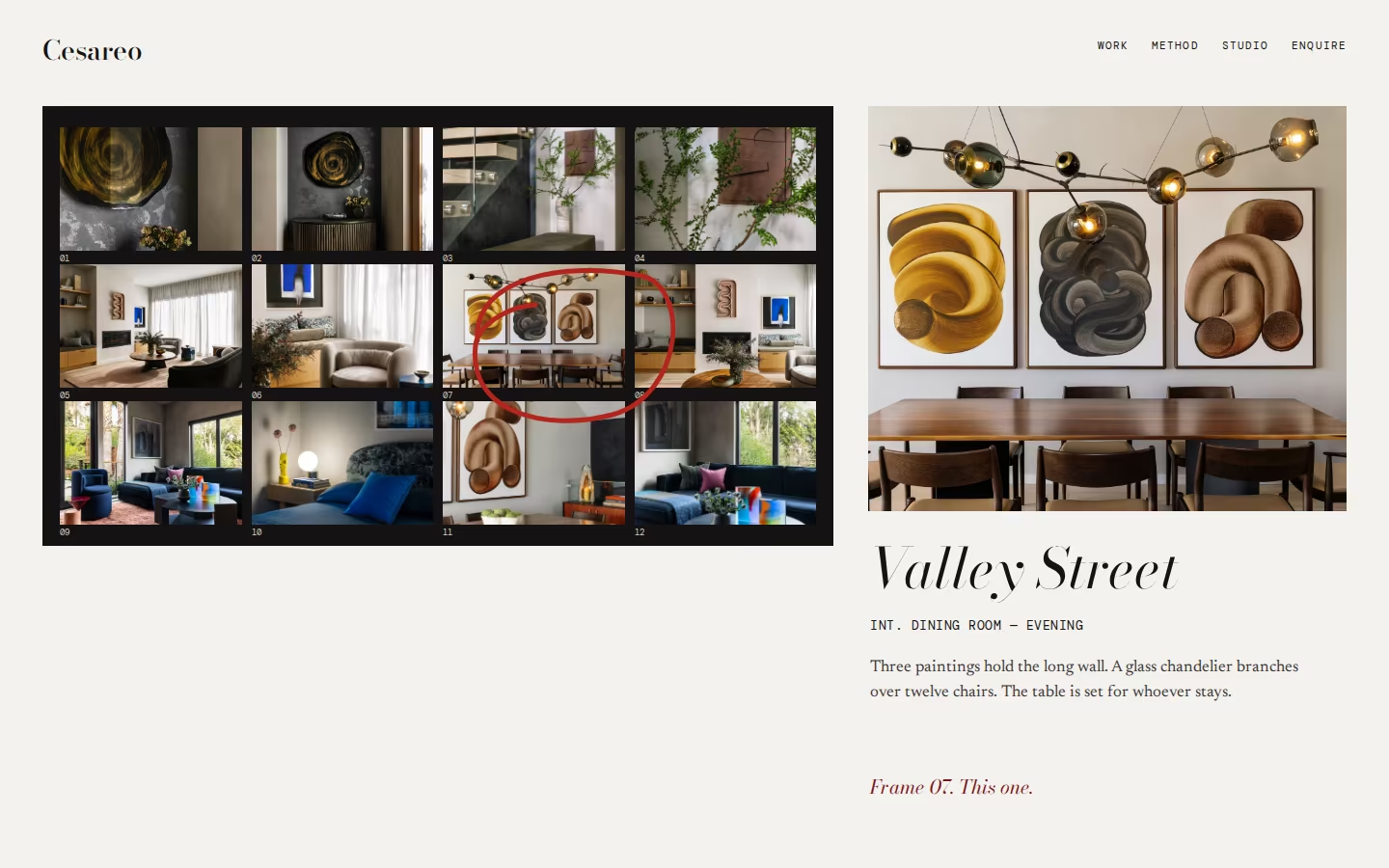
- Contact sheets and red-pencil selections
- Rooms introduced like scenes: INT. DINING ROOM, EVENING
The Director: in the hand, and honestly
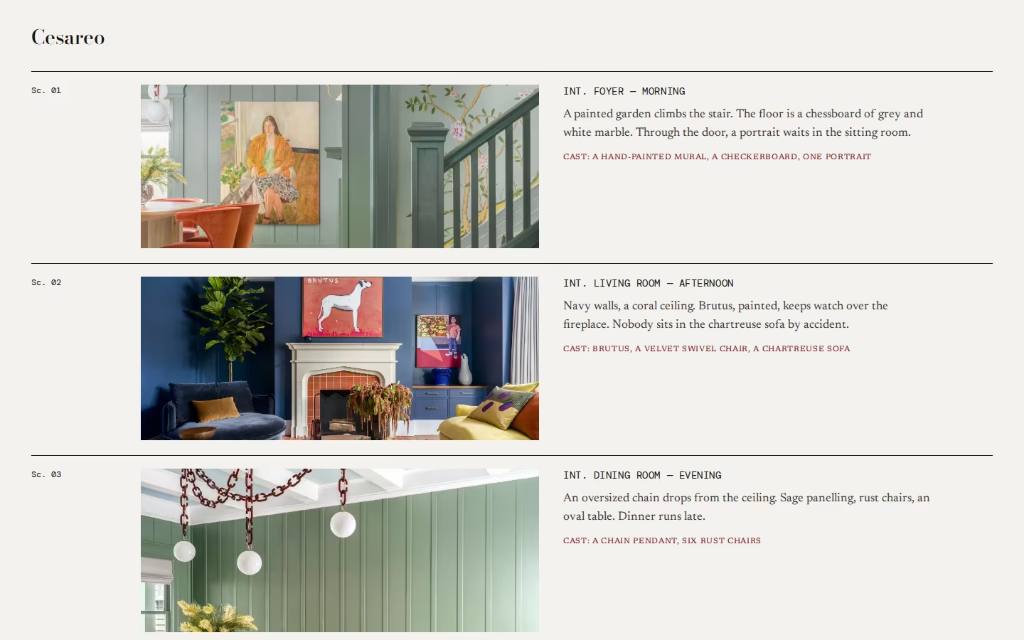
- Tells a story no peer can claim: Leo’s film and world-building lineage
- Shows the editing and the thinking, answering “what am I paying for?”
- Witty without trying
- Film references turn into a gimmick if overused
- Depends on sharp writing for every project, every time
The Collector
A catalogue of houses and the things in them.
Cultured · Personal · Worldly
The Collector: character and system
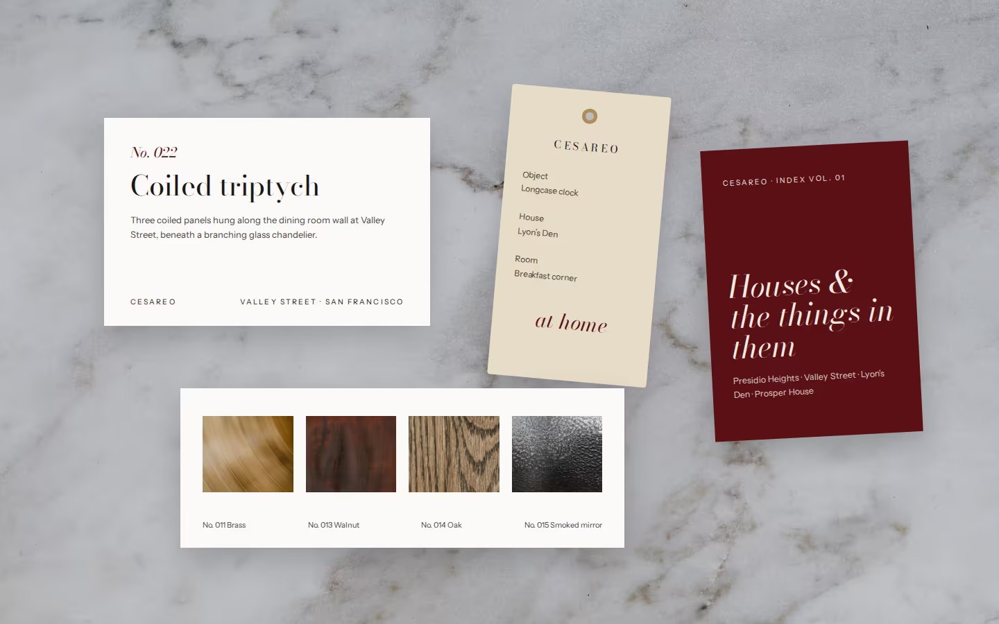
The collector who knows the story of every object in the room and the name of whoever made it.
The first ten secondsAn index of rooms, art and objects, each with a number.
Signature moves- Catalogue numbers and museum-style captions
- Makers and artists credited by name
- Material samples as part of the identity
CESAREO
Bodoni Moda + Instrument Sans for captionsObjects and details as often as rooms; material samples photographed flat.
The Collector: on the website
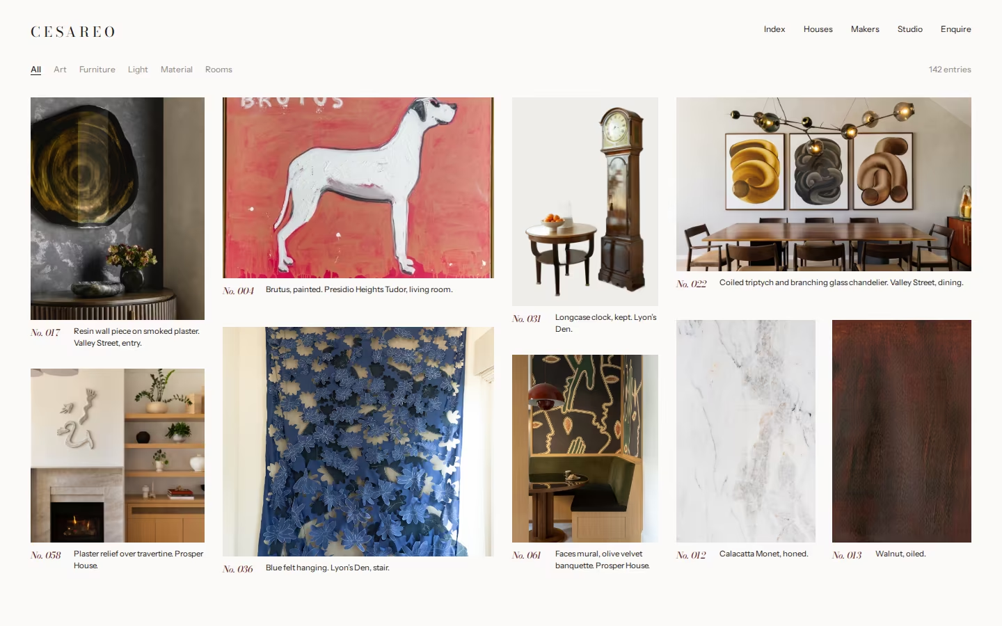
- Catalogue numbers and museum-style captions
- Makers and artists credited by name
The Collector: in the hand, and honestly
- The best gallery of work, which is the website’s first job
- Celebrates craft and the makers behind it
- Scales naturally into furniture and objects
- Can feel cool or museum-like without warm writing
- Needs disciplined content: object details and credits for every house
Choosing
Side by side, and what we would do.
Side by side
Our scores, out of five. They are a conversation starter, not a verdict.
| The Host | The Director | The Collector | |
|---|---|---|---|
| Intrigue in the first ten seconds | |||
| Warmth | |||
| Distinct from Bay Area peers | |||
| Shows the work (the site’s first job) | |||
| Room to evolve | |||
| Easy to sustain week to week |
What we would do
The Host, with the Collector’s captions.
The Host is closest to what you asked for, oxblood and white type, and to the idea of belonging. Its main risk, colour fighting the rooms, is solved by giving photography its own white ground.
Borrowing the Collector’s index and captions gives the website the strong gallery it needs and puts makers and artists on the page. The Director’s red pencil is worth keeping for process pages and social.
- Which world feels most like the studio you are becoming, not the one you are today?
- How much oxblood feels right: a whole room, or a door?
- Should wit live in the words, the images, or both?
- What would you add, remove or combine?
Please send one consolidated set of comments from the studio, so we can move quickly and keep the direction coherent.
What happens next
Review call
We walk through the three worlds and agree a direction, or a considered blend.
Visual identity V0.1
Logotype and brand-mark options, palette with values, typography candidates, photography direction.
Refinement
One round on the chosen logo, type and colour.
Brand guidelines
The system in one document, ready for the website design stage.
We look forward to hearing which world feels like home.
SC&CO
Creative Direction V2.0 for Cesareo Design