“The Cesareo Design identity should be primarily typographic, supported by a distinctive brand mark.”
So the wordmark carries the brand, and the mark is the secondary signature: a stamp, a favicon, a plaque.
You asked for an identity that is primarily typographic, supported by a distinctive brand mark, set in a serif in the spirit of Heimat Didone. This page is the shortlist: first the letterforms, then the wordmark lockups, then the mark.
Konekt stays where it belongs, as the website reference: oxblood with white type. It is not the letterform reference; Konekt’s own wordmark is a bookish, moderate-contrast serif, not a Didone.
Straight from the discovery questionnaire, in your words. Everything on this page is judged against these five lines.
“The Cesareo Design identity should be primarily typographic, supported by a distinctive brand mark.”
So the wordmark carries the brand, and the mark is the secondary signature: a stamp, a favicon, a plaque.
“Serif Font. Heimat Didone as an example.”
A high-contrast Didone serif. Heimat Didone is a commercial Atipo family, so section 01 shows it by name only, next to the open-licence faces nearest to it.
“Are there any icons, symbols, or patterns that resonate? — Not really.”
No given symbol to draw. The mark therefore comes out of the letters or the architecture, never from a decorative motif bolted on.
“Oxblood, Polished Nickel, Burnished Brass, Calacatta Monet Marble, Smoked Mirror, walnut and oak wood.”
The logo has to hold on oxblood and be engravable in metal: one weight, clean joins, no fine detail that fills in.
“The Konekt Website is perfect. I want to incorporate the ox blood red and white font.”
A website reference, as you confirmed, not a letterform reference. Oxblood and white type is atmosphere; the logo decision is separate.
“We do not want to abandon the elegance or restraint of the existing identity. We want to build upon it.” Avoid “the beige luxury formula”; add “curiosity, cultural depth, storytelling, humor”.
Elegant but not polite. The wit has to live in the lockup and the mark, not in a novelty typeface.
Heimat Didone (Atipo) is a contemporary Didone: strong thick–thin contrast, vertical stress, and hairlines sturdy enough to survive small sizes. It is a commercial licence, so it cannot be shown here. These are the faces closest to it, plus a few warmer alternatives, all with open licences.
Contrast — how thin the hairlines get against the stems. Higher contrast reads more fashion; lower reads more editorial and warm.
The C and the R — the C’s terminals and the R’s leg carry most of the character in “Cesareo”.
Small sizes — the same face has to work at 14 px in a caption and on a brass plaque.
Set in Bodoni Moda as the working stand-in. The questions here are the short name versus the full name, capitals versus upper and lower case, and how “Design” is carried.
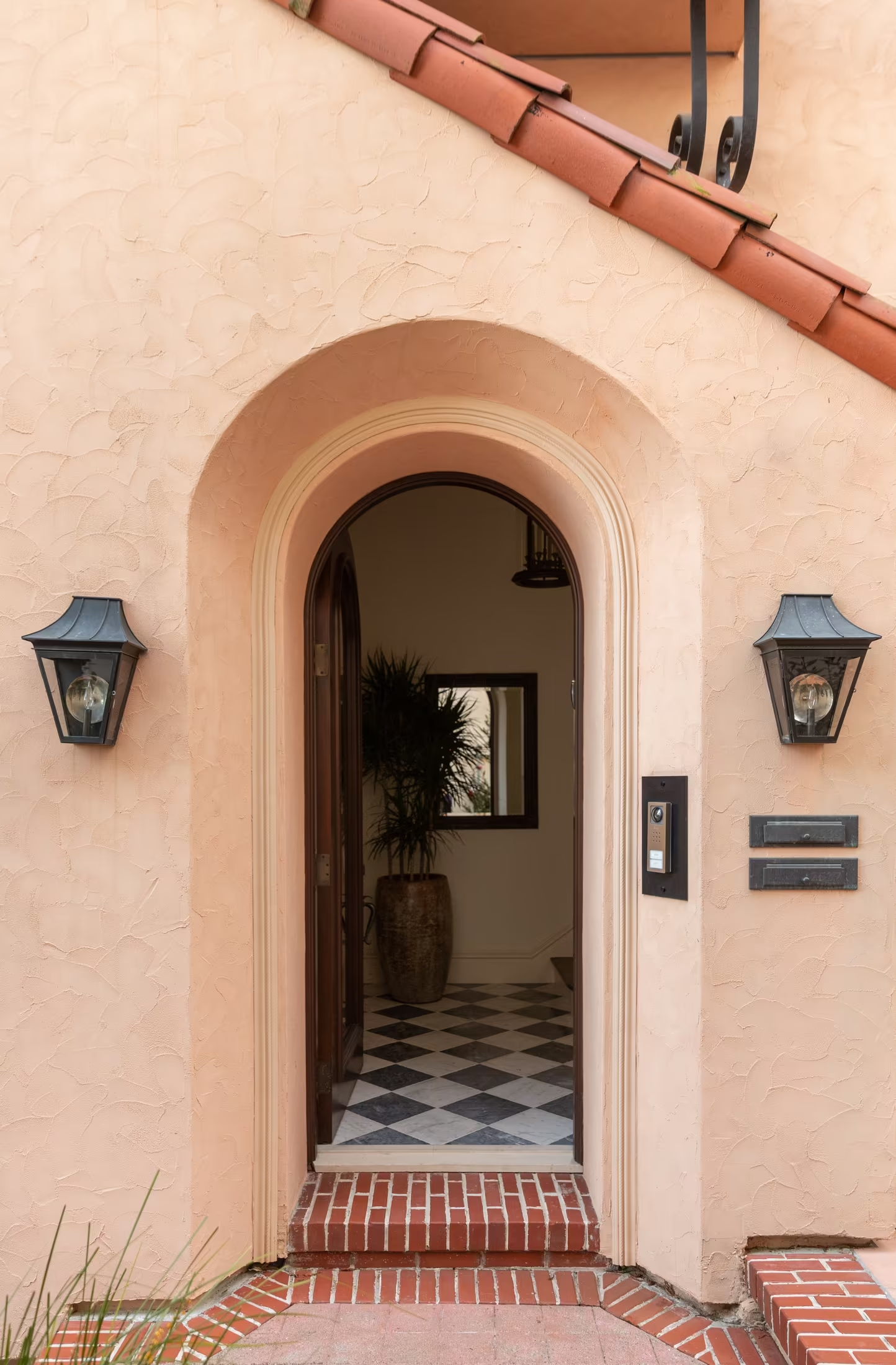
You said no particular motifs, so every mark here is drawn either from the letters or from the architecture that recurs in your work: the threshold, the arch, the frame. The existing roundel with three gables is the thing to build on or to retire.
Browser tab, Instagram, a stamp. Anything that disappears at 16 px cannot be the only mark.
The wordmark over photography, in oxblood, and stamped in brass.
 Cesareo
 CESAREO
Four answers and the identity stage can start.